WooCommerce Development & E-commerce Personalization For Cutting Tools Manufacturer
At A Glance
Headquartered in Michigan, ARCH Cutting Tools is a leading manufacturer of precision machining tools. With distributors across the US, combined with the ability to create custom tools for specific user applications, they are fueling the resurgence of American manufacturing.
Industry
Our Role
Obstacles & Objectives
ARCH is an innovative company, continually growing its product offering to meet the needs of the growing manufacturing industry. Simultaneously, ARCH has acquired several businesses in recent years. The result is an ever-expanding list of products that currently is in the tens of thousands, with no signs of slowing.
Despite having great products, and an attractive site design, it was not acting as an effective tool to grow the business. The website really has two separate goals:
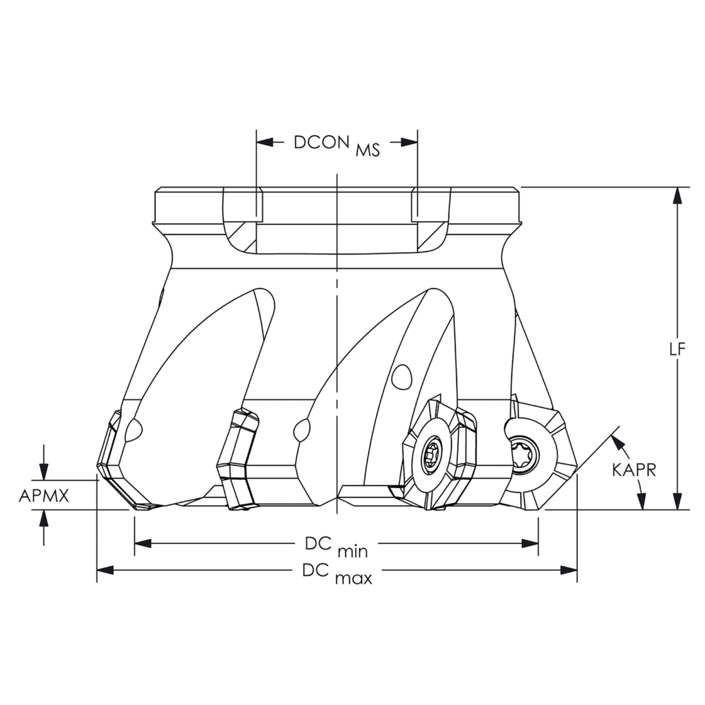
ARCH’s products are highly technical. In an industry where thousandths of an inch is the difference between success and failure, their customers need to know every last detail of the tools they purchase to ensure they get the right one for the job. It is not uncommon for products to have dozens of attributes.
Despite having great products, and an attractive site design, it was not acting as an effective tool to grow the business. The website really has three separate goals:
- Sign up new accounts (accounts are required for ordering).
- Support the distributors with product and sales materials.
- Generate orders for the distributors (all orders are routed through distributors).
It was not easy to find out how to become a distributor or to become a customer (an account is required for purchase). The site had extremely slow load times which frustrated users, especially because it was not easy to find products. The site’s categorization was extremely granular, requiring several clicks before getting to products, and when you got there, you may only find one or hundreds.
Searching for products was not any easier, as the search results were rarely relevant, and because of the need to review technical information only found on the product pages, clicking back and forth between category pages/search results and the product pages further frustrated users.
The result was many phone calls to the customer support team rather than using the automated money machine that their website should serve as.
Strategy & Solution
Overcoming Obstacles
ARCH has a high-traffic, highly customized site and is used for several purposes beyond E-commerce order capture. Simply taking a copy of it, rebuilding it top to bottom, and launching it would be irresponsible. Instead, we took a measured approach that started with research.
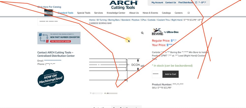
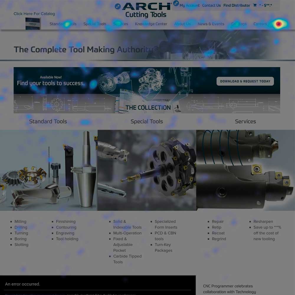
Before doing any work we installed heat mapping software to visualize user behavior on the website. We spent a significant amount of time reviewing the heat maps and recordings of the user experience. The following user behavior was commonly observed:
- Jumping back and forth between all the subcategories before ultimately using the search tool, indicating that navigation was ineffective
- Jumping back and forth between search results and the product pages, sometimes for hours, before adding anything to the cart
- Users adding products to the cart and not proceeding to checkout because they didn’t have an account
Navigation and search were clearly the biggest hurdles affecting E-commerce conversions, but we also had to tackle the load time issues and make it easier for customers to get an account.
Data-driven Recommendations
The following recommendations were implemented to address the obstacles:
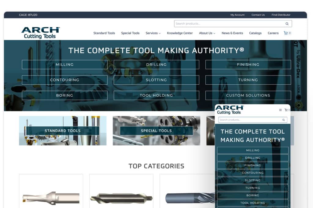
1. Retheme
A new custom theme was developed using Gutenberg blocks, focusing on keeping the site lite, with well-optimized images to minimize load time. During the retheme, we also redesigned the homepage to emphasize the most popular categories.
2. Navigational Improvements
Product categories were paired down so that you found products more quickly with less digging and page loads.
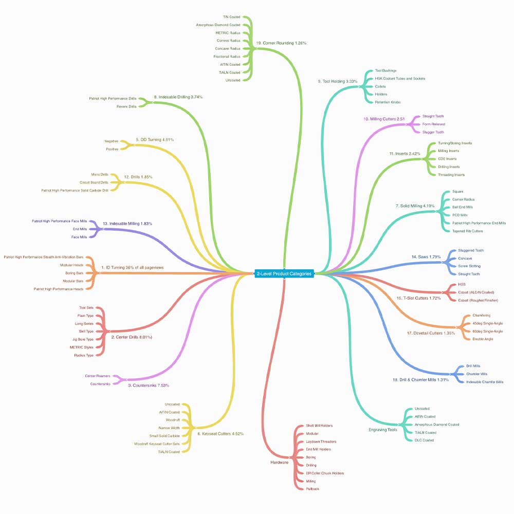
3. Meaningful Category Pages
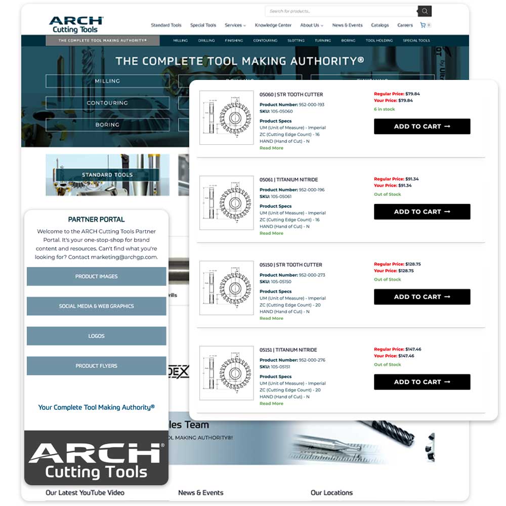
Rather than just having a grid of products with images and titles, we included product specs and changed to a list format with add-to-cart buttons. By doing this, users could more easily find the product they needed right from the category page and add it to the cart without going to a product page.
4. Search Improvements
We implemented Algolia, an enterprise search tool that uses its own indexes to provide lightning-fast search results and filtering. To do this, we have developed a custom plugin that provides an integration between WooCommerce and Algolia.
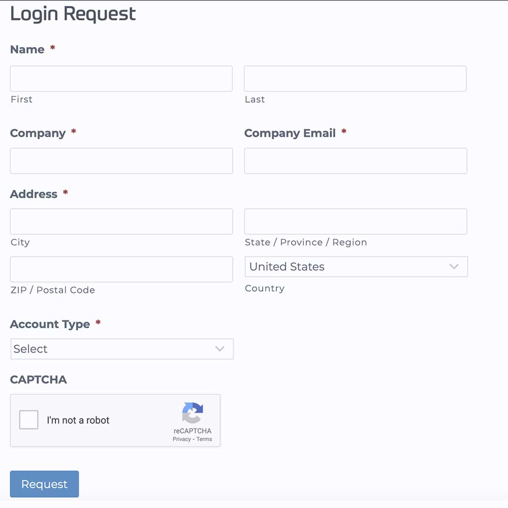
5. Account Request
Rather than just telling people that they need a login to order, we implemented a form to request a login. Once approved, the user was automatically added to the site with the proper role to place orders.
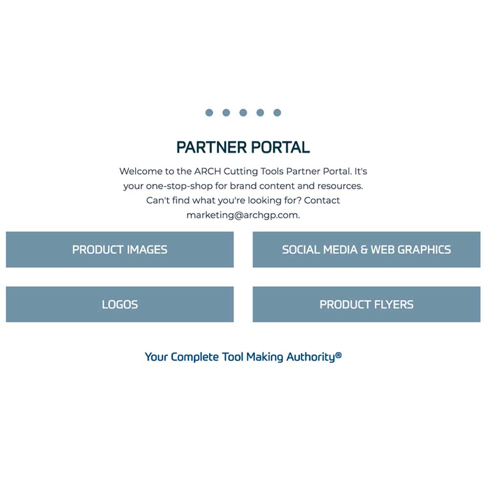
6. Distributor Portal
A new portal was created for distributors that allows them access to downloadable resources like media kits and marketing assets.
These site improvements were not implemented in one large push but rather in phases so that the results of our work could be measured. The goal in this is that if we had a negative result, we could more easily identify the cause and address it, but we could also learn from positive results elsewhere on the site.
Meeting Objectives
The end result of this work is a drastic improvement in reaching goals. A lift can be seen at every release….
Ultimately, what this boils down to is that anonymous users can become users with purchasing accounts more easily. Once they have an account, it is significantly easier to find products. Because of this, people are not calling into support to place their orders but placing them on the website. They are not just placing orders at a higher percentage rate, but for larger amounts with more items in the order.
The customers are happy, and the client is thrilled to be signing on more accounts who are placing their orders through a more streamlined and cost-effective method. Their site has now become the invaluable sales tool that they had always envisioned.
Increased Conversion Rate
64%
A 64% increase in conversion rate, with a nominal increase in traffic, resulted in a 112% increase in revenue.
Increased Time On Page
158%
A 44% decrease in page views, but a 158% increase in time on a page, with the majority of that time being spent on category and search results pages, indicates these pages are now exponentially more relevant and valuable in providing meaningful information to make a purchase.
Increased Average Order value
18%
An 18% increase in average order value and 35% more items per order. When we look at the 58% decrease in pages per session and an 18% increase in time per session, this indicates that users are spending more time on fewer pages but finding more products they need. The result is larger orders.
Increased New Accounts
33%
By placing the account request on the page gating access to the checkout, we increased the number of new account requests by 33%, which means 33% more people that can place orders.

Broadening Horizons
One of the biggest difficulties with ARCH’s products has been the diversity, highly technical nature, the sheer size of the product catalog, and the fact that a large portion of the product data has come together through acquisitions.
We are currently working to bring consistency to the product specifications, nomenclature, and values. (i.e bore diameter vs bore and 6” vs .5 feet). This is a large task when you extrapolate the number of specifications each product has, the number of variations in nomenclature and values, and the number of products in the catalog.
As this comes together, we will continue building out the filters available on the search results and category pages so that users can find products even faster by selecting the most meaningful specs for their needs.
We believe this is going to be another game changer for ARCH, and are thrilled to be a partner in their continued growth and success!
“I just thought I would share how amazing your search bar and website work. It took just 12 seconds and we found the tool that fit the criteria.“
Anonymous ARCH CustomerRelated Works
Services Provided
Product Naming
Create a unique, memorable product name that communicates the brand experience and is relatable to customer sentiment.
Brand Consulting
Research and consulting for brand environment.
Branding
Create a customer experience in line with the product experience.
Messaging Creation
Tone and voice of unique messaging to enforce brand experience.
Logo / Identity Design
Creation of logo lockup, word mark, custom type, iconography, and design elements.
Packaging Design
Strategically create packaging elements for ingredients that align with brand and identity experience.
Vendor Management
Research and source the appropriate vendors for print materials, packaging printing, and packaging elements.
Print Design
Design packaging inserts such as instructions and collateral that align with brand identity and messaging.
Marketing
Selling the product using online and traditional resources such as pay-per-click, ad words, affiliate marketing, email campaigns, and promotional offers.
Advertising
Promoting brand and product awareness to ideal customers through brand building campaigns online, social media, and affiliate networks.
Website Design / Development
Design and develop an online e-commerce experience that is aligned and encourages brand engagement.
Competitor Research
Research competitor products and companies to create a consensus and present a unique experience based on our findings to a focus group of ideal, potential, and competitor customers


