An ecommerce UX audit that shows where your shoppers give up
Analytics tells you people leave. An ecommerce UX audit tells you where and why: The menu that hides half the catalog, the search that returns nothing for a common typo, the checkout field that makes people stop. Our team is Baymard Institute UX certified, and we audit WooCommerce stores against Baymard’s large-scale e-commerce UX research.
Certified

Shoppers can’t buy what they can’t find
Store owners know their catalog too well to see it the way a first-time visitor does. Categories named after internal product lines, filters that don’t match how buyers think about size or material, product pages that answer the questions your sales staff hear on the phone but nowhere on the page.
Every extra click and dead end costs orders, and the damage is worse on a phone. An ecommerce usability audit puts the store up against evidence (research, heat maps, session recordings) instead of opinions, so redesign money goes where it changes behavior. It’s the store side of our UX design and information architecture work, and often the first step in a WooCommerce project with us.
Products buried several clicks deepSite search that misses typos, SKUs and synonymsFilters that don’t match how buyers compareProduct pages missing the details people ask aboutCheckout steps that ask for too much
What our ecommerce UX audit covers
You get a written report with screenshots, ranked by impact and effort, that your team or ours can build from.
Navigation and categories
We count how many clicks each key product sits from the home page and find where menus and category pages send people the wrong way.
Search and filtering
Site search tested with typos, SKUs and plain-language queries, and filters checked against the attributes buyers actually compare.
Product pages
Images, specs, pricing, stock, shipping and returns details, checked against Baymard’s guidelines for what shoppers look for before buying.
Cart and checkout
A field-by-field review covering account creation, payment options, error messages and mobile keyboards.
Heat maps and recordings
Where traffic allows, Hotjar heat maps and session recordings show what real shoppers click, skip and abandon.
Ranked fix list
Every finding comes with a recommended fix and a priority, so quick wins ship first and bigger changes get planned and quoted.
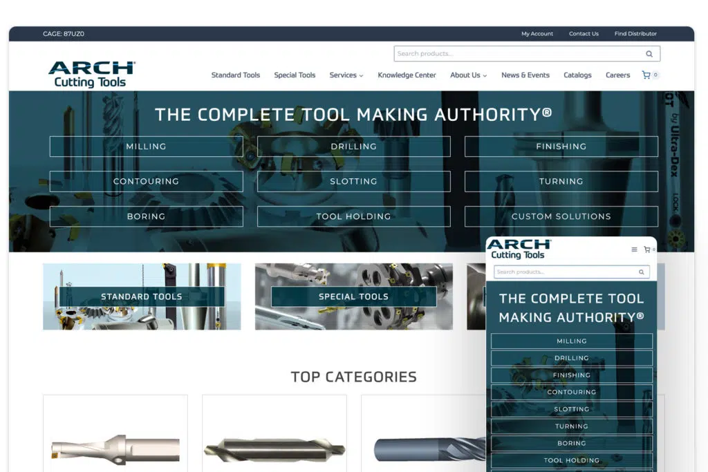
ARCH Cutting Tools: Products sat 5–11 clicks away
Before ARCH rebuilt its WooCommerce store, we ran heat-map research and an e-commerce UX audit. One finding shaped the whole project: Shoppers needed 5–11 clicks to reach a product. The rethemed store was built around shortening that path.
After launch, ARCH’s conversion rate rose 64%, revenue 112% and average order value 18%. United Chemical got the same treatment. Its audit pointed to shallow menus and three competing search tools, and after the fixes, monitored in Hotjar, its conversion rate rose 61% and bounce rate fell 23%.
Heat-map research and UX audit before any design workProducts found 5–11 clicks from the home page+64% conversion rate after the rethemed store launched+112% revenue, +18% average order value
How the audit runs
Kickoff
We agree on goals, key products and customer types, and get read access to your analytics.
Data review
Funnels, site search terms and, where installed, heat maps show where shoppers drop off.
Expert review
We walk the store on desktop and phone, page type by page type, against Baymard’s research-backed guidelines.
Report and walkthrough
You get the ranked findings and a call to go through them, plus a quote for any fixes you want us to make.
UX audit questions
Related WooCommerce services
WooCommerce Conversion Rate Optimization
Structural fixes to search, product pages and checkout, then testing.
WooCommerce Consulting, Research & Planning
Research and planning before you commit budget to a build.
Custom WooCommerce Theme Design
A custom WooCommerce theme designed mobile-first and built to load fast.
Show us the store. We’ll show you where shoppers stall, and what fixing it costs.
A plan, price and timeline inside five business days.