5 Must-Have Design Assets Every Business Needs
In the early stages of building a business, it’s easy to focus entirely on the product or service you’re offering and overlook the importance of visual branding. But the truth is, the way your business looks is often the first thing people notice—and it plays a huge role in how they perceive your credibility, professionalism, and value.
That’s where design assets come in. These are the foundational visual components that bring your brand to life, guide how your business is presented, and ensure consistency across every platform and interaction. Whether you’re promoting your services online, networking in person, or sending out a proposal, these assets shape the experience people have with your brand.
Without them, your visuals can feel disjointed, off-brand, or forgettable. With them, you gain a cohesive identity that makes your brand more recognizable, more trustworthy, and more effective at communicating your message. That’s why investing in strong, versatile design assets isn’t just for large companies—it’s essential for businesses of every size.
Let’s explore five of the most important design assets every business needs to stand out and succeed.
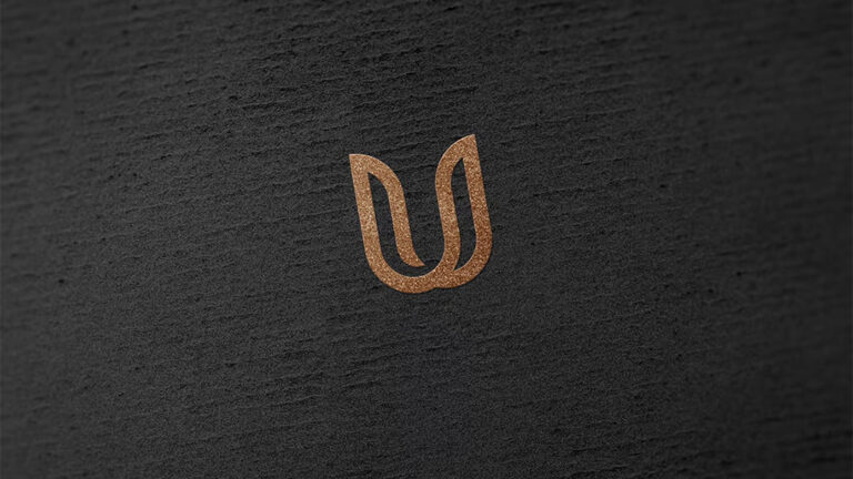
Logo: The Visual Anchor of Your Brand
Your logo is arguably the most important design asset you’ll ever create. It’s the single visual element that will appear on almost everything your business touches—from your website and packaging to email signatures and invoices. A strong logo serves as the face of your brand, instantly signaling who you are and what you stand for.
A professionally designed logo isn’t just about looking attractive—it’s about making sure your brand is easily recognizable and memorable. It should work at any size, in full color or black and white, and across both digital and print mediums. The design should also reflect your brand’s personality. For example, a playful, rounded logo might suit a children’s brand, while a clean, minimal mark may be more appropriate for a high-end consulting firm.
Beyond the main logo, you should also have alternate versions for different uses: a simplified icon version for social media, a horizontal version for website headers, and perhaps a stacked version for tight spaces. These variations keep your branding flexible without losing consistency.
Businesses that attempt to DIY their logo often run into problems down the line, needing costly redesigns or updates. Investing in a professional logo from the start—through a reliable graphic design service—saves time, builds credibility, and sets a strong foundation for every other asset that follows.
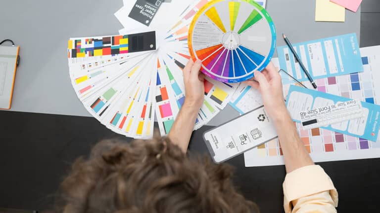
Brand Color Palette: Establishing Emotional and Visual Consistency
Color is one of the fastest ways to build recognition and trigger an emotional response from your audience. When used consistently, a defined color palette can make your brand instantly recognizable, even without showing your name or logo. Think of the red and yellow combination of McDonald’s or the bold purple used by Twitch—those colors are the brand.
A brand color palette typically includes primary colors (used most frequently), secondary colors (used for accents and flexibility), and sometimes neutral tones to round out the system. These colors will appear in your logo, on your website, in your social media graphics, packaging, signage, and beyond.
More than just aesthetics, color also communicates meaning. Blue might convey trust and reliability, while orange suggests energy and enthusiasm. The right palette supports your brand’s message and influences how people feel when they interact with you.
Having an official palette also keeps your brand consistent across all channels. Whether you’re working with a web developer, printer, or social media manager, everyone knows exactly which shades to use. This consistency builds familiarity and trust with your audience—and it makes your visual presence more impactful, no matter where it appears.
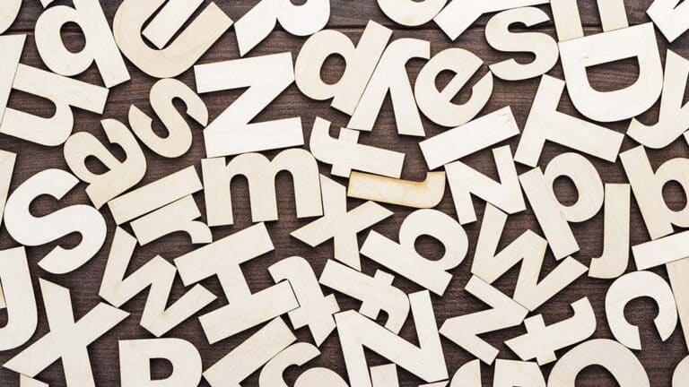
Typography System: Fonts That Reflect Your Brand Voice
Just like your logo and color palette, typography is a fundamental part of your visual identity—and it often goes overlooked. The fonts you choose say a lot about your brand’s personality. Are you bold and modern? Classic and professional? Approachable and friendly? The right typefaces can instantly communicate these traits to your audience without saying a word.
A strong typography system includes a set of fonts designated for specific uses. Typically, this involves a primary font for headings, a secondary font for body text, and sometimes an accent font for emphasis. These fonts should be cohesive in style and easy to read across devices, screen sizes, and formats.
The purpose of a typography system is twofold: it reinforces brand recognition and improves readability. When you use the same font family consistently, your materials start to feel like they belong together—whether someone is reading your website, looking at your product packaging, or flipping through a brochure. That consistency helps build a more polished and professional brand experience.
A good rule of thumb is to avoid using more than two or three typefaces across your brand. This keeps your visuals clean and avoids the cluttered or amateur look that happens when too many competing fonts are used. Pairing fonts effectively also enhances hierarchy, helping guide the reader’s eye and make content easier to scan.
Typography might not be the flashiest design asset, but it’s a powerful tool in shaping your brand’s tone. With the right font choices, your content becomes easier to read, more visually appealing, and aligned with your overall brand voice.
Brand Style Guide: Your Visual Rulebook
A brand style guide is the behind-the-scenes asset that brings all your design elements together into one cohesive system. It’s a document—often digital, sometimes printed—that outlines how your brand should look and feel in every situation. Think of it as your visual rulebook: a go-to resource for designers, marketers, developers, and anyone else creating materials on your behalf.
Your style guide should include clear specifications for your logo usage (including spacing and placement), color palette (with hex, RGB, and CMYK codes), typography system, image style, and any other design elements you want to protect. It may also include tone-of-voice guidelines, examples of correct and incorrect usage, and tips for maintaining consistency across platforms.
Without a brand style guide, your team is left guessing—and that often results in inconsistent visuals. One email campaign uses the wrong shade of blue, your social media graphics feature unapproved fonts, and your packaging design looks nothing like your website. This lack of cohesion weakens your brand and confuses your audience.
A style guide solves that problem by creating a clear, standardized framework that everyone can follow. It not only ensures consistency—it saves time, reduces errors, and keeps your branding strong no matter who’s creating the content.
Investing in a brand style guide is a smart move for any business that wants to scale. As your team grows or you begin working with freelancers, agencies, or partners, having a centralized set of design rules becomes essential for staying visually aligned.
Business Cards: Small but Powerful Branding Tools
In a digital world, it’s easy to overlook the value of physical branding assets—but business cards remain one of the most practical and powerful tools for making a great first impression. Whether you’re at a networking event, conference, or casual meeting, a well-designed business card gives you a tangible way to represent your brand on the spot.
A professional business card does more than share your contact information. It’s a mini version of your brand identity—showcasing your logo, colors, fonts, and design sensibility in a format that people can hold, keep, and remember. When thoughtfully designed, it communicates attention to detail and professionalism.
Business cards can also serve as conversation starters. Unique textures, finishes, shapes, or layouts can catch someone’s attention and make your card stand out in a stack. That extra design touch may be the reason someone remembers you over someone else.
Even if you rely mostly on digital communication, keeping business cards on hand shows that you’re prepared and intentional. It’s a small investment that can make a big impact—and when aligned with the rest of your brand, it becomes another powerful asset that reinforces your business identity wherever you go.
Social Media Templates: Speed Meets Consistency
In today’s fast-moving digital landscape, maintaining an active presence on social media is essential—but doing so consistently and professionally can be a major challenge without the right tools in place. That’s where branded social media templates come in. These are pre-designed layouts tailored to your brand that can be reused and adapted across platforms like Instagram, Facebook, LinkedIn, TikTok, and Pinterest.
Templates save time and streamline your content creation process. Instead of designing every post from scratch, your team can plug in new text, images, or promotions into a pre-approved design. This ensures that every post feels aligned with your visual identity, no matter who’s creating it.
More importantly, templates create cohesion. When your followers see consistent design elements—your colors, fonts, logo placement, and brand voice—they begin to associate those visuals with your business. That recognition builds trust and helps you stand out in an overcrowded feed.
Social media templates should be created for a variety of post types: quotes, announcements, product features, behind-the-scenes content, and stories. Ideally, they should be built in editable formats like Canva, Adobe Express, or Figma so that your marketing team can easily customize them without needing a designer for every update.
Whether you’re managing your own social accounts or working with a team, branded templates are a smart asset that makes your content creation more efficient, more consistent, and more impactful.
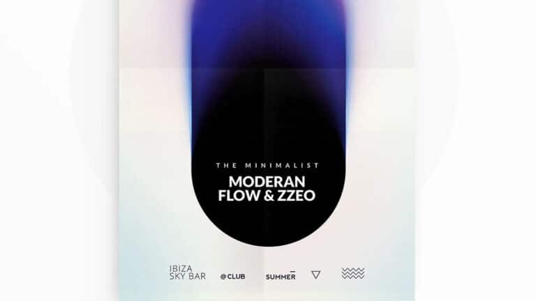
Marketing Collateral: Flyers, Brochures, and Presentation Decks
While digital marketing dominates, printed and presentation-based materials still play a significant role—especially in sales, B2B industries, events, and product launches. Professionally designed marketing collateral helps you communicate your offer clearly, persuasively, and in a way that aligns with your brand.
Common examples include one-pagers, brochures, pitch decks, posters, sales sheets, trade show banners, postcards, and more. Each of these serves a different purpose but shares one goal: to visually communicate your message in a compelling way that supports conversion.
When marketing materials are designed without a cohesive brand strategy, they often feel disjointed or disconnected from the rest of your business. Fonts might clash, images may feel off-brand, and messaging can lose its impact. On the other hand, when your collateral is designed as part of your larger visual system, everything works together to reinforce your message.
A well-crafted pitch deck, for example, can win over investors or clients by visually supporting your key points with clarity and polish. A brochure handed out at an event becomes a memorable takeaway that reminds attendees who you are and what you offer. Each piece of collateral is an opportunity to make a lasting impression—and it should reflect the same professionalism and attention to detail as the rest of your brand.
Website Graphics: A Seamless Digital Experience
Your website is your digital storefront, and every graphic that lives on it plays a role in shaping a visitor’s experience. From hero images and banners to custom icons and product visuals, website graphics help guide users through your site while visually reinforcing your brand identity.
First impressions online are heavily influenced by visuals. If your site looks cluttered, outdated, or inconsistent, users may question your legitimacy and leave before exploring your offer. But a clean, well-designed site that uses custom graphics, on-brand illustrations, and purposeful visual hierarchy keeps visitors engaged and encourages them to take action.
Effective website graphics do more than look good—they serve a function. They help explain ideas, break up text, emphasize calls to action, and lead users intuitively through your site. Whether you’re selling products, offering services, or capturing leads, visuals support the conversion journey at every step.
Responsive design is another key consideration. Your website graphics must look sharp and work seamlessly across devices—desktop, tablet, and mobile. Optimizing images for speed and clarity helps ensure a smooth user experience and better search engine rankings.
Every touchpoint on your website should feel visually aligned with the rest of your brand. When done right, your graphics don’t just decorate your site—they drive results.
Conclusion: Invest Once, Use Often
Building out your essential design assets isn’t about creating “pretty” materials—it’s about equipping your business with the tools it needs to grow, communicate, and compete. These assets give you the power to maintain consistency, improve brand recognition, and scale your marketing efforts efficiently.
Once you’ve developed these core assets—logo, color palette, typography, templates, collateral, and more—they become reusable, flexible resources that support every campaign, every post, and every pitch. They reduce guesswork, speed up production, and help your team create with confidence.
Most importantly, they reinforce the perception that your business is professional, trustworthy, and worth paying attention to. Whether your audience interacts with your brand online, at an event, or through a printed piece, they’ll receive a consistent experience that builds familiarity and loyalty over time.
If you’re serious about elevating your brand and growing your business, don’t leave your design assets to chance. Invest in them early, use them often, and revisit them as your brand evolves. The return will speak for itself in the form of stronger first impressions, higher engagement, and lasting impact.