Designing Graphics That Resonate with Your Target Audience
You can have the most beautifully crafted graphic in the world, but if it doesn’t speak to your audience, it won’t move the needle. Whether you’re trying to sell a product, promote an event, or build brand awareness, your visuals need to connect with the people they’re meant for. Great design isn’t just about looking polished—it’s about creating an emotional and intellectual connection that motivates someone to take action.
Audience-centric design is what turns passive viewers into active participants. It acknowledges that different groups respond to different aesthetics, tones, and formats. A graphic that works for Gen Z won’t necessarily resonate with a business executive, and vice versa. When you design with your audience in mind, you not only capture attention—you build trust, relevance, and influence.
If you’re not sure how to tailor your visuals effectively, working with a professional graphic design service can give you the insight and creative direction you need to make sure every visual element aligns with your goals and your audience’s expectations.
Define Your Target Audience First
Before you open your design software or sketch out a layout, you need to answer one key question: who is this for? Designing without a clear audience in mind is like throwing darts in the dark. You may get lucky, but more often than not, you’ll miss the mark. A targeted approach, on the other hand, lets you design with purpose.
Start by building a profile of your ideal customer. Go beyond age and gender—dig into psychographics. What are their interests? What problems are they trying to solve? What motivates them to take action? Are they value-driven, trend-conscious, or purely price-focused? Understanding these aspects gives you the foundation for visual storytelling that resonates.
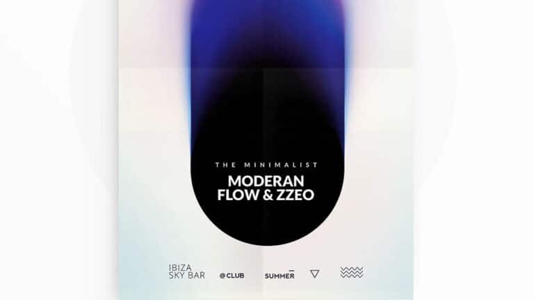
If you serve multiple audience segments, consider how your design might need to shift across campaigns or platforms. A product targeting working moms might use warm tones, approachable fonts, and real-life photography. That same product marketed to college students might rely on bold color blocks, minimal type, and high-energy graphics. The difference lies in knowing what matters most to each group.
Even simple visuals—like social media quotes or promotional banners—should be tailored with your audience in mind. Every design decision, from color to copy, should be filtered through the lens of: “Will this speak to the people I want to reach?”
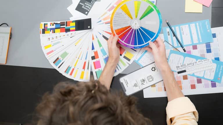
Align Visual Style with Audience Expectations
Once you understand who you’re speaking to, the next step is aligning your visual style with what that audience expects and relates to. People are more likely to engage with content that feels familiar and reflective of their world. That doesn’t mean copying competitors—it means meeting your audience where they are, visually and emotionally.
Different audiences respond to different design cues. Younger users might gravitate toward playful typography, vibrant gradients, and edgy composition. Professionals in more traditional industries may prefer clean lines, muted color palettes, and structured layouts. Cultural context matters too—color symbolism, visual metaphors, and style trends can vary by region or community.
When your visuals align with what your audience already trusts or aspires to, your message feels more relevant. It creates instant recognition and reassurance, allowing the viewer to focus on what you’re saying rather than questioning how you’re saying it.
The key is to study what your audience consumes—not just from you, but from the other brands and creators they follow. What visual language do they respond to? What styles dominate their feeds? What do they repost, comment on, or share? Let those insights inform your design choices, so your graphics become not just attractive, but resonant.
Speak to Their Values and Motivations
When designing for your audience, it’s not just about how things look—it’s about what they mean. People are drawn to content that reflects their values, beliefs, and goals. If your graphics tap into what your audience cares about most, they’ll be more likely to stop scrolling, pay attention, and take action.
Start by identifying the emotional triggers that resonate with your audience. Are they motivated by success? Comfort? Belonging? Innovation? Social impact? Each of these values can be expressed visually through color choices, image selection, iconography, and layout. For example, a brand appealing to environmentally conscious consumers might use earth-toned palettes, imagery of nature, and minimalistic design to communicate sustainability and intentionality. A fitness brand targeting driven, goal-oriented individuals might favor bold colors, strong typography, and action-packed visuals that signal energy and achievement.
Even your copy within the design should support those values. A sleek, futuristic layout paired with motivational language will speak to a different kind of viewer than a warm, friendly visual with conversational copy. The key is aligning every design choice—color, tone, message—with what your audience already believes in and aspires to.
People buy into brands that reflect who they are or who they want to become. When your graphics reflect those ideals back to them, you’re not just designing—you’re building a relationship rooted in shared identity.
Choose the Right Format for the Right Platform
Your audience doesn’t just influence what your graphics look like—it should also influence where and how they appear. Different demographics use different platforms in different ways, and tailoring your format to fit the platform can be just as important as the design itself.
For example, Gen Z audiences tend to live on TikTok, Instagram, and YouTube. They expect vertical, mobile-optimized content that’s fast-paced and eye-catching. If you’re designing for them, static horizontal graphics aren’t likely to land. In contrast, professionals in B2B spaces might be more active on LinkedIn or email, where clean infographics, whitepapers, and presentation decks are more effective.
Think about what type of content your audience prefers to consume. Are they watching videos, skimming headlines, or engaging with carousels? Are they swiping through stories, tapping through reels, or scrolling through feeds? Understanding platform behavior allows you to optimize your graphic design for both visibility and usability.
It also ensures you’re not wasting effort on formats that won’t reach your target audience. Designing a beautiful graphic for Facebook doesn’t help if your ideal customer is on Pinterest. Designing a long-form infographic doesn’t make sense if your audience prefers bite-sized carousel posts. Adapt the format and dimensions of your graphics to suit the platform where your audience is most active—and make sure each design is mobile-friendly, since most users browse on their phones.
Use Language and Tone That Feels Familiar
Visual design doesn’t stop with imagery—it also includes the words you use and how you present them. Copy and design go hand in hand, and the voice you use in your graphics can either pull your audience in or push them away.
The most effective messaging feels like it’s coming from someone your audience already knows. It uses the language they use, reflects the tone they’re comfortable with, and communicates at the right level of complexity or simplicity. If your audience is made up of creatives and entrepreneurs, you might lean into motivational phrases and an informal tone. If you’re targeting corporate decision-makers, a more professional, precise voice may feel more appropriate.
Typography also plays a role in reinforcing that tone. A handwritten script font sends a very different message than a clean sans serif. A bold, all-caps headline suggests urgency and power, while lowercase type and soft line spacing might signal calm and friendliness. The visual and verbal tone should match, creating a cohesive experience that feels authentic and engaging.
Ultimately, your audience should see themselves reflected in your design—including how it sounds. When the language, tone, and design elements feel familiar, people are more likely to trust the message and connect with the brand behind it.
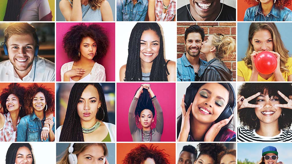
Incorporate Culturally Relevant Imagery and Symbols
Design that resonates with an audience isn’t created in a vacuum—it reflects the world that audience lives in. One of the most powerful ways to forge a meaningful connection is by using culturally relevant imagery, symbols, and visual references. When done respectfully and authentically, this kind of design signals that you truly understand and respect your audience’s identity, heritage, or lifestyle.
Cultural relevance might include representation in photography, using symbols with meaning to a particular group, or referencing trends, icons, or aesthetics from specific communities. For example, a campaign targeting Latinx millennials could incorporate color palettes and textures inspired by traditional textiles, along with inclusive imagery of people who reflect that community. A brand speaking to tech-savvy Gen Z users might embrace memes, internet slang, or vaporwave-inspired design as part of the visual language.
It’s important to do this with care. Using cultural elements just for the sake of aesthetics—without understanding their meaning or context—can backfire. Audiences are savvy, and they can spot inauthenticity quickly. Worse, poorly executed cultural references can come across as tone-deaf or even offensive.
Start by listening. Follow creators and influencers from the communities you want to reach. Observe how they use visual language. Consider hiring or consulting with designers who have lived experience within your target audience. And when in doubt, seek feedback before launching your graphics. The goal is to reflect, not appropriate—to affirm your audience’s identity rather than exploit it for attention.
When your audience sees their culture, experiences, or interests reflected in your visuals, it deepens emotional resonance and encourages lasting brand loyalty. It tells them: “We see you, and this was made for you.”
Test and Get Feedback from Real Users
Even with the best research and intentions, you can’t always predict how a design will land until it’s in front of real people. That’s why testing is such a critical part of designing graphics that truly resonate. What you think your audience wants and what actually grabs their attention can sometimes be two very different things.
User feedback doesn’t have to mean formal focus groups or massive surveys. It can be as simple as sharing a few design options with a sample of your target audience and asking for their honest impressions. Which one feels most “on brand” for them? Which headline makes them want to click? Which image makes them stop scrolling?
You can also test designs live using A/B testing on social media or in email campaigns. For example, you might send one version of a graphic with a bold call-to-action and another with a more subtle tone, and track which one gets more engagement. These insights are invaluable—they tell you not only what works, but why it works.
Pay close attention to both qualitative and quantitative responses. What words do people use when describing your visuals? Do they feel energized, confused, inspired, bored? Numbers can show you performance, but user feedback reveals emotion—and design is ultimately about how something makes someone feel.
The more feedback you gather, the more confident you’ll become in your design decisions. It turns guesswork into strategy and helps you create visuals that not only look great but genuinely connect.
Keep Accessibility in Mind
Design that resonates should be inclusive by nature. If your audience includes people with different abilities—and it almost certainly does—then accessibility needs to be part of your creative process. This means ensuring your graphics are clear, readable, and usable for as many people as possible.
Start with color contrast. Make sure there’s enough contrast between text and background so that it’s legible for users with low vision or color blindness. Avoid relying on color alone to convey meaning—use icons, labels, or textures to reinforce your message.
Font choice and size are also important. Use readable typefaces at sizes that work across devices, and avoid overly decorative fonts for body text. Make sure your headlines and CTAs are prominent and easy to distinguish from other content.
If your graphic includes text within an image, consider how it will be experienced by someone using a screen reader. When possible, provide alt text or accompanying captions that convey the same message. Think about users with motor impairments as well—can they navigate your graphic’s content on mobile with ease?
Accessibility isn’t just about compliance. It’s about empathy. It’s about ensuring that your message is reaching—and respecting—every member of your audience. When users feel included and considered, they’re far more likely to engage with your brand.
Conclusion: Connection Beats Aesthetics
At its core, design is communication. And communication only works when the person on the other side receives it. That’s why designing for your target audience isn’t just a creative best practice—it’s a business necessity. It’s how you move from simply creating visuals to building connections that matter.
Great design doesn’t shout into the void. It speaks directly to the people you want to reach. It reflects their goals, matches their tone, fits into their world, and makes them feel something—curiosity, trust, excitement, recognition. When your audience sees themselves in your design, they’re far more likely to pay attention, engage, and act.
So before you dive into your next project, pause and ask: who are we designing for? What do they care about? What makes them click, laugh, share, or buy? Then, let those answers guide every visual choice you make.
Because in the end, the designs that convert the most aren’t always the flashiest—they’re the ones that feel personal, relevant, and real. And that kind of connection is what turns followers into customers, and customers into loyal fans.