How to Build a Cohesive Visual Identity with Graphic Design
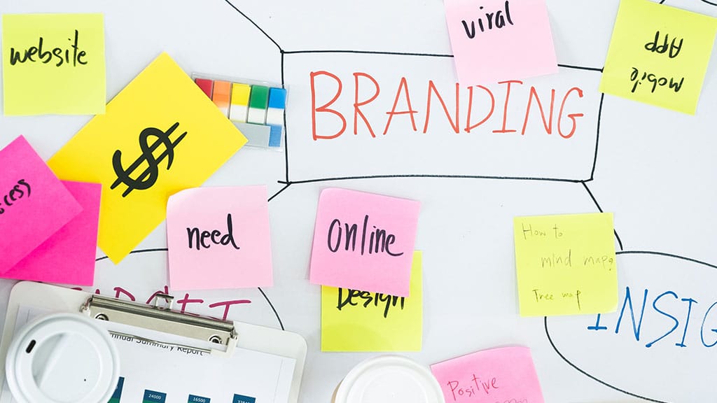
In today’s crowded market, visual identity is often the first impression your brand makes—and sometimes the only one that sticks. It’s more than just a logo or color scheme; it’s the sum of all visual elements that represent your business and influence how people perceive it. From your website and social media to your packaging and email campaigns, every visual touchpoint contributes to your brand’s overall impression.
A cohesive visual identity communicates professionalism, builds trust, and helps your audience instantly recognize your brand. When your visuals are consistent across all platforms, you create a seamless brand experience that feels deliberate and refined. When they’re not, your brand can appear fragmented, untrustworthy, or forgettable—even if your product or service is outstanding.
Creating this cohesion isn’t about copying and pasting the same design across everything. It’s about developing a flexible, yet consistent system of visual components—color, typography, layout, imagery, and more—that all feel like they belong to the same brand family. That’s what makes your business stand out, and more importantly, what makes it stick in people’s minds.
Let’s dive into the foundational steps every business should take to build a cohesive visual identity that’s both strategic and scalable.
Define Your Brand Personality and Voice
Before any design work begins, you need clarity on who your brand is and how it communicates. Your visual identity should be a reflection of your brand’s personality and voice, so it’s crucial to define these elements upfront. Are you casual and playful? Polished and professional? Bold and disruptive? The answers to these questions will shape every design decision that follows.
Start by identifying your brand values, mission, and core audience. What do you stand for? Who are you trying to reach? And what kind of emotional response do you want to evoke? These aren’t just marketing questions—they directly inform your visual tone.
For example, a wellness brand targeting young professionals might want to appear calming, modern, and trustworthy. That could translate into soft color palettes, minimal typography, and clean layouts. A streetwear brand aimed at Gen Z, on the other hand, might lean into bold colors, dynamic typography, and gritty textures that reflect a rebellious edge.
This process doesn’t require a full rebrand. Even if your business is well-established, refining your personality and tone can help bring clarity and consistency to your existing visuals. When your brand’s look and feel align with its voice and values, it creates a more authentic and engaging experience for your audience.
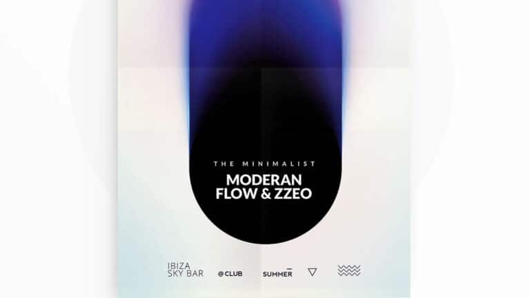
Design a Versatile, Memorable Logo
Your logo is the cornerstone of your visual identity. It’s often the first design asset created and the one that appears most frequently across your brand’s materials. A strong logo is more than a pretty icon—it encapsulates your brand’s essence in a single mark.
To build a cohesive identity, your logo should be versatile, scalable, and easy to recognize. It needs to work across different sizes and applications—from business cards and social media icons to large signage or digital headers. That’s why most great logos have multiple variations: a full logo with text and symbol, a simplified icon version, and perhaps a horizontal or stacked version depending on layout needs.
Good logos also reflect the personality and industry of your brand. A tech startup might use geometric forms and clean lines, while a boutique bakery might opt for a hand-drawn script with soft, nostalgic elements. But regardless of the style, your logo should be distinctive and timeless—not just trendy.
Working with a professional who offers a full graphic design service can help ensure your logo is built to function well, look beautiful, and align with your larger visual system. From there, your logo becomes the anchor point from which all other design elements flow, providing consistency and familiarity across every brand touchpoint.
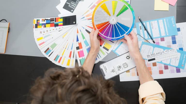
Choose a Distinct and Consistent Color Palette
Color is one of the most powerful elements of your brand’s visual identity. It evokes emotion, influences perception, and makes your brand instantly recognizable. When chosen and applied consistently, a well-defined color palette becomes a signature element that ties all of your brand’s visuals together.
The goal is to select a palette that not only looks good, but also reflects your brand personality and connects with your target audience. For example, blues and greens are often associated with calm, trust, and professionalism—ideal for industries like healthcare, finance, or tech. On the other hand, vibrant reds or oranges communicate energy, excitement, and urgency, making them well-suited for retail or food brands.
Your palette should include a primary color (your most dominant and recognizable hue), one or two secondary colors for flexibility, and a few neutrals to provide balance and contrast. These colors should be applied consistently across your website, marketing materials, packaging, signage, and social media content.
It’s also important to specify exact color codes—HEX, RGB, CMYK, and Pantone if applicable—so that everyone creating content for your brand is working with the same standards. Consistency in your color usage doesn’t just make your brand look more polished—it builds familiarity and trust over time. When people repeatedly see your color palette in different contexts, they begin to associate those colors with your brand.
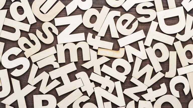
Select Brand Typography That Matches Your Tone
Typography is more than a design choice—it’s a communication tool. The fonts you use help establish the tone of your messaging and make your content easier to read and recognize. Just like with color, consistent use of typography is essential for building a cohesive visual identity.
Start by selecting a font system that includes at least two complementary typefaces: a primary font for headlines and titles, and a secondary font for body text. These should work well together while offering enough contrast to establish visual hierarchy. You might also choose an accent font for special cases like pull quotes, CTAs, or branded graphics, but this should be used sparingly.
When choosing fonts, consider what tone they convey. A serif font may feel elegant, traditional, or trustworthy. A clean sans-serif might feel modern and accessible. A bold display font could communicate creativity or innovation. The goal is to choose fonts that align with your brand personality and remain legible across all formats.
Once you’ve chosen your fonts, define specific rules around usage—such as font sizes, spacing, weights, and where each typeface should appear. These standards should be applied consistently across your website, emails, printed materials, and social posts.
When typography is intentional and cohesive, it enhances the user experience and reinforces your brand’s personality. It brings structure to your layouts and helps guide the viewer’s eye. When typography is inconsistent or poorly chosen, it can confuse readers and make your brand feel disorganized.
Create a Library of Brand Imagery and Icons
Imagery plays a huge role in how your audience connects with your brand. Whether you’re using custom photography, illustrations, stock images, or branded icons, these visual elements need to follow a consistent style to feel cohesive across platforms.
Start by defining the visual style that aligns with your brand’s personality. Should your photography feel bright and airy, or moody and dramatic? Are your illustrations clean and minimal, or textured and hand-drawn? What kinds of subjects, settings, and color tones support your brand story?
Consistency in imagery builds familiarity and emotional resonance. If your Instagram feed, website, and print materials all share a similar visual style, your audience will start to associate that aesthetic with your brand. On the other hand, using random styles or clashing imagery can dilute your message and confuse potential customers.
The same goes for icons. If you use icons across your website, app, or marketing content, choose or create a consistent set with matching stroke weights, shapes, and visual proportions. Mixing and matching icon styles can make your brand feel sloppy or amateur.
Creating a curated image and icon library for your team or creative partners makes it easier to maintain visual consistency across all content. When everyone is pulling from the same high-quality, on-brand assets, your identity stays aligned—no matter who’s creating the content.
Develop a Layout and Grid System
A strong layout system is the invisible structure that holds your brand’s design together. It governs how elements like text, images, and graphics are arranged across various platforms—websites, social media, email newsletters, print materials, and more. A consistent layout approach helps unify your visuals and makes your brand feel more professional, organized, and easy to engage with.
Using a grid system is one of the most effective ways to achieve this consistency. Grids help establish alignment, spacing, and proportionality. They ensure your designs feel balanced and intentional, even when the content changes from piece to piece. Designers often use column-based grids for print layouts or responsive web grids that adapt to different screen sizes.
In practice, this means defining consistent margins, spacing between elements, and clear rules for how titles, text, and images should be placed in relation to one another. For example, all blog headers might use the same font size and be centered above a wide image. Product descriptions may follow a left-aligned text block next to a fixed-width image. These patterns make your content easier to scan and understand, which improves both usability and brand trust.
Consistency in layout also speeds up the design process. Once your grid system is in place, you can apply it to new materials quickly without reinventing the wheel. Whether you’re designing a brochure or creating a new web page, a layout framework ensures everything looks like it belongs under the same brand umbrella.
Build Templates for Common Brand Assets
Templates are a game-changer for maintaining visual identity while streamlining production. By creating branded templates for the assets you use most often—social media posts, email headers, presentations, ads, blog graphics, and print collateral—you not only ensure consistency but also save time and reduce design errors.
Each template should incorporate your logo, color palette, typography, and imagery guidelines. For example, Instagram post templates might include consistent placement for headlines and calls-to-action, while slide decks may feature your brand’s fonts and footer design on every slide. Templates can be built in tools like Adobe InDesign, Canva, Figma, or Google Slides—whatever works best for your workflow and team.
Templates also help maintain consistency across departments or contributors. If you have multiple people creating content—marketers, salespeople, freelancers, or partners—providing them with pre-approved templates reduces the chances of going off-brand. It creates a unified experience, even if different people are producing the materials.
The key is to make your templates flexible enough to accommodate various types of content, but structured enough to protect your visual identity. With the right balance, you empower your team to create efficiently without sacrificing design quality.
Document Everything in a Brand Style Guide
A brand style guide is the glue that holds your visual identity together. It’s a comprehensive document that outlines how all your visual elements should be used—and just as importantly, how they shouldn’t be used. This guide ensures that your brand remains cohesive, whether you’re producing content in-house, working with freelancers, or growing your team.
Your style guide should include details like your logo variations and usage rules, color codes (HEX, RGB, CMYK, Pantone), approved fonts and their hierarchy, icon style, photography and illustration guidelines, layout grids, and examples of branded templates in action. It can also include tone-of-voice recommendations for copywriting to ensure verbal and visual communication are aligned.
An effective style guide makes onboarding faster, design reviews smoother, and brand integrity easier to maintain over time. It’s not just for designers—marketers, developers, content creators, and even customer service teams can benefit from understanding how the brand should look and feel across every touchpoint.
As your business evolves, so should your style guide. Revisit it regularly to update assets, clarify standards, and add new examples that reflect your growing identity. A living document keeps your brand sharp and scalable.
Conclusion: Consistency Creates Connection
When your brand visuals are aligned, your audience doesn’t just see your business—they remember it. A cohesive visual identity isn’t about rigid design or overly strict rules. It’s about creating a unified, intentional look and feel that communicates who you are across every platform, channel, and piece of content.
From your logo and color palette to your imagery and templates, every design decision plays a part in shaping how people perceive your brand. And when all those elements work together in harmony, the result is a stronger brand presence, deeper trust, and a more professional reputation.
Whether you’re just starting out or refining an established brand, building a cohesive visual identity sets the foundation for all your marketing efforts. It helps you show up consistently, communicate clearly, and stand out in a saturated marketplace. When your design reflects your values, speaks your audience’s language, and stays visually aligned—your brand doesn’t just look good. It becomes unforgettable.