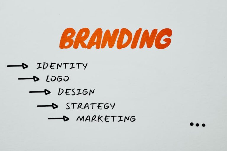
How to Create a Brand Style Guide for Consistency Across Platforms
In today’s crowded marketplace, brand consistency is key to standing out and building trust with your audience. A well-defined brand style guide ensures that your brand’s visuals, messaging, and tone remain consistent across all platforms—from websites and social media to packaging and print materials. Without clear guidelines, businesses risk inconsistent branding, which can confuse customers and weaken recognition.
A brand style guide serves as a rulebook that helps teams, designers, content creators, and marketers stay aligned. It provides specific instructions on how to use logos, colors, typography, and messaging, ensuring that all brand assets work together cohesively. Major brands like Apple, Coca-Cola, and Nike have mastered consistency through strong style guides that keep their branding recognizable no matter where they appear.
By creating a detailed brand style guide, businesses can improve brand recall, establish credibility, and maintain a professional appearance across platforms. Whether you’re a small business or a large corporation, defining your branding rules is a crucial step toward long-term success.
Define Your Brand’s Core Identity
Before diving into visuals or typography, your brand style guide should start with the core identity—the foundation of everything your brand represents. This includes your mission, vision, values, and personality, which collectively shape how your brand communicates with the world.
Your mission statement defines the purpose of your brand and what it aims to achieve. It should be clear, concise, and inspire both your internal team and your audience. For example, Nike’s mission statement is “To bring inspiration and innovation to every athlete in the world.” It immediately tells you what they stand for.
Your vision statement outlines the long-term goal or future aspiration of your brand. It helps guide strategic decisions and ensures that all branding efforts contribute toward a bigger picture. A strong vision statement should be aspirational yet achievable, helping align everyone in the company toward a common goal.
Your brand values are the principles that drive your business decisions and brand interactions. These values influence everything from the tone of your messaging to how you engage with customers. Brands that stay true to their values foster stronger emotional connections with their audience. For instance, Patagonia emphasizes sustainability in all aspects of its brand, from its messaging to its product materials.
Lastly, defining your brand personality helps establish a consistent tone and voice. Is your brand playful and humorous? Sophisticated and professional? Edgy and rebellious? Identifying key personality traits ensures that all brand communication feels unified and authentic.
This section of the style guide serves as the North Star of your branding. It ensures that everyone—from designers to copywriters—understands the brand’s identity and can create content that aligns with its core message.
Logo Usage Guidelines
A brand’s logo is often the most recognizable visual element, making it critical to maintain consistency in how it is used. Inconsistent logo application—such as stretched, recolored, or modified versions—can weaken brand identity and reduce professionalism. Your style guide should establish clear rules for logo usage to maintain visual integrity.
First, provide a primary logo that should be used in most applications. This is the full version of your logo that represents your brand’s identity. Next, outline secondary logo variations, such as simplified versions, monochrome alternatives, or stacked layouts. These variations ensure your logo remains flexible across different mediums, whether it’s being used on a website header, a mobile app, or printed materials.
Your guide should also include size and spacing guidelines to prevent distortion or crowding. Specify minimum size requirements to ensure legibility and define clear space rules around the logo to prevent other design elements from interfering with it. Many brands use a standard measurement—such as the height of a letter in the logo—to determine this spacing.
Another key component is defining background usage. Logos may need to be adapted based on the background they’re placed on. Your guide should provide examples of correct usage on light and dark backgrounds, ensuring the logo remains visible and easy to recognize in all scenarios.
Finally, include a list of logo don’ts to prevent misuses that could dilute brand identity. Examples may include stretching the logo, changing colors, applying drop shadows, or placing it on busy patterns that affect legibility.
By maintaining strict logo guidelines, businesses ensure that their branding remains polished and professional across all marketing channels. Companies often work with branding services to refine their logo usage rules and develop a cohesive style guide that strengthens brand recognition. A strong logo, when used consistently, helps reinforce trust and recall in the minds of consumers.
Color Palette Specifications
Color is one of the most powerful branding elements, influencing emotions, perceptions, and brand recognition. A strong and consistent color palette ensures that a brand remains visually cohesive across all platforms, from digital to print. In a brand style guide, defining primary and secondary colors along with their proper use is essential for maintaining uniformity.
The primary color palette consists of the main colors that represent the brand. These are the colors most frequently used in the logo, website, and core branding materials. For example, Coca-Cola’s primary color is red, while Facebook’s is blue. These colors create an instant association with the brand and should remain consistent in all branding efforts.
The secondary color palette includes complementary colors that support the primary palette. These are often used in backgrounds, buttons, call-to-action elements, and accents. While they add flexibility to design, they should never overpower or replace the primary colors.
Each color in the guide should be clearly defined with color codes, including:
- HEX codes (for digital use, such as websites and social media).
- RGB values (for screen-based designs).
- CMYK values (for print materials).
- Pantone codes (for high-quality print consistency).
Additionally, guidelines for background usage should be included to ensure contrast and readability. Some colors may not work well on light or dark backgrounds, and alternative variations should be specified. This section of the style guide should also include accessibility considerations, ensuring that colors meet contrast ratio standards for readability and inclusivity.
A well-defined color palette reinforces brand recognition and ensures that all marketing materials, websites, social media graphics, and packaging align visually with the brand identity.
Typography and Font Rules
Typography plays a crucial role in defining a brand’s personality and readability. The fonts a brand uses should be consistent, legible, and aligned with the brand’s tone. Whether formal, modern, playful, or bold, typography should enhance communication rather than distract from it.
A brand style guide should include approved typefaces and specify their usage in different contexts. Typically, brands define:
- Primary font: The main font used in headings and titles (e.g., Montserrat, Helvetica).
- Secondary font: A complementary font for body text and subheadings (e.g., Open Sans, Lato).
- Accent font (optional): A decorative font used sparingly for emphasis, such as in call-to-action elements.
The guide should also outline font hierarchy, ensuring a structured and consistent approach across all content. This hierarchy defines:
- Headline fonts (size, weight, and spacing).
- Subheadings (font size relative to headlines).
- Body text (legibility for paragraphs and long-form content).
- Call-to-action fonts (boldness and contrast to grab attention).
Spacing rules, including line height (leading), letter spacing (kerning), and paragraph spacing, should also be defined to maintain readability. Some brands even specify acceptable replacements for their fonts in case a design tool doesn’t support the primary typeface.
For digital applications, the guide should mention web-safe fonts for use in emails and websites to ensure compatibility across devices. Some fonts that work well in print may not be optimized for web use, so providing alternatives prevents inconsistencies.
By defining clear typography rules, brands ensure that every piece of content—whether a website, social media post, or print ad—maintains a uniform and polished appearance, reinforcing brand identity and professionalism.
Imagery and Graphic Elements
In addition to typography and colors, imagery and graphic elements play a significant role in shaping a brand’s visual identity. A brand style guide should specify the types of visuals that align with the brand’s tone and aesthetics to maintain consistency across platforms.
Photography Guidelines
- Define the style and mood of photography (e.g., natural, high-contrast, minimalistic, vibrant).
- Specify whether brand imagery should be studio-shot, lifestyle-oriented, or candid.
- Include rules on filters, lighting, and composition to create a consistent look.
- Identify preferred subjects (e.g., product shots, people in real-life situations, workplace settings).
For example, a luxury brand may prefer soft lighting, neutral backgrounds, and high-end aesthetics, while an outdoor adventure brand may favor bold, colorful, and action-focused imagery.
Illustrations and Icons
If a brand incorporates illustrations or custom icons, the guide should define:
- The style (flat, hand-drawn, vector, etc.).
- The color palette used in illustrations.
- Guidelines on icon size, shape, and usage to maintain visual harmony.
Brands like Mailchimp, for instance, use playful, hand-drawn illustrations as part of their identity, while Google follows a minimalist and geometric iconography style. Keeping these elements consistent ensures a professional and polished look across all materials.
Patterns and Textures
Some brands incorporate background patterns, overlays, or textures as part of their visual style. If applicable, the guide should define:
- When and where to use these elements.
- Approved textures (e.g., grainy, gradient, abstract, minimal).
- How they should complement typography and colors without overpowering the design.
Having clear rules for imagery and graphic elements prevents inconsistency and ensures that every visual piece reinforces the brand’s aesthetic. This allows marketing teams, designers, and content creators to work cohesively, ensuring a seamless brand experience across all platforms.
Voice and Tone Guidelines
While visuals create a first impression, your brand’s voice and tone shape how people relate to you over time. Voice is the personality of your brand—how you speak, write, and communicate—while tone adjusts based on context, audience, and emotion. Consistency in voice and tone across platforms ensures your audience knows what to expect and builds trust through familiarity.
In your brand style guide, start by defining your brand voice in a few key traits. For example, your brand might be friendly, knowledgeable, witty, or bold. Think of your brand as a person—how would they speak in different situations? Are they the enthusiastic teacher? The cool best friend? The no-nonsense expert?
Once you’ve defined your core voice, create examples of how this voice shows up in different contexts:
- Website copy: Clear, confident, and helpful.
- Social media posts: Playful and engaging, using emojis or casual phrasing.
- Customer service emails: Empathetic, respectful, and solution-oriented.
- Marketing materials: Energetic and persuasive, focusing on benefits.
Tone, unlike voice, is flexible. Your style guide should outline how the tone shifts depending on the situation. For instance, your tone in a product launch email may be excited and bold, while a response to a customer complaint would be calm and reassuring. Providing do’s and don’ts, before-and-after examples, and templates helps keep content creators aligned with your brand’s communication style.
By including voice and tone in your style guide, you create a foundation for meaningful, brand-aligned communication across departments and platforms—ensuring your audience always hears the same “voice” no matter where they engage with your brand.
Application Across Platforms
Once you’ve defined the core elements of your brand—logo, colors, fonts, imagery, and voice—it’s crucial to show how they apply consistently across platforms. Your brand style guide should break down the practical application of these rules in various channels, both online and offline.
For websites, consistency in typography, button styles, navigation, image use, and messaging helps create a cohesive user experience. Provide examples of web layouts, hero sections, and product pages that demonstrate proper use of your style elements.
On social media, brand consistency is key to standing out in a busy feed. Use the style guide to define post templates, tone for captions, hashtag use, and visual branding (like watermark placement or background styles). Include image size guidelines for platforms like Instagram, Facebook, LinkedIn, TikTok, and X (Twitter), since aspect ratios vary.
In email marketing, style rules should guide subject lines, header formatting, button design, and tone. Provide templates or screenshots that demonstrate branded email layouts and common scenarios (like newsletters, promotions, and transactional emails).
For print materials, specify how branding translates to brochures, business cards, packaging, and signage. Define margins, bleed areas, and printing specs to ensure high-quality and consistent results.
Don’t forget internal documents and presentations. Consistency here reflects professionalism and reinforces brand values internally. Provide slide deck templates, letterhead examples, and branded report styles.
By showing how each element plays out across platforms, you remove ambiguity and help team members (and external partners) apply your branding with confidence.
Examples and Templates
The most helpful brand style guides go beyond theory—they show real-world application. Including branded examples and ready-to-use templates in your guide makes it easy for teams to apply the standards without guessing or reinventing the wheel.
Add annotated screenshots of:
- A correctly formatted email newsletter
- A sample Instagram carousel
- A blog post layout with proper font hierarchy
- A before-and-after brand voice example in social copy
- Business card or flyer designs with approved colors and fonts
Also provide downloadable templates for:
- Social media posts
- PowerPoint/Keynote presentations
- Business proposals or one-pagers
- Letterhead and invoices
- Email signatures
Make it easy for internal teams and contractors to access these templates via cloud storage (e.g., Google Drive, Dropbox, or your brand portal). The more examples you offer, the more streamlined the creative process becomes—and the more consistent the brand will be, no matter who’s executing it.
These assets are especially helpful when onboarding new team members or working with freelancers and agencies. Instead of lengthy explanations, you can simply point them to examples that reflect your brand in action.
Maintaining and Evolving the Guide
Creating a brand style guide is not a one-and-done process. Your brand will evolve over time—new products, new audiences, rebrands, or expanded platforms will require updates to your identity. That’s why your style guide needs a maintenance plan to stay relevant and useful.
Assign ownership of the guide to a specific person or team, such as your creative director or brand manager. This ensures someone is accountable for keeping the guide current as new needs emerge. Schedule regular reviews (quarterly or biannually) to evaluate whether updates are needed based on new campaigns, design trends, or feedback from the team.
Encourage team members to submit suggestions or questions when inconsistencies or edge cases arise. If a designer isn’t sure how to apply a gradient background on mobile, or if a marketer struggles with tone in a technical blog post, those questions can help shape future guide revisions.
Track usage of the guide and communicate updates clearly. When revisions are made—like adding a new color variation or refining brand voice—notify all relevant departments and update shared documents or digital style libraries.
Lastly, revisit your brand’s identity every few years to ensure it still reflects your values, audience, and market position. A great brand is one that knows how to evolve while staying rooted in what makes it unique. Your style guide should grow alongside it.
By maintaining a dynamic, well-organized brand style guide, you protect your brand’s integrity while giving your team the tools to scale, create, and innovate—without ever losing your core identity.