The Business Impact of Color Psychology in Graphic Design
Color is often the first thing someone notices about a brand. It shapes immediate impressions, sets the emotional tone, and influences behavior—all before a single word is read. While many people think of color in design as an aesthetic decision, the truth is that it’s also a strategic one. For businesses, understanding the psychology behind color choices is essential to building an effective visual identity that not only looks great but also drives results.
Whether it’s the calming effect of blue, the urgency of red, or the freshness of green, each color evokes a unique emotional response. These emotional triggers can affect how your audience perceives your brand, interacts with your content, and ultimately decides whether to engage or convert. That makes color psychology one of the most powerful tools in a designer’s toolkit—and one that savvy businesses use to their advantage.
From branding and advertising to web design and packaging, the right color choices can boost brand recognition, build trust, and increase sales. But using color effectively means going beyond personal preference or trends. It requires intention, research, and alignment with your brand’s mission, audience, and goals. For companies looking to harness color psychology in a strategic way, working with a professional graphic design service can help ensure every visual choice supports your larger business objectives.
Understanding the Basics of Color Psychology
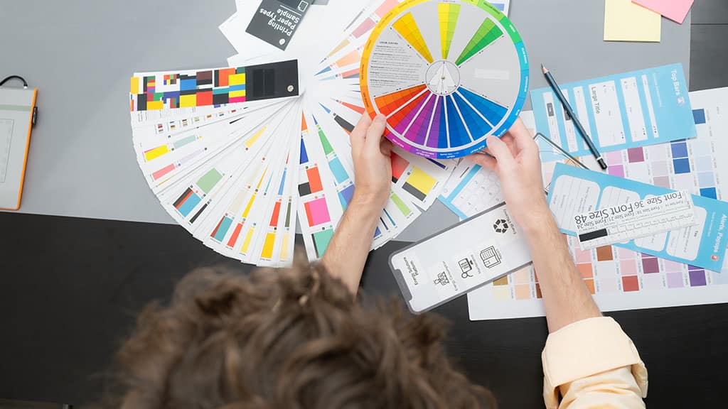
Color psychology is the study of how different colors affect human emotions and behavior. While personal experiences, cultural background, and context all play roles in how we perceive color, there are consistent patterns that marketers and designers rely on when crafting visual experiences.
Red, for example, is associated with passion, urgency, and energy. It increases heart rate and grabs attention, making it popular for clearance sales and fast-food branding. Blue, on the other hand, tends to evoke calm, trust, and professionalism. That’s why it’s widely used in banking, technology, and healthcare. Yellow often feels optimistic and youthful, while green suggests growth, nature, and wellness. Black can signal luxury and power, whereas white conveys purity, simplicity, and cleanliness.
These associations aren’t just interesting observations—they influence real-world behavior. Studies have shown that up to 90% of first impressions about a product or brand are based on color alone. Color can influence how long someone stays on a website, how likely they are to click a button, and even how much they’re willing to pay.
Understanding these effects allows brands to create intentional, targeted emotional experiences. For example, an eco-conscious skincare company might choose green and soft neutrals to reflect sustainability and gentleness. A cutting-edge tech startup might choose bold blues or purples to convey innovation and reliability. In both cases, the color palette supports the brand’s message and helps it resonate with the intended audience.
Red for Urgency and Action: When to Use It
Red is one of the most powerful colors in design—and one of the trickiest to use well. It commands attention like no other color and creates a sense of urgency that can prompt action. That’s why you’ll often see it used in clearance tags, flash sale graphics, or call-to-action buttons. In the right context, red is an effective motivator. It can increase click-through rates, make offers feel time-sensitive, and add energy to a visual layout.
But red also carries risk. Because it’s such an emotionally intense color, it can easily feel aggressive or overwhelming if overused. In branding, too much red can create anxiety or tension, especially in industries where trust and calm are priorities—like healthcare or finance. That’s why it’s often balanced with neutral colors like white or gray or used as an accent rather than a dominant color.
Red can also vary in meaning across cultures. In Western contexts, it often symbolizes urgency or excitement. In parts of Asia, it’s associated with luck and celebration. So, when designing for global audiences, it’s important to consider the broader implications of your color choices.
Used thoughtfully, red can be a strategic tool for grabbing attention and driving immediate action. But it should always be paired with strong design principles and a clear understanding of your brand’s emotional goals.
Blue for Trust and Reliability: Building Customer Confidence
Blue is one of the most commonly used colors in branding—and for good reason. It’s universally associated with trust, dependability, and intelligence. When businesses want to reassure their audience, foster long-term loyalty, or communicate stability, blue is often the go-to choice.
You’ll find blue prominently featured in industries where trust is paramount: banking, insurance, technology, and healthcare. Brands like PayPal, IBM, and GE all rely on blue to convey professionalism and calm. That’s because blue tends to evoke a sense of safety. It reduces stress, feels familiar, and often encourages users to feel secure while browsing, purchasing, or inputting personal data.
Lighter shades of blue often feel fresh, friendly, and open—great for wellness brands, educational platforms, and customer service-focused businesses. Darker blues, meanwhile, feel more serious and traditional, ideal for financial institutions or corporate brands that want to communicate authority and experience.
However, the emotional impact of blue also depends on context. Used too heavily, it can feel cold or distant. That’s why it’s important to pair blue with warm or neutral accents, dynamic layouts, or inviting imagery to maintain balance and personality. It’s not just the color itself but how it’s used within the broader brand experience that shapes perception.
Ultimately, blue is a safe, strategic choice for brands looking to create a dependable, trustworthy identity. When executed thoughtfully, it signals professionalism and reassures customers that they’re in good hands.
Green for Wellness and Sustainability: Signaling Health and Growth
Green has strong ties to nature, health, and renewal. It’s the color of growth, life, and balance—which is why it’s often used by brands in wellness, sustainability, agriculture, and finance. If your business is rooted in eco-conscious values or promotes healthy living, green can be a powerful way to communicate those principles visually.
In color psychology, green evokes calm and reassurance. Unlike red, which creates urgency, or yellow, which stimulates energy, green has a soothing effect. It can lower anxiety and promote feelings of relaxation and clarity. For wellness brands, this is particularly valuable—green encourages users to slow down and engage more mindfully.
It’s also a highly versatile color. Light greens feel fresh and youthful, while darker greens suggest tradition and wisdom. Olive or muted greens can feel earthy and grounded, ideal for eco-focused or artisanal brands. Paired with the right typography and imagery, green can either lean contemporary or classic.
But like all colors, green needs thoughtful application. Too much can dilute its impact or make your brand feel generic—especially as green becomes more popular in crowded markets. For sustainability-focused companies, authenticity matters more than ever. A green color palette should be supported by clear messaging and real environmental values, or it risks coming off as superficial.
When used strategically, green doesn’t just suggest growth—it supports it, by aligning your brand visually with values that consumers increasingly prioritize: health, balance, and sustainability.
Yellow and Orange for Optimism and Energy
If you want to capture attention and convey energy, yellow and orange are bold choices. These warm colors evoke optimism, enthusiasm, and friendliness. They’re often associated with youth, creativity, and action—making them ideal for brands that want to feel approachable and dynamic.
Yellow in particular stands out in a crowd. It’s often used to highlight important information or bring joy to a layout. Brands like McDonald’s and Snapchat use yellow to create a feeling of happiness and playfulness. But because yellow reflects the most light of any color, it can be fatiguing if overused. It’s best applied in moderation or as an accent to add personality without overwhelming the viewer.
Orange blends the cheerfulness of yellow with the energy of red. It’s commonly used for calls to action, retail promotions, and brands targeting youthful, adventurous audiences. Think of brands like Fanta or The Home Depot—orange feels confident and informal, great for creating a high-energy atmosphere.
However, these colors require balance. On-screen, yellow and orange can pose contrast challenges, especially when used as background colors or text. Pairing them with darker elements or grounding neutrals can make your design more readable and visually effective.
Used wisely, yellow and orange help your brand appear more energetic, cheerful, and alive. When your goal is to uplift and inspire, these hues are some of the most effective tools in the color psychology playbook.
Black, White, and Neutrals: Sophistication and Simplicity
While bold colors often get the spotlight, neutrals—particularly black, white, gray, and beige—play a vital role in effective graphic design. These shades may not grab attention in the same way as red or yellow, but they bring balance, structure, and sophistication to your visuals. In many cases, they act as the foundation that allows other brand colors to shine.
Black is associated with luxury, power, and elegance. It’s a popular choice for high-end brands in fashion, beauty, and technology. Think of brands like Chanel or Apple—black is used to convey refinement and confidence. It’s also incredibly versatile, working well as a background, accent, or typography color. But too much black can feel heavy or uninviting, which is why it’s often balanced with white space or lighter tones.
White, on the other hand, suggests purity, minimalism, and clarity. It offers a clean canvas that promotes focus and simplicity. In web design, generous use of white space creates breathing room, helping guide the eye and improve content hierarchy. It’s especially effective for modern, editorial, or wellness brands that value clarity and openness.
Grays and beiges serve as quiet neutrals that add depth and professionalism without competing with other brand colors. They’re often used in corporate design, luxury branding, or to tone down louder palettes. These shades can add a calming or mature presence to your visual identity.
When used together, black, white, and neutrals can create a timeless and balanced aesthetic. They allow brands to project sophistication while ensuring content remains the focal point. These colors may be subtle, but their impact on brand perception and user experience is significant.
Color Harmony and Brand Consistency Across Platforms
One of the most important principles in design—especially in branding—is consistency. Color harmony ensures that your entire visual ecosystem works together cohesively. It’s not just about choosing appealing colors; it’s about selecting a palette that aligns with your brand values and applies consistently across all platforms, from digital to print.
A well-defined brand color palette typically includes primary, secondary, and accent colors, each with a specific role. Your primary colors form the core identity—these are the ones most associated with your logo, website, and packaging. Secondary colors support the primary palette, often used in infographics, illustrations, or background elements. Accent colors are used sparingly for emphasis, such as calls to action or icons.
Maintaining color harmony within this system ensures visual consistency, which in turn strengthens brand recognition. When customers see the same colors used across your website, social media posts, emails, and advertising, it creates familiarity and trust. Over time, even without seeing your logo, your audience begins to recognize your brand through color alone.
Inconsistency, on the other hand, can dilute your message and create confusion. If your red CTA button is suddenly green on one page or your Instagram feed uses entirely different hues than your website, it weakens the connection your audience has with your brand.
Brand guidelines that include color usage rules, hex codes, and real-world examples help maintain that consistency—especially when multiple people or teams are involved in content creation. The more cohesive your visual identity, the more confident and professional your brand appears.
Accessibility and Cultural Considerations in Color Use
Effective design should be inclusive—and color plays a major role in accessibility. Not all users perceive color the same way, and certain combinations can create challenges for those with visual impairments or color blindness. Designing with accessibility in mind ensures that everyone can engage with your brand content clearly and comfortably.
The most common form of color blindness affects red-green perception. This means that relying solely on color to communicate meaning—like using red for errors and green for success—can alienate part of your audience. To fix this, combine color with other cues, such as icons, labels, or patterns. Ensuring sufficient contrast between text and background is also essential for readability.
There are many free tools and browser extensions that allow designers to test for color accessibility. Incorporating these checks into your workflow ensures your content is compliant with Web Content Accessibility Guidelines (WCAG) and reflects your brand’s commitment to inclusivity.
Cultural context is equally important. Colors hold different meanings in different parts of the world. For instance, white symbolizes purity and weddings in many Western cultures but is associated with mourning in parts of Asia. Red can signal danger in one region and celebration in another. If you operate in global markets or have a diverse customer base, it’s worth researching the cultural connotations of your chosen colors to avoid misunderstandings or unintended messaging.
Design that’s both accessible and culturally sensitive demonstrates respect for your audience and widens your reach. It also strengthens trust, which is key to building lasting customer relationships.
Conclusion: Choosing Colors That Convert and Communicate
Color is one of the most powerful tools in visual communication. It speaks instantly, emotionally, and universally—often before a single word is read. In branding and marketing, your color choices shape first impressions, guide user behavior, and influence how your audience feels about your business.
From creating urgency with red to instilling trust with blue or signaling sustainability with green, each color has a purpose. The impact isn’t limited to individual elements—it extends to the entire brand experience. When your colors are chosen thoughtfully, applied consistently, and balanced with accessibility in mind, they become a core part of your brand identity and a strategic driver of business results.
Color psychology doesn’t mean guessing what looks good. It’s about using proven principles to support your goals—whether that’s increasing conversions, building brand recognition, or creating an emotional connection. A strong color palette isn’t just attractive—it’s effective. It works hard behind the scenes to help your audience remember you, trust you, and choose you.
Ultimately, great design isn’t just about aesthetics—it’s about impact. And when your colors are working for you, your entire brand becomes more powerful, more memorable, and more successful.