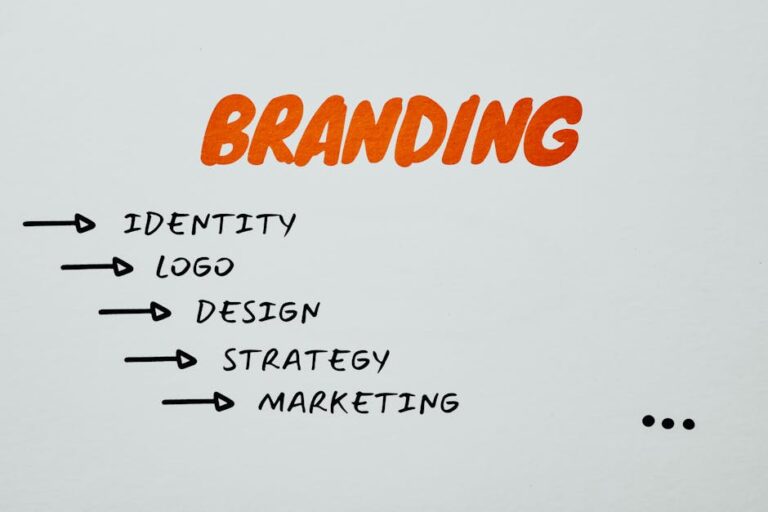
The Power of Logo Design: What Makes a Great Logo?
A logo is more than just a visual symbol—it’s the face of a brand. It is often the first thing customers notice and the one element they associate with a company over time. A well-designed logo has the power to create an instant connection, evoke emotions, and build brand recognition. Whether it’s Nike’s swoosh, Apple’s bitten apple, or McDonald’s golden arches, the most successful logos are simple yet powerful, making them easily identifiable across the world.
A logo serves as the foundation of a brand’s identity. It appears on everything from business cards and websites to product packaging and advertisements. Because of its widespread presence, a logo must be designed with purpose and clarity. A strong logo differentiates a company from its competitors and communicates its values without the need for words. A weak or overly complicated logo, on the other hand, can make a brand forgettable or difficult to trust.
Many businesses underestimate the importance of investing in a professionally designed logo, but a poorly designed logo can undermine an entire brand’s credibility. A great logo should be strategic, visually appealing, and aligned with a company’s overall branding efforts. It is not just about aesthetics—it’s about function, adaptability, and memorability. By understanding the core principles of effective logo design, businesses can ensure that their logos make a lasting impact.
Simplicity: Why Less is More in Logo Design
One of the most important characteristics of a great logo is simplicity. The most effective logos are often the most straightforward—clean, uncluttered, and easy to recognize at a glance. Simplicity ensures that a logo is versatile, making it work across different platforms, sizes, and applications without losing its impact.
Consider some of the world’s most iconic logos: Apple, Nike, and Google. Each of these logos is incredibly simple, yet instantly recognizable. Apple’s logo is nothing more than a bitten apple, Nike’s swoosh is a single curved line, and Google’s lettering is straightforward yet distinct with its playful color scheme. These logos stand out because they do not rely on unnecessary details or overly complex graphics to make an impression.
A simple logo is also easier for people to remember. Research shows that consumers only take a few seconds to form an impression of a brand, and an overly complicated logo can be difficult to recall. Logos that try to incorporate too many elements—such as excessive text, intricate patterns, or multiple symbols—can quickly become overwhelming. A simple, clean design ensures clarity and instant recognition, even when seen for just a brief moment.
Additionally, simplicity improves a logo’s adaptability. Logos need to work across various formats, from digital screens to physical products. A highly detailed logo may look great on a website but could lose clarity when printed on small items like business cards or embroidered on merchandise. A minimalist design ensures that the logo remains effective and visually appealing in any setting.
Memorability: Creating a Lasting Impression
A great logo doesn’t just look good—it leaves a lasting impression. Memorability is what allows a brand to stay in customers’ minds long after they’ve interacted with it. A memorable logo is unique, distinctive, and instantly recognizable, helping businesses build brand awareness and customer loyalty.
There are several ways to create a memorable logo. One of the most effective approaches is to use a strong, recognizable shape or symbol. Logos that feature simple yet striking imagery, such as Twitter’s bird or Mercedes-Benz’s three-pointed star, stand out because they are visually distinctive. People are more likely to remember a brand if its logo features a shape or icon that is easy to recall and associate with the company.
Color also plays a key role in memorability. Studies have shown that color increases brand recognition by up to 80%. Choosing a unique and appropriate color palette can make a logo more noticeable and emotionally impactful. For example, Coca-Cola’s red evokes excitement and energy, while Facebook’s blue conveys trust and reliability. Selecting the right color combination helps reinforce brand identity and enhances recognition.
Typography can also contribute to memorability. A well-chosen font or custom lettering can give a logo personality and make it more distinctive. Brands like Disney and Coca-Cola use custom typography that is instantly recognizable, making their logos unique even without additional imagery. The right typeface can help a brand establish a consistent visual identity that customers can easily associate with its products or services.
A memorable logo is one that remains effective over time. It should be designed with longevity in mind, avoiding trendy design elements that may become outdated quickly. Brands that refresh their logos too often risk losing recognition and weakening their brand identity. A well-designed, timeless logo helps a company establish itself in the market and build trust with its audience.
Investing in high-quality logo design is one of the smartest branding decisions a business can make. Companies that seek professional branding services ensure that their logo aligns with their overall brand identity, enhances recognition, and leaves a lasting impact. A logo is not just a mark—it is a symbol of a company’s reputation, values, and vision. When done right, it becomes a powerful asset that strengthens brand credibility and fosters customer loyalty.
Timelessness: Designing a Logo That Stands the Test of Time
A great logo should be designed to remain relevant for years, if not decades. While design trends evolve, a brand’s core identity should remain consistent, making timelessness a critical factor in logo design. Many businesses make the mistake of chasing current design trends, only to find that their logo quickly becomes outdated and requires frequent redesigns. Constantly changing a logo can confuse customers and weaken brand recognition.
Some of the most iconic logos in the world—such as Coca-Cola, Nike, and Mercedes-Benz—have remained largely unchanged for decades. Their logos are simple, strong, and free from fleeting design fads. The key to longevity is avoiding excessive detail, trendy fonts, or overly complex elements that may lose appeal over time.
A timeless logo is based on classic design principles rather than momentary trends. It should have a strong, recognizable form that remains effective regardless of technological or cultural changes. Simple typography, minimalistic graphics, and clear shapes contribute to a logo’s ability to stand the test of time.
That doesn’t mean a logo should never evolve. Even timeless brands occasionally refine their logos to modernize them while maintaining their core identity. For example, Apple has subtly adjusted its logo over the years, transitioning from a rainbow-striped apple to a sleek monochrome version. However, the basic shape and concept have remained the same, ensuring continuity and recognition.
When designing a logo, businesses should consider whether the design will still look relevant and effective in 10, 20, or even 50 years. A well-designed, timeless logo reduces the need for frequent rebranding and helps a company maintain a strong, consistent brand identity over the long term.
Versatility: Ensuring Your Logo Works Across All Mediums
A successful logo must be versatile enough to work across various platforms, mediums, and sizes. Whether displayed on a business card, a billboard, a mobile app, or product packaging, the logo should maintain its clarity and impact. A logo that looks great on a website but loses its effectiveness in print or small-scale applications fails to serve its purpose.
Scalability is one of the most important aspects of logo versatility. A logo should remain legible and recognizable whether it is enlarged on a storefront sign or reduced to a small icon on a social media profile. Logos with intricate details or overly thin lines may become difficult to distinguish at smaller sizes, making them less effective.
Color variations also contribute to versatility. A well-designed logo should work in full color, black and white, and monochrome formats. This ensures that the logo remains impactful in different branding scenarios, such as newspaper ads, invoices, or grayscale printing. Many companies design a primary full-color version of their logo alongside simplified variations that maintain brand identity in different applications.
Another factor in logo versatility is adaptability across digital and physical branding. A logo should look just as strong on a website or mobile app as it does on printed materials like brochures, clothing, or promotional items. A well-balanced logo design ensures that no matter where it appears, it reinforces brand recognition and maintains a professional appearance.
To test versatility, designers often create mockups of the logo in different formats and sizes. This allows businesses to see how the logo performs in real-world applications before finalizing the design. A highly versatile logo strengthens a brand’s presence across multiple touchpoints, ensuring consistency and recognition in all marketing efforts.
Relevance: Aligning Logo Design with Brand Identity
A logo should reflect a brand’s personality, values, and industry while remaining distinctive and relevant. It serves as a visual representation of what a company stands for, making it crucial that the design aligns with the brand’s identity.
Every industry has common design elements that customers associate with certain types of businesses. For example, a law firm may opt for a sophisticated and minimalistic logo with strong typography to convey professionalism and trust. A children’s brand, on the other hand, may use bright colors and playful shapes to create a fun and friendly appeal.
While industry relevance is important, businesses should avoid clichés that make their logo blend in rather than stand out. For instance, a tech company doesn’t have to use the standard “glowing blue digital font” to look modern, and a coffee shop doesn’t need a cup of coffee in its logo to be effective. Instead, the goal should be to incorporate elements that hint at the industry while maintaining uniqueness.
Color, typography, and imagery all contribute to a logo’s relevance. A brand that positions itself as luxurious may use an elegant serif font with gold or black tones, while a youthful and energetic brand may use bold, sans-serif lettering with bright hues. Every element should be intentionally chosen to reinforce the brand’s message and appeal to the right audience.
Relevance also means designing a logo that can grow with the brand. A business may start with a narrow focus but expand its services or product lines over time. A logo that is too specific to one offering may become limiting in the future. For example, a fitness brand that initially focuses on yoga might outgrow a logo featuring a yoga pose if it later expands into general wellness, nutrition, or high-intensity training.
When a logo is relevant to both the brand and its audience, it strengthens trust and recognition. Customers should be able to instantly associate the logo with the business and what it represents. A relevant and well-designed logo makes a brand more approachable, professional, and appealing to its target market.
Color Psychology: How Colors Influence Perception
Color plays a crucial role in logo design because it evokes emotions, communicates brand values, and influences consumer perception. The colors chosen for a logo can determine how a brand is perceived at first glance. Each color has a psychological impact, and brands use this to their advantage to reinforce their messaging and connect with their target audience.
For example, red is associated with passion, energy, and excitement, making it a popular choice for brands like Coca-Cola, Netflix, and YouTube. Blue conveys trust, professionalism, and reliability, which is why companies like Facebook, PayPal, and IBM use it prominently. Yellow evokes feelings of happiness, warmth, and optimism, seen in brands like McDonald’s and Snapchat. Green is often linked to health, sustainability, and nature, making it ideal for brands like Whole Foods and Starbucks.
Black and white can create a sense of sophistication, luxury, and timelessness. High-end brands like Chanel and Prada use black to convey exclusivity and elegance. Meanwhile, multicolor logos, such as Google’s, signify diversity, creativity, and inclusivity.
The key to using color effectively in logo design is to choose hues that align with a brand’s personality and industry. A financial institution using bright neon colors might seem untrustworthy, while a children’s brand using only dark, muted tones might not appear playful or inviting. A well-thought-out color palette enhances brand recognition and ensures that the logo resonates with the intended audience.
Typography: The Role of Fonts in Brand Perception
Typography is another essential element of logo design, as the choice of font significantly impacts how a brand is perceived. The right typography enhances brand personality, making it more memorable and distinct, while the wrong choice can make a logo feel unprofessional or misaligned with the brand’s message.
There are four primary categories of fonts used in logo design:
- Serif Fonts – These fonts have small lines (serifs) at the ends of letters and are often associated with tradition, professionalism, and reliability. Brands like Time Magazine and Tiffany & Co. use serif fonts to convey elegance and trust.
- Sans-Serif Fonts – Clean and modern, sans-serif fonts do not have decorative strokes, making them appear sleek and approachable. Brands like Google, Spotify, and Airbnb use sans-serif fonts to project simplicity and innovation.
- Script Fonts – Designed to mimic handwriting, script fonts can add a sense of sophistication, creativity, or friendliness, depending on their style. Coca-Cola and Instagram use script fonts to create a personal, inviting feel.
- Display Fonts – These fonts are highly stylized and unique, often used by brands looking to make a bold, artistic statement. Disney’s playful typography is a great example of how a custom font can become an integral part of a brand’s identity.
Typography should be chosen carefully to ensure readability and versatility. A logo should be legible at all sizes, from a billboard to a small app icon. Overly decorative fonts may lose clarity when scaled down, making them ineffective in digital formats. A well-selected font helps reinforce the brand message and creates a lasting impression on customers.
Avoiding Common Logo Design Mistakes
While designing a logo may seem straightforward, many brands make critical mistakes that weaken their brand identity. Being aware of these pitfalls can help businesses create a stronger, more effective logo.
One of the most common mistakes is overcomplicating the design. Logos with excessive details, intricate patterns, or multiple fonts can appear cluttered and lose impact when scaled down. Simplicity is key—logos should be clean, memorable, and easy to recognize at a glance.
Another mistake is poor font selection. A font that is too trendy may look outdated in just a few years, while an overly complex typeface can make the logo difficult to read. Typography should complement the brand’s personality and remain legible in various applications.
Color misuse is another major issue. Choosing colors that clash or fail to contrast properly can make a logo difficult to read. Additionally, failing to consider how the logo appears in black and white can lead to inconsistencies in branding materials. Testing different color variations ensures that the logo remains effective across all formats.
Ignoring scalability is another mistake brands make. A logo might look great on a website but lose clarity when printed on smaller items like business cards or promotional materials. Designing a logo that maintains its effectiveness in all sizes is essential for brand consistency.
Lastly, a weak connection to the brand’s identity can lead to confusion. A logo should reflect what the brand represents, ensuring that customers immediately associate it with the company’s values and mission. A mismatch between the logo and the brand’s personality can make it difficult to build trust and recognition.
Conclusion: The Lasting Impact of a Great Logo
A well-designed logo is one of the most valuable assets a brand can have. It is a visual representation of everything a business stands for, influencing how customers perceive and remember it. The best logos are simple, memorable, timeless, versatile, and relevant—ensuring that they remain effective across various platforms and industries.
Investing in thoughtful logo design strengthens a brand’s identity, builds trust with customers, and enhances brand recognition. A great logo should communicate a brand’s values at a glance, making it easier for consumers to connect with the company. Whether through strong typography, strategic color choices, or a minimalist design approach, a logo should reinforce a brand’s message and set it apart from competitors.
Businesses that prioritize logo design as part of their overall branding strategy position themselves for long-term success. A powerful logo is more than just an aesthetic choice—it’s a key component of a brand’s visual identity, influencing everything from marketing materials to product packaging.
By avoiding common design mistakes, choosing colors and typography wisely, and ensuring scalability and versatility, brands can create a logo that not only stands out today but continues to make an impact for years to come.