The Psychology Behind Great Business Graphic Design
Great design does more than look good—it makes people feel something. It inspires trust, sparks interest, and drives action. Behind every polished layout or carefully chosen color palette is a deeper layer: psychology. Understanding how people think, feel, and behave when they interact with visual content is the secret to creating design that actually works.
For business owners, this means graphic design shouldn’t just be seen as decoration. It’s a strategic tool that influences perception and decision-making. When your visuals are crafted with psychological principles in mind, they don’t just make your brand look more professional—they help customers connect with it on a deeper level.
In this post, we’ll explore how psychology powers the most effective business design choices—from first impressions to layout and beyond. Whether you’re redesigning a website, creating marketing materials, or updating your brand identity, understanding these principles can help your visuals do more than stand out—they can drive results.
First Impressions and Visual Processing
Humans are visual creatures. In fact, our brains process images 60,000 times faster than text. When someone encounters your brand for the first time—whether through a website, an Instagram post, or product packaging—their brain is already making judgments before they’ve even read a word. That first impression happens in milliseconds, and design is what shapes it.
The way your brand is presented visually communicates professionalism, trustworthiness, and relevance almost instantly. Clean lines, balanced layouts, and intentional color use signal that your business is organized and credible. On the flip side, cluttered visuals, hard-to-read fonts, or outdated styles can create uncertainty or make your brand feel less established—even if your product or service is excellent.
This is why investing in thoughtful, strategic design matters. You’re not just filling space—you’re shaping how people feel about your business from the moment they encounter it. When your design is tailored to match your brand’s values and audience expectations, it creates harmony between how you want to be seen and how people actually perceive you.
Design also helps reduce cognitive load. By making visual information easy to scan and understand, you allow users to process what they’re seeing quickly and comfortably. That ease creates a positive feeling—one that can translate into higher engagement and greater trust.
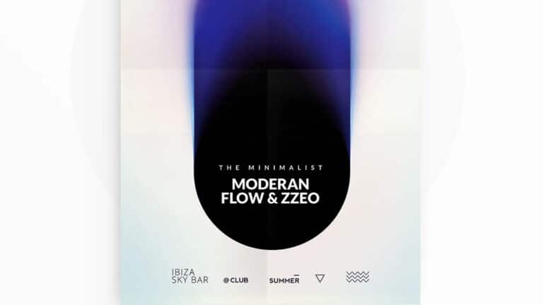
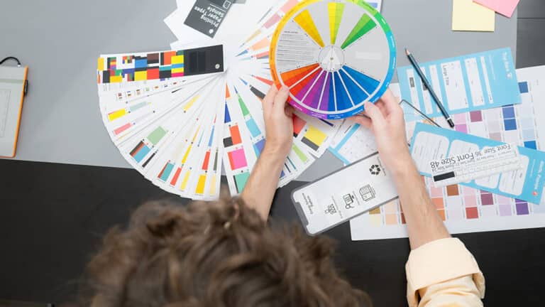
Color Psychology and Emotional Response
Color is one of the most powerful psychological tools in a designer’s toolkit. It evokes emotion, signals meaning, and plays a critical role in how people connect with your brand. Different colors carry different associations—some cultural, some instinctual—and choosing the right palette can help reinforce your message without saying a word.
For example, blue often conveys trust, calm, and reliability, which is why it’s commonly used in finance and tech. Red creates urgency and excitement, making it a popular choice for sales or calls to action. Green signals growth and health, while black suggests sophistication and luxury. These associations aren’t random—they’re rooted in how our brains interpret color as a form of communication.
But it’s not just about picking one color and calling it a day. Effective color use is about creating harmony, contrast, and balance. The right color palette supports your content and guides your viewer’s eye, drawing attention to what matters most. It also helps set the emotional tone of your brand—whether that’s bold and energetic, soft and nurturing, or sleek and modern.
For small businesses, using color with intention can be the difference between blending in and standing out. Whether you’re designing a logo, website, or ad campaign, working with professionals who understand how color impacts perception can ensure your visuals resonate on both a conscious and subconscious level. This is where graphic design services that prioritize strategy over trends can really make a difference—helping you build brand recognition and emotional connection at a glance.
Typography and Readability
Typography might seem like a basic design choice, but it carries significant psychological weight. The fonts you choose, and how you use them, shape how your message is received—sometimes even more than the words themselves. People form emotional impressions based on font style, size, spacing, and alignment. All of these decisions influence whether your brand feels formal or friendly, modern or traditional, trustworthy or trendy.
For example, serif fonts (those with small lines at the ends of characters) tend to feel more classic and professional, often used by law firms, publishers, and institutions. Sans-serif fonts, which are clean and minimal, give off a more modern and approachable vibe and are commonly used in tech, startups, and lifestyle brands. Script or handwritten fonts, when used intentionally, can convey warmth, creativity, or elegance.
Beyond aesthetics, readability is crucial. When typography is too small, overly stylized, or cluttered, it becomes hard to read—and users are quick to give up. The goal is to reduce visual friction and make your content as easy to process as possible. Simple hierarchies, clear headings, generous line spacing, and good contrast between text and background all contribute to a smoother user experience.
Effective typography doesn’t call attention to itself—it helps the content flow effortlessly. It subtly guides your audience through your messaging and supports the emotional tone of your brand. When done right, it’s invisible—but it leaves a lasting impression.
Layout and Visual Hierarchy
In design, how you organize information matters just as much as what you say. Visual hierarchy refers to the arrangement of elements in a way that guides the viewer’s eye through content in a logical, intuitive order. The psychological principle behind this is simple: people naturally look for structure. They want to know what to focus on first, what’s most important, and how to navigate the rest.
A well-designed layout uses size, spacing, alignment, color, and imagery to direct attention. Headlines should be clearly dominant, followed by subheadings, body text, and supporting visuals. Call-to-action buttons should stand out but still feel like a natural part of the design. White space (or negative space) also plays a huge role in giving elements room to breathe and preventing visual overload.
Without hierarchy, designs can feel chaotic and confusing. Viewers may not know where to look or what to do next—and that confusion often leads to inaction. But when hierarchy is thoughtfully built in, users feel more confident and engaged. They intuitively understand your message and are more likely to stick around, explore further, or take the desired next step.
This principle is especially important for websites, landing pages, and ads—anywhere you’re asking a viewer to process information quickly and make a decision. The right layout can make that decision easier by leading the eye and simplifying choices.
The Power of Familiarity and Consistency
One of the most underrated psychological drivers in design is the concept of “processing fluency”—the idea that people prefer visuals they can understand quickly and easily. In business branding, that often comes down to consistency. When your design elements—colors, fonts, logos, imagery, and tone—are used consistently across all platforms, your audience becomes familiar with your brand. That familiarity leads to trust.
This is why inconsistent visuals can be so damaging. If your Instagram posts don’t match your website, or your brochures look like they came from a different brand altogether, people may question your credibility. It creates cognitive friction. But when everything looks like it belongs together, it creates a seamless experience that puts people at ease.
Consistency isn’t about being boring—it’s about being intentional. It allows your brand to become instantly recognizable, even in a crowded market. And it makes every interaction—whether online or in person—feel like part of a larger, coherent story.
In the mind of your customer, consistency equals reliability. When your brand looks polished and familiar, it’s easier for them to trust you, remember you, and choose you over competitors.
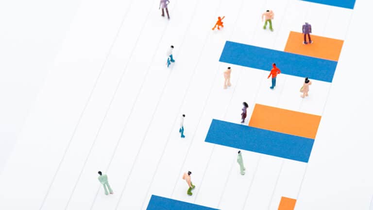
Visual Cues and Decision-Making
Visual design plays a critical role in guiding users toward action—and it’s not just about being eye-catching. Subtle design elements known as visual cues influence how people interpret information and what steps they take next. These cues include arrows, lines, icons, highlighted buttons, and even faces or eye direction in photos—all of which draw attention to key areas and nudge users toward a decision.
Humans are naturally wired to follow visual signals. A brightly colored button at the bottom of a pricing table, for example, attracts more clicks than a plain one—especially if it contrasts with the background and is labeled with clear, benefit-driven text. Similarly, using directional elements like arrows or pathways in your design subconsciously guides the viewer’s gaze and behavior.
Designers use these principles to create predictable flows, helping users move through information quickly and efficiently. This is especially important in sales pages, product pages, and email campaigns—where every second of attention counts. The design should tell the user what’s important, where to look next, and what action to take—without them even realizing they’re being guided.
Misusing visual cues, on the other hand, can lead to decision fatigue or confusion. If everything is bold and calling for attention, nothing truly stands out. Strategic restraint is key. The goal is not just to impress visually but to support better, faster decision-making through clear visual communication.
Storytelling Through Imagery
People are emotional decision-makers, and stories are the fastest way to create emotional connection. That’s why great business design doesn’t just inform—it tells a story. And often, that story is told visually. Whether through photography, illustration, or layout choices, design helps shape the narrative your brand is sharing with the world.
When you use imagery that evokes emotion, supports your message, and mirrors your audience’s values, you create a brand that people feel connected to. For example, a wellness brand might use calm, nature-inspired visuals to tell a story of self-care and balance. A tech startup might use futuristic, clean imagery to tell a story of innovation and forward thinking.
But storytelling through design isn’t limited to big splashy campaigns. It’s present in the way your social media posts are styled, how your website introduces your team, and how your product packaging communicates value. A well-composed image or carefully designed graphic can evoke trust, nostalgia, excitement, or confidence in a single glance.
The psychology behind this is simple: humans are hardwired to remember stories more than facts. So when your design supports a compelling brand narrative, it becomes more than just visually appealing—it becomes emotionally sticky.
The Role of Symmetry and Balance
There’s a reason certain designs just “feel right” the moment you see them. That intuitive reaction is often the result of visual balance—a concept deeply rooted in psychology. Symmetry and balance give a design structure, calm, and a sense of order that puts viewers at ease.
Symmetrical designs create feelings of stability and trust. This is why law firms, financial institutions, and health care brands often favor centered logos and evenly spaced layouts. Balanced designs feel reliable and professional—even if the viewer can’t explain why.
That said, asymmetrical design also has its place. When used intentionally, asymmetry can create energy and draw the eye in unexpected ways. The key is to maintain visual weight—a concept that ensures no part of the design overpowers another. Designers use spacing, contrast, and alignment to make sure all elements coexist in harmony, even when the layout is intentionally off-center.
When balance is ignored, designs can feel jarring or chaotic. Users might not know where to look or may subconsciously sense that something’s off. But when everything is well-aligned and balanced, it creates a sense of control and professionalism that builds confidence in your brand.
Conclusion: Designing with the Brain in Mind
The best graphic design is more than just beautiful—it’s intentional. Every font, color, image, and layout choice affects how your audience thinks, feels, and acts. That’s the power of psychology in design. It’s what transforms a simple visual into a meaningful experience—and what makes your brand memorable, trustworthy, and compelling.
Understanding the psychology behind design gives your business an edge. It allows you to create with purpose, knowing how people will interact with and respond to your content. Whether you’re launching a product, building a brand, or improving user experience, design grounded in psychological principles ensures you’re not just looking good—you’re connecting.
This mindset also makes it easier to avoid common design pitfalls. You stop guessing at what “looks right” and start making decisions based on how your audience thinks. You focus not only on aesthetics but on effectiveness—on building trust, guiding behavior, and creating emotional resonance.
In the end, great design isn’t about being flashy or trendy. It’s about being clear, consistent, and human. It’s about showing your audience that you understand what they want, how they feel, and what they need to see to believe in your business. When your design reflects that understanding, your brand doesn’t just stand out—it makes an impact.