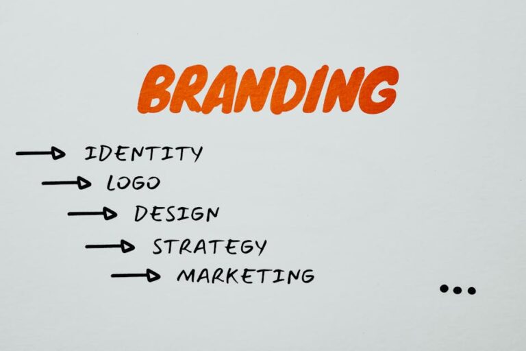
The Role of Typography in Branding: Fonts That Speak Your Brand’s Language
Typography is more than just a design choice—it is a fundamental part of a brand’s identity. The fonts a brand selects play a crucial role in shaping how it is perceived, influencing everything from trust and professionalism to creativity and approachability. While colors and logos often take center stage in branding discussions, typography silently reinforces a brand’s message across every customer interaction.
Think about the brands you instantly recognize, such as Coca-Cola, Google, or Vogue. Their typography choices are as much a part of their brand identity as their logos or color schemes. Coca-Cola’s flowing script conveys tradition and nostalgia, Google’s clean sans-serif fonts communicate simplicity and modernity, and Vogue’s elegant serif typography exudes sophistication and luxury. These choices are intentional, shaping consumer perception at a subconscious level.
The right typography strengthens a brand’s ability to connect with its audience, while inconsistent or poorly chosen fonts can create confusion. For businesses looking to establish a strong, memorable identity, typography should be given the same strategic consideration as logos and brand colors. Selecting the right fonts ensures that messaging is clear, appealing, and aligned with the brand’s overall personality.
The Connection Between Typography and Brand Identity
Typography is a direct reflection of a brand’s personality, values, and positioning in the market. Whether a brand wants to appear authoritative, fun, minimalistic, or luxurious, font choices help communicate that identity without the need for words. Just as a handwritten note conveys a different tone than a printed document, typography influences how people emotionally connect with a brand.
For instance, a law firm that uses bold, traditional serif fonts conveys authority and trust, reassuring clients that they are professional and dependable. In contrast, a trendy startup with a sleek sans-serif typeface may come across as modern, fresh, and tech-savvy. Typography is a nonverbal cue that subtly shapes how customers feel about a brand before they even engage with its messaging.
Consistency in typography is just as important as choosing the right fonts in the first place. A brand that constantly switches between different font styles across its website, marketing materials, and packaging can appear unorganized and untrustworthy. Consistent typography, on the other hand, creates a cohesive experience, reinforcing brand recognition across all platforms. This is why major brands develop strict typography guidelines to ensure uniformity in all communications.
Beyond just aesthetics, typography also impacts usability. Legible, well-structured fonts enhance readability, improving the customer experience. A poorly chosen font—one that is difficult to read or improperly spaced—can frustrate users, making them less likely to engage with a brand’s content. A well-crafted typography system balances beauty with function, ensuring that both form and readability contribute to an effective brand identity.
Understanding Font Categories and Their Meanings
Typography is divided into several categories, each with its own personality and psychological associations. Understanding these categories helps brands select fonts that align with their messaging and audience expectations.
- Serif Fonts – These fonts feature small decorative strokes (serifs) at the ends of letters. They are often associated with tradition, reliability, and sophistication. Well-known brands like The New York Times, Rolex, and Vogue use serif fonts to convey authority and timeless elegance.
- Sans-Serif Fonts – Sans-serif fonts are clean and modern, lacking the decorative strokes of serif fonts. They are often used by technology companies and startups because they feel sleek, contemporary, and minimalistic. Brands like Google, Airbnb, and Spotify use sans-serif fonts to communicate approachability and innovation.
- Script Fonts – These fonts mimic handwriting and add a personal, artistic, or elegant touch to branding. They can evoke nostalgia, creativity, or luxury, depending on the style. Brands like Coca-Cola and Cadillac use script fonts to create a sense of heritage and sophistication.
- Display Fonts – These fonts are highly stylized and unique, often used for logos or headings rather than body text. They are best for brands looking to make a bold statement or convey a strong personality. Disney and Fanta use custom display fonts that reflect their playful, imaginative identities.
- Monospace Fonts – Monospace fonts have equal spacing between characters, making them feel technical and structured. They are commonly used by coding-related brands, finance companies, or minimalist design-focused businesses. Courier and IBM’s typography are examples of monospace fonts used effectively.
Each font category conveys a different tone, influencing how consumers perceive a brand at first glance. Businesses must carefully consider which typefaces best reflect their values and industry while ensuring they remain readable and scalable across different mediums.
For brands looking to refine their visual identity, professional business branding services can provide expert guidance in selecting the right typography to align with their overall brand strategy. Fonts may seem like a small detail, but they play a powerful role in shaping customer perception, reinforcing brand credibility, and ensuring consistency across all brand touchpoints. A thoughtful typography system strengthens a brand’s language, making it instantly recognizable and leaving a lasting impression on its audience.
How to Choose the Right Font for Your Brand
Selecting the right font for a brand requires more than just picking a stylish typeface—it involves aligning typography with the brand’s personality, target audience, and overall messaging. The wrong font choice can send mixed signals and create a disconnect between a brand’s visual identity and the emotions it aims to evoke.
The first step in choosing a font is identifying the brand’s personality and values. A luxury brand may opt for an elegant serif font that conveys tradition and sophistication, while a tech startup might choose a sleek sans-serif font that represents modernity and innovation. Fonts should reflect the core attributes of the brand so that they reinforce the desired perception.
Another important factor is audience alignment. Understanding customer demographics, preferences, and expectations helps determine the best font style. For example, a children’s brand might use playful, rounded typography, while a law firm would likely benefit from a strong, authoritative serif font. Fonts should resonate with the target audience while maintaining readability and professionalism.
Legibility is key when choosing a font. A well-designed font should be easy to read across different mediums and screen sizes. Some fonts look appealing in logos but may be difficult to read in body text. It’s crucial to test fonts in various applications—on websites, printed materials, and mobile screens—to ensure they maintain clarity. Overly decorative or script fonts may work for headlines but should be avoided for body text where readability is essential.
Finally, businesses should consider versatility and scalability. A good brand font should work across all marketing channels, from business cards and websites to billboards and social media graphics. Brands with strong typography consistency create a unified look that strengthens recognition. When selecting a font, brands should ensure that it offers multiple weights and styles (such as bold, italic, and light) to provide flexibility in design while maintaining uniformity.
Typography and Emotional Branding
Typography has a direct impact on how people emotionally connect with a brand. Fonts evoke specific feelings, just like colors and imagery, shaping how customers perceive a business. By understanding the psychological effects of different font styles, brands can use typography as a tool to reinforce their messaging and create deeper connections with their audience.
For example, serif fonts—such as Times New Roman or Garamond—often convey a sense of trust, tradition, and reliability. That’s why financial institutions, newspapers, and luxury brands frequently use them to establish credibility. A brand that wants to appear stable and well-established can benefit from a classic serif font.
Sans-serif fonts, like Helvetica or Open Sans, feel modern, clean, and friendly. They are widely used by technology companies, startups, and direct-to-consumer brands that aim to appear approachable and contemporary. A sans-serif font gives the impression of simplicity, efficiency, and innovation, making it a popular choice for digital-first brands.
Script fonts, such as Pacifico or Brush Script, add a personal, handcrafted feel to branding. They often evoke emotions like creativity, elegance, and nostalgia. Brands that want to convey warmth and uniqueness, such as boutique businesses or artisanal products, often incorporate script fonts in their logos or packaging.
Display fonts—which are highly decorative and unique—can make a brand feel bold, exciting, or unconventional. These fonts are commonly used by entertainment brands, fashion labels, and food & beverage companies that want to stand out with a distinctive personality. However, display fonts should be used sparingly, as they can become overwhelming if overused.
By carefully selecting fonts that align with the brand’s emotional goals, businesses can create stronger associations between their identity and their audience. A well-chosen typeface not only improves aesthetics but also reinforces the feelings a brand wants to evoke every time a customer interacts with its content.
The Importance of Typography Hierarchy in Branding
Typography hierarchy is a crucial element of branding that ensures text is organized, readable, and visually appealing. It helps guide the viewer’s attention, making it easier for customers to digest information while reinforcing brand identity. Without a clear hierarchy, content can feel cluttered or confusing, leading to a poor user experience.
A strong typographic hierarchy typically includes:
- Primary Fonts (Headlines) – The most dominant font in a brand’s typography system. It is used for major headlines, product names, or campaign taglines. These fonts should be bold and attention-grabbing, setting the overall tone of the brand.
- Secondary Fonts (Subheadings & Body Text) – These fonts should complement the primary font while maintaining legibility. Subheadings help organize content, while body text should be highly readable for longer-form content such as blog posts, product descriptions, or customer emails.
- Accent Fonts (Call-to-Action or Highlights) – Some brands use a third font for specific design elements, such as call-to-action buttons, quotes, or captions. This font is typically used sparingly to create contrast and draw attention to key areas.
Font weight, size, and spacing also play a role in hierarchy. For example, bigger and bolder fonts create emphasis, while lighter fonts convey subtlety. Proper line spacing (leading) and letter spacing (kerning) improve readability, making content more inviting to read.
An effective typography system enhances visual communication while keeping branding consistent across all touchpoints. Whether it’s on a website, a product label, or a social media ad, maintaining a well-structured hierarchy ensures that messaging is clear and aesthetically appealing.
Brands that master typography hierarchy not only improve user experience but also strengthen brand credibility. Well-organized, visually appealing text makes a brand feel polished and professional, reinforcing customer trust and engagement.
Custom Typography: Creating a Unique Brand Font
Some of the most recognizable brands in the world use custom typography to create a one-of-a-kind identity. A custom font ensures that no other company has the exact same typographic style, making a brand’s visual identity truly unique. This is especially beneficial for brands looking to stand out in crowded markets or reinforce a strong personality.
For example, brands like Coca-Cola, Google, and Netflix have custom typefaces that are exclusive to their brand. Coca-Cola’s script font is instantly associated with its legacy and nostalgia, while Google developed its own custom sans-serif font, Google Sans, to align with its modern and user-friendly aesthetic. Netflix also created Netflix Sans, optimizing its typeface for digital screens while maintaining brand consistency across platforms.
Custom typography has several advantages:
- Exclusivity and Brand Recognition – A unique typeface prevents competitors from using the same fonts, reinforcing brand distinctiveness.
- Flexibility and Functionality – Custom fonts can be designed for both digital and print applications, ensuring readability across all brand touchpoints.
- Alignment with Brand Identity – A tailored font allows brands to capture their exact tone, whether it’s sleek and futuristic or warm and inviting.
However, investing in a custom typeface also comes with challenges. Developing a font requires time, expertise, and a budget to hire professional type designers. Additionally, brands must ensure their custom font is scalable and legible across different devices, from mobile apps to billboards.
While not every brand needs a custom font, those looking for highly distinctive branding can benefit from investing in a bespoke typeface. Even businesses that use pre-existing fonts can modify letterforms or create variations to establish a more recognizable and ownable typography style.
Typography Consistency Across Platforms
Brand typography must be consistent across all platforms to reinforce a strong, cohesive identity. Whether customers are interacting with a brand through a website, social media, packaging, or email marketing, the font choices should remain uniform to strengthen recognition.
Digital Consistency: Websites, apps, and online ads must use the same fonts across different screen sizes. Digital typography should be optimized for readability, ensuring that fonts remain clear on both desktop and mobile devices. Some brands use variable fonts, which allow for automatic adjustments in weight and size depending on the display, improving legibility and user experience.
Print Consistency: Physical branding elements, such as brochures, business cards, product packaging, and signage, should match digital typography. Using different fonts for print and digital materials can create visual dissonance, making the brand appear inconsistent.
Social Media Consistency: Since brands communicate frequently on social media, typography should align with the brand’s identity across all platforms. Some brands create branded templates for Instagram posts, YouTube thumbnails, and LinkedIn banners to maintain a uniform aesthetic.
Email and Advertising Consistency: Email campaigns and digital ads should reflect the same font choices as the website and social media. Even if technical limitations require font substitutions, businesses should choose alternatives that resemble their core typography to maintain brand cohesion.
By ensuring typography consistency, brands build trust and professionalism, making it easier for customers to recognize them across different mediums. When done right, typography becomes an integral part of a brand’s visual DNA, reinforcing brand awareness with every interaction.
Common Typography Mistakes to Avoid
While typography can enhance branding, poor font choices can have the opposite effect, making a brand look unprofessional, inconsistent, or difficult to read. Avoiding common typography mistakes ensures that branding remains strong and effective.
1. Using Too Many Fonts – A brand should have a structured typography system with no more than 2-3 fonts (primary, secondary, and possibly an accent font). Too many fonts create visual clutter and inconsistency, making a brand’s messaging look uncoordinated.
2. Ignoring Readability – Fonts should be chosen not just for aesthetics but also for legibility. Overly decorative or script fonts may look elegant in a logo but can be difficult to read in longer text blocks. The key is balancing personality with clarity.
3. Failing to Maintain Brand Consistency – Brands that frequently change their fonts or use different typefaces across materials weaken brand recognition. A strong brand sticks to its typography guidelines to ensure a cohesive experience across all channels.
4. Choosing Inappropriate Font Styles – A font should match the brand’s industry and tone. A playful, bubbly font might work for a children’s brand but would be inappropriate for a law firm. Fonts should reinforce a brand’s credibility rather than undermine it.
5. Poor Typography Hierarchy – Without proper structure, typography can confuse rather than guide the reader. Headings, subheadings, and body text should be clearly differentiated using size, weight, and spacing to create a natural reading flow.
By avoiding these common mistakes, brands can ensure their typography remains professional, legible, and aligned with their identity.
Conclusion: Strengthening Brand Identity Through Typography
Typography is more than just letters on a page—it is a powerful tool that shapes how people perceive and interact with a brand. The right font choices enhance brand recognition, emotional connection, and credibility, making typography one of the most essential elements of a brand’s identity.
A well-chosen typeface reflects a brand’s personality and values, whether it’s authoritative, friendly, elegant, or bold. When combined with consistent usage across platforms, typography helps reinforce a brand’s visual presence, making it instantly recognizable.
For businesses looking to establish a strong and unique identity, typography should be approached with the same level of strategic thinking as logo design, color selection, and messaging. Whether through a carefully selected font family or a custom-designed typeface, typography has the potential to create a lasting brand impression.
As brands evolve, typography should be periodically reviewed to ensure it remains relevant and effective. Small refinements—such as adjusting line spacing, updating font weights, or refreshing type choices—can help maintain modernity while preserving brand identity.
Ultimately, typography is a silent ambassador for a brand. When executed well, it strengthens branding, fosters customer trust, and creates a seamless visual experience that resonates with audiences across all touchpoints.