The Web Design Checklist: Focus on Imagery
Note: This is part 4 in our “Web Design Checklist” series.
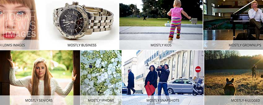
Before we begin, I would like to thank Josiah Lewis Photography for providing the banner image in this post. Josiah’s images definitely bring value to our websites and our clients’ websites.
Fact: You have about two-tenths of a second to make a first impression with your web design. With web design, you don’t have a wealth of chances—that first impression could very well be your last. Two-tenths of a second is very little time. With this in mind, you cannot afford to have a forgettable design; when someone hits your site, it must “pop” out at them.
So, how do you make your website pop out? You must use imagery.
Almost every website uses images to some extent. But how many of them use them effectively? The most visually appealing websites uses imagery to dominate the attention of their web visitors. Powerful use of striking images is the best way to grab the web visitor by the collar, direct the attention of their eyes, and get them hooked to the design. That’s a great first impression, don’t you think?
Try powerful, vivid imagery
No, the regular run-of-the-mill, vanilla images won’t cut it. If the image seems absolutely boring, with little to no color, and seems totally forgettable, discard the thought of using it in your web design.
That’s not to say that the imagery should distract the user from the rest of your site, to the point that he forgets about your content and other elements on your site. It shouldn’t be too complex (more on that later).
We use powerful imagery because it initially draws the attention of the user, and will make your design more interesting. It should add color. It needs to make your design seem unique—which is good for differentiation and branding purposes.
The imagery is its own form of communication, separate from the words on the page. “A picture is worth a 1000 words” is how the old adage goes, and that applies to web design.
The vanilla stock photos that you’ve seen on a million other websites don’t really fit the bill. That’s not to say that you shouldn’t use stock photos, but if picture doesn’t really add to the design, then don’t use it.
The images should complement the other elements on the site
An image—especially a large, vivid one—should be able to complement the other elements of the design. If the image doesn’t seem to fit the color scheme, the navigation, layout, and overall look of the site, then use another image.
If the shoe doesn’t fit, don’t force it in.
Figure out the type of imagery
Full screen images: This type of images is currently in vogue. There has been an influx of this type of design due to the massive increase in technology and capabilities. Responsive design frameworks have made this of design more feasible. And it also helps that, if done correctly, these full screen images can be extremely beautiful.
Full screen images will fill the browser, not the entire screen. They are usually the focal point of the website. This can be good or bad, depending on how you want your website to be experienced. If you want the content and copy of your site to be the focal point then you should probably use a different type of imagery. To get inspiration for full screen images, go here.
Smaller imagery: Full screen images may not work for every site. Instead of having full screen images as the background or main focal point, you can use smaller photos to complement the design of your site. Make sure that any image that you use will fit in proportion to the other elements of the design: like the layout, the content, the logo and banner areas, etc.
Focus on simplicity, not complexity
Don’t mistake the use of vivid imagery to mean that you must have complex images that distracts users from the other elements of your site. Often enough, it’s better to use one simple image rather than using multiple photos. When you have too much going on, it will make your design look cluttered and unprofessional.
If you’re using images, ask yourself if it’s simple enough. Complex imagery will often work against you.
The imagery should go hand-in-hand with other elements of the checklist: the navigation, colors and typography. Are you using imagery effectively?