Why Minimalist Design Works: Less Clutter, More Conversions
In today’s digital landscape, consumers are constantly overwhelmed with visual stimuli—pop-ups, notifications, scrolling banners, competing calls to action. The average person encounters thousands of marketing messages each day, so it’s no surprise that attention spans are shrinking. Amid all the noise, one approach continues to stand out for its clarity and effectiveness: minimalist design.
Minimalism in design isn’t about making things boring or plain. It’s about creating a visual environment where every element serves a purpose. By stripping away the nonessential and emphasizing what really matters, minimalist design helps users focus, take action, and connect more deeply with your brand. It’s a design philosophy rooted in clarity, not compromise.
This style has become especially popular in website and app design, where user experience and performance directly impact business outcomes. When visitors land on a clean, easy-to-navigate page, they’re more likely to stay, engage, and convert. That’s why brands across every industry—from tech startups to high-end retailers—are embracing minimalist design as a strategic advantage.
Whether you’re launching a new product, refreshing your brand, or optimizing your website for conversions, working with a team that specializes in custom graphic design services can help you apply minimalist principles in a way that’s clean, functional, and aligned with your unique goals.
What Defines Minimalist Design?
At its core, minimalist design is about doing more with less. It’s a discipline that focuses on essentials—eliminating distractions and highlighting the elements that drive the most value for your users. But while the final result might look effortless, minimalism actually requires a thoughtful, intentional approach.
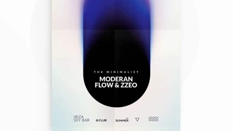
The hallmarks of minimalist design include clean layouts, ample white space, limited color palettes, and simple, legible typography. Rather than packing a page with features, visuals, and text, minimalist designers prioritize hierarchy—making sure the most important information stands out clearly. This often means using large, bold headlines, concise copy, and a visual structure that guides the user’s eye naturally from top to bottom.
Color is used sparingly and strategically. A mostly neutral palette might be accented with one bold, branded color to draw attention to a call to action or product feature. Images are high quality but not overused. Buttons are large, clear, and purposeful.
Crucially, minimalism also considers functionality. It reduces cognitive load, making it easier for users to process information and make decisions. There’s no guessing where to click, no confusion about where they are on the site. Instead, the interface feels intuitive and seamless—building trust and encouraging interaction.
Minimalist design isn’t just a look; it’s a framework that prioritizes clarity, performance, and user-centric thinking.
Faster Load Times, Better User Experience
One of the most practical benefits of minimalist design is speed. With fewer graphics, animations, and scripts to load, minimalist websites tend to perform better—especially on mobile devices and slower internet connections. And that matters more than ever, since load time is directly tied to user behavior and bounce rates.
Studies show that users will abandon a page if it takes more than a few seconds to load. Every additional second of delay can mean lost conversions. Minimalist design reduces unnecessary elements that can slow down a site—resulting in faster performance, better SEO rankings, and a smoother user experience overall.
This leaner structure also makes it easier to design responsively. When a layout is simple and focused, it’s more adaptable across screen sizes and devices. This ensures that your message, calls to action, and visual identity remain effective whether viewed on a phone, tablet, or desktop.
By embracing minimalist design, you’re not just making your site look cleaner—you’re removing the barriers that prevent users from taking action. And in doing so, you’re improving engagement, building trust, and increasing the likelihood of conversion.
White Space as a Strategic Design Tool
One of the most misunderstood elements in minimalist design is white space, also known as negative space. At first glance, white space might seem like “empty” space—but in reality, it’s one of the most powerful tools a designer can use. White space gives your content room to breathe, highlights important elements, and guides the user’s eye through your layout.
Think of white space as a visual pause. It allows users to absorb information without feeling overwhelmed. When too many elements are crammed into a single screen or page, people tend to shut down or scroll past. But when content is well-spaced and cleanly organized, it becomes easier to engage with. This is especially important for CTAs, headlines, product images, and forms—elements that drive conversions and require focus.
White space also contributes to an elevated, premium feel. That’s why luxury brands, tech startups, and high-end service providers often lean into minimalist aesthetics. When design is spacious and uncluttered, it communicates confidence. It tells the viewer, “We don’t need to say everything all at once—we know what matters.”
Using white space effectively means making intentional decisions about alignment, margins, padding, and layout flow. When done right, it enhances every aspect of your design and creates a smoother, more focused user experience.
Focused Messaging Increases Conversion Rates
Minimalist design isn’t just about visual style—it’s about communication. When you strip away distractions, you’re left with a clearer message. And that’s exactly what your audience needs in order to make a decision. Whether your goal is to sell a product, capture an email address, or get someone to click a link, the way your message is presented directly impacts how likely it is to convert.
Cluttered design tends to bury the message beneath competing visuals, excessive copy, or unclear navigation. Users get confused about where to go, what to read, or what to do next. This hesitation kills momentum and increases drop-off rates.
Minimalist design removes that friction. It reduces the number of choices a user has to make, allowing them to focus on what truly matters. When you pair a concise headline with a single, clear CTA and a distraction-free layout, your message becomes easier to absorb—and your audience becomes more likely to act.
In fact, some of the highest-converting landing pages online are extremely minimal. They feature one or two sentences, a powerful image, and a big, obvious button. Why? Because there’s no question about what’s being offered or what the user should do next.
This level of clarity can be achieved across platforms, from websites and email campaigns to digital ads and mobile apps. The key is to resist the temptation to over-explain or over-design. Instead, lead with what matters most—and let your design support the message with confidence and simplicity.
Minimalism Enhances Brand Perception
How your brand looks directly affects how it’s perceived. A cluttered, outdated, or inconsistent design can make your business seem unprofessional, unfocused, or out of touch. On the other hand, minimalist design communicates refinement, purpose, and attention to detail—all qualities that build trust and credibility.
When people see a clean, cohesive visual identity, they’re more likely to view your brand as modern and reliable. This applies not only to your website, but also to social media graphics, packaging, presentations, and even business cards. Consistency across all touchpoints reinforces your brand’s values and helps you stand out in a competitive market.
Minimalism also makes your branding more memorable. Instead of trying to say everything at once, minimalist design highlights the most important visual and verbal elements—your logo, color scheme, typography, and tone. This allows users to form faster associations with your brand, which strengthens recall over time.
Ultimately, minimalism sends the message that your brand knows who it is, what it offers, and how to deliver it without noise. That level of clarity builds trust—and trust is what turns visitors into customers and customers into loyal advocates.
Easier Navigation Keeps Users Engaged Longer
One of the greatest challenges in web and app design is keeping users engaged long enough to explore, understand, and convert. When someone lands on your site, their brain is instantly scanning for clarity: What is this? Where do I go next? How do I get there? Minimalist design simplifies navigation, reducing decision fatigue and making it easier for users to move from one step to the next.
When there are too many options—too many buttons, dropdowns, tabs, or sidebar distractions—users can feel overwhelmed and unsure of where to click. This leads to hesitation, frustration, or abandonment. By contrast, minimalist navigation eliminates clutter and focuses on a few high-priority actions. A clear, well-spaced menu, an obvious CTA, and intuitive page structure give users the guidance they need without overloading them with choices.
Minimalist layouts are often structured in a grid or modular format, which makes content easy to scan and digest. This organization creates a rhythm in the user experience, encouraging visitors to continue engaging with your content in a logical, stress-free way.
Fewer distractions also means fewer opportunities to lose the user’s attention. When navigation is clear and seamless, users are more likely to stick around, explore multiple pages, and complete conversion-focused actions. Less visual noise equals more time spent focused on your content—and that can translate directly into higher engagement rates and better business outcomes.
Mobile Optimization Made Easier
Minimalist design and mobile-friendliness go hand in hand. With the majority of web traffic now coming from mobile devices, it’s more important than ever to ensure that your content displays beautifully and functions smoothly on smaller screens. Cluttered designs that might be manageable on desktop can become a nightmare on mobile, where space is limited and load times are critical.
A minimalist approach naturally supports responsive design. With fewer elements to reposition or resize, minimalist pages adapt more fluidly to different screen sizes. This simplicity allows you to prioritize the most important content and actions, ensuring that users can quickly understand what your site offers and how to interact with it—whether they’re on a phone, tablet, or laptop.
Minimalist design also plays a role in usability. Larger tap targets, simplified navigation, and focused layouts improve touch interaction and scrolling behavior. Users don’t have to zoom, hunt for buttons, or deal with complex interfaces. Instead, they’re met with an interface that’s intuitive, accessible, and pleasant to use on the go.
Another major benefit? Faster performance. On mobile networks, speed is everything. Minimalist websites load faster because they use fewer graphics, fewer scripts, and less bandwidth overall. This improves the user experience, reduces bounce rates, and can even boost SEO rankings, especially since Google uses mobile performance as a ranking factor.
Design Scalability and Long-Term Flexibility
One of the less obvious—but incredibly valuable—benefits of minimalist design is how easily it scales. As your business grows and evolves, your design needs will likely change. You might add new product pages, launch email campaigns, update branding elements, or introduce new functionality to your site. A minimalist foundation gives you the flexibility to build on without needing to constantly redesign everything from scratch.
Because minimalist design is built on clarity and consistency, it’s easier to maintain and expand. Adding new content doesn’t disrupt the balance of your layout. Updating CTAs or swapping imagery doesn’t throw off the visual hierarchy. The simplicity of the system allows for rapid iteration and keeps your design cohesive, even as your offerings evolve.
This makes minimalist design a smart investment. Rather than reworking a cluttered, bloated design every time you launch something new, a minimalist approach allows for modular, efficient updates. It supports future-proofing your website or brand materials and reduces the time and cost associated with major overhauls.
It also means your brand can stay relevant longer. Design trends come and go, but simplicity and clarity never go out of style. A minimalist foundation ensures that your visual identity remains timeless while giving you the freedom to refresh individual elements when needed.
Conclusion: Minimalist Design Is a Business Decision, Not Just an Aesthetic
Minimalism isn’t about doing less for the sake of being trendy—it’s about doing less better. It’s a design philosophy that puts the user first, emphasizes clarity over clutter, and drives action by removing unnecessary distractions. In a world where attention is currency, minimalist design allows your message, offer, or product to shine without competition.
It’s not just about looking clean. It’s about creating a streamlined, engaging experience that makes it easier for users to make decisions and take action. From faster load times and easier navigation to increased conversions and elevated brand perception, the benefits of minimalist design extend far beyond the visual. It’s a powerful strategy for improving user experience and achieving measurable business results.
For businesses that want to stand out, communicate clearly, and grow efficiently, embracing minimalist design is more than an aesthetic choice—it’s a smart, scalable, and conversion-driven approach to visual communication.
By cutting through the noise and focusing on what matters most, minimalist design doesn’t just work—it works better.