The Importance of Wireframes When Designing a Website

And designing a website isn’t too different.
It’s never a good idea to simply design a website from what’s floating in your head. The result can be sloppy, rough and fraught with errors. It’s a fool errand to believe that you can produce a stellar website just from the fresh-out-the-womb, untested ideas that come from your head. Just like building a house, you need a blueprint—a clear visual representation of what you’re trying to create. The importance of wireframes could not be stressed enough because they allow you to define your website strategy upfront.
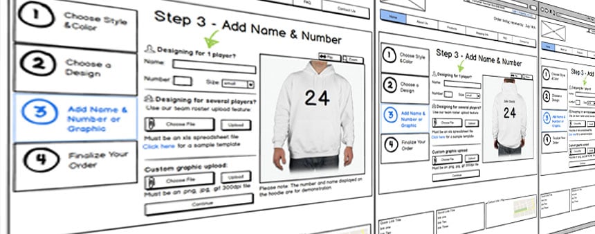
Wireframes will provide that clarity. Wireframes are basic visual mockups of the site’s design. They give a rough outline of the layout of the site. It shows the placement of the site’s buttons, menus, header, footer, sidebar and content areas. A wireframe is purely prototypical; it is (usually) devoid of any color or any detailed graphics or designs. It presents the most basic and necessary elements from the design. It’ll show the appearance in a digestible, elementary format.
When starting a web design project there are few things as practical and valuable as a wireframe.
Five Reasons You Should Use Wireframes
The use of the wireframe is one of the most important steps in the preliminary process of designing your site. Let’s look at some reasons why.
- It gives you something to work with. The use of a wireframe can inspire a designer and it can guide a coder/developer. Using a wireframe is a great way for a project to start off in an organized manner.
- It can be a huge time saver. You won’t spend too much time bogged down in the unnecessary details. Details like colors, graphics, and images are extraneous when creating superfluous when creating a wireframe.
- It shows the functionality of each page. This is very important. Every header, sidebar, footer, content area, and menu should be clear and easily navigable. If your wireframe is cluttered and hard to understand, you can’t expect your final product to be much better.
- It allows you to make adjustments. The whole concept of the mockup is to be able to see what works and what doesn’t. Revisions are part of the game, and wireframes will allow you to make them quickly and painlessly.
- You’ll have something to show for. When you’re obligated to present a web design project, it’s important to have something to show for. Wireframes allow you to present a preliminary visual representation of the site. This is especially valuable if you’re showing the wireframe to a client.
Best Tools for Wireframing

There are various ways to go about generating a wireframe. There are different tools and methods that you can use.
Balsamiq, Mockflow, and Gliffy are all awesome tools that allow you to create wireframes in virtually no time. They’re all known for their simple interfaces general ease of use.
Photoshop and Illustrator can also do the job well, but if you’re not familiar with the software, there is a learning curve.
Hand-sketching a wireframe can work great as well, especially if you don’t have the resources to use the software listed above.
The Best Practices for Wireframing
How detailed should the wireframe be?

What tool should I use to make the wireframe?
The answer to this question depends on what you’re comfortable with. Using Photoshop and Illustrator is more of a hands-on process. You will have to be knowledgeable about how to use the tools, but they can give a very polished look to your wireframes. Software like Balsamiq, on the other hand, is perfect if you are not comfortable with creating mockups with Photoshop.
Should I use color or grayscale?
While adding color to mockups can be beneficial at times, it’s better to use grayscale for your wireframes. If a wireframe is being set up, that means that you’re still in the beginning stages of the project, and it is unnecessary to get bogged down by details like specific colors at that point. Save the colors and the detailed graphics for later when you are set on the design and the layout.
What’s next after I create the wireframe?
See what works and what doesn’t. At this point, you have to see what’s viable. The goal at this stage is to make revisions and corrections so that you can move forward with the project. A successful wireframe is one that clearly illustrates the layout and shows the functionality and relationship between different elements. Once this has been accomplished, progress to the next stage of your project.
Are you ready to discuss your next website project with the leader in website design? If so, contact Zen Agency today! We are experts in website design.


