The Art of Theming WooCommerce: A Deep Dive Into Web Design Styles and How WooCommerce Takes It to the Next Level
When the words “web design” and “WooCommerce” appear in the same sentence, you know you’re in for a treat. Let’s unpack this Pandora’s box of digital creativity and innovation. Ready? Let’s go!
Intro to Web Design
Think of web design as the digital architecture of your online presence. It’s not just about pretty visuals; it’s about user experience, navigation, functionality, and much more. Want to master the art of web design? Partnering with experienced professionals like those at Zen Agency can give you the edge you need to stand out.
Why Is Web Design Important?
- First Impressions: You have seconds to make an impression. A well-designed website ensures you make a positive one.
- Credibility: Poor design = poor credibility. It’s as simple as that.
- Conversion: Good design isn’t just eye candy; it actually helps convert visitors into customers.
The Many Faces of Web Design
In the ever-evolving world of web design, understanding the multitude of styles available can help you make informed decisions. Whether you’re an aspiring designer or a business owner looking for the perfect online aesthetic, the design style you choose will significantly impact the user experience. Below are some of the most common web design styles.
1. Flat Design
What Is It?
Flat design takes minimalism to the next level. This design style avoids gradients, drop shadows, and textures, focusing instead on flat, monochromatic surfaces. Flat design uses bold, bright colors and simple typography to make up for the lack of visual depth.
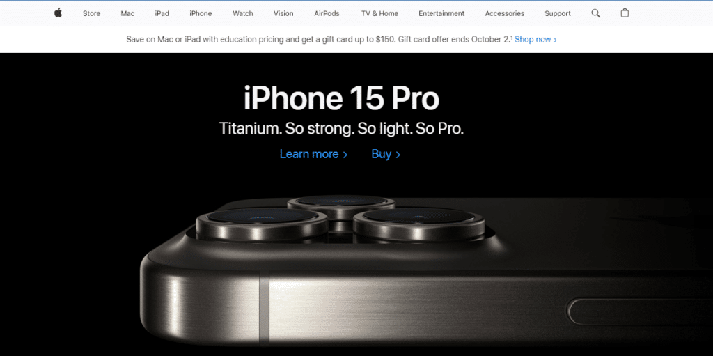
Real-World Example: Apple
Apple’s website is a classic example of flat design. It uses a lot of white space, clean lines, and simple typography to convey a sense of simplicity and elegance.
Why It Works
- Fast Loading: Fewer elements and textures mean quicker load times, which is crucial for SEO and user experience.
- High Readability: The focus on clean lines and space improves text readability and content consumption.
- Mobile-Friendly: Flat elements scale easily, making the design highly responsive and mobile-friendly.
2. Material Design
What Is It?
Developed by Google, Material Design is an evolution of flat design that incorporates depth and shadows. This design philosophy aims to create a unified experience across platforms and devices.
Real-World Example: Google Drive
The Google Drive interface uses shadows and layering to indicate which elements are interactive and how they should behave when touched or clicked.
Why It Works
- Intuitiveness: Shadows and layers mimic real-world objects, offering visual clues to the user about how elements interact.
- Consistency: Material design offers a consistent user experience across multiple platforms and devices.
- Rich Interactions: Animated transitions and effects make the user interface more engaging.
3. Illustrated Design
What Is It?
This design style incorporates hand-drawn elements and illustrations, providing a unique and often whimsical aesthetic. These elements can range from small, playful icons to large, intricate background illustrations.
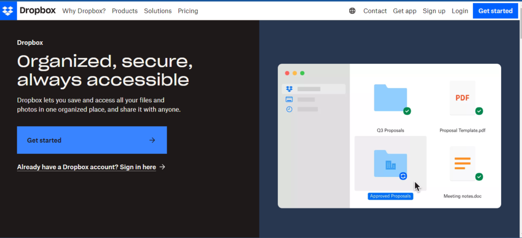
Real-World Example: Dropbox
Dropbox uses simple but engaging illustrations to guide users through its services, making complex technologies feel approachable.
Why It Works
- Human Touch: Illustrations add a personal, relatable touch to digital interfaces.
- Storytelling: Custom illustrations can be tailored to fit a brand’s story, making the site more memorable.
- Stand Out: In a digital world full of templated designs, an illustrated website stands out from the crowd.
4. Grid-Based Design
What Is It?
Grid-based design organizes elements on the page within a set grid, aiding in the logical flow of information. This design style is often seen in online magazines, blogs, and corporate websites.
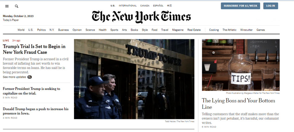
Real-World Example: The New York Times
The New York Times website uses a grid-based layout to organize a large amount of content in a readable and accessible manner.
Why It Works
- Structure: The grid provides a clean layout, making the site easier to navigate.
- Content-Focused: It helps the audience focus on the content, whether it be images, text, or other media.
- Responsive: Grid layouts can adapt to different screen sizes, offering a good mobile experience.
Each design style comes with its own set of advantages and challenges. The key is to understand your target audience and content needs, then choose a style that aligns well with them. Whether you are interested in theming WooCommerce or designing a portfolio site, the design style you choose will play a critical role in how users perceive and interact with your website.
Web Design and WooCommerce: A Perfect Blend
Ah, now we’ve come to the crux of the matter: theming WooCommerce. If you are looking for a WooCommerce free theme, your options are far from limited. WooCommerce is like the Swiss army knife of e-commerce design, offering extensive customization capabilities.
The Advantages of Wooing with WooCommerce Themes:
- Customization: From colors and fonts to the layout, everything is under your control.
- Scalability: Start small and dream big; WooCommerce grows with you.
- Functionality: Be it payment gateways or inventory management, WooCommerce has got you covered.
Now let’s look at how you can use a theme WooCommerce free to your advantage:
Meet Astra: The Jet-Setting Theme for Go-Getters
What Is Astra?: Astra is a WooCommerce free theme that is lightweight and customizable.
Why You’ll Love It: Astra offers deep integration with WooCommerce, letting you design your store without touching a line of code.
Example: Storefront
What is Storefront?: Think of Storefront as the dress rehearsal to your opening night. It’s the default WooCommerce theme and is as easy as pie to set up.
Why It Strikes a Chord: Developed by WooCommerce, it ensures a pitch-perfect user experience right from the start. You’ll get a finely-tuned platform without fiddling with coding or additional plugins.
Real Examples of Web Design in WooCommerce
Let’s peek into the real world and see how businesses are leveraging theming WooCommerce:
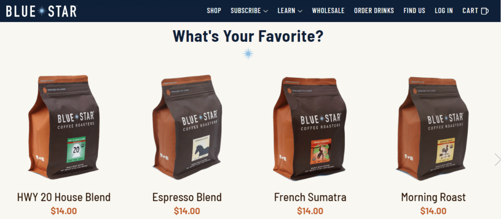
1. Blue Star Coffee
Design Style: Minimalist
How It’s Done: This WooCommerce store uses a clean, simple layout to put the focus on its high-quality coffee products.
2. Over Clothing
Design Style: Illustrated Design
How It’s Done: This website incorporates hand-drawn elements to resonate with its target youth market.
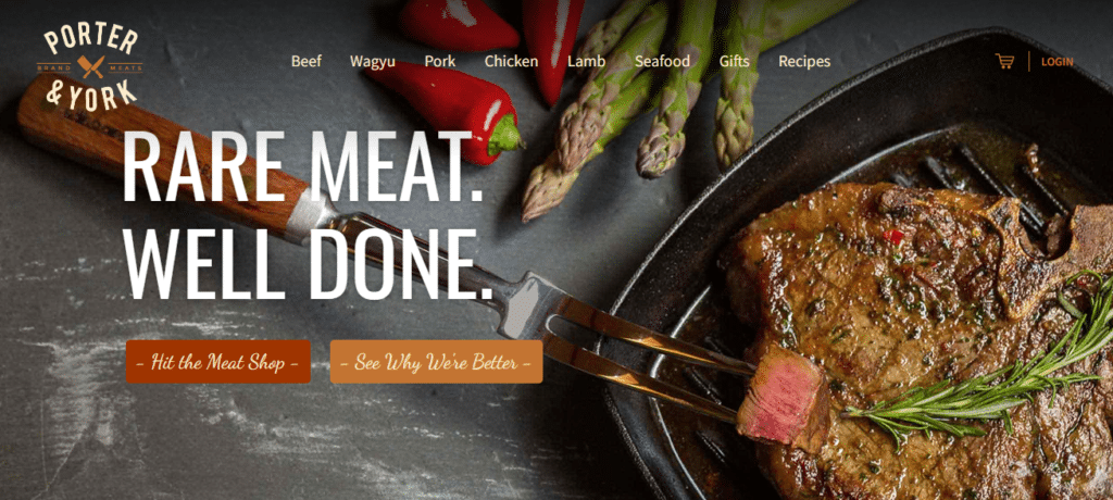
2. Porter and York
Design Style: Material Design
How It’s Done: Featuring dynamic shadows and layered interfaces, Porter and York create an intuitive shopping experience.
Conclusion
In the complex but rewarding journey of web design, WooCommerce serves as your steadfast companion. Whether you opt for a WooCommerce free theme or decide to go premium, remember that design isn’t just what it looks like; it’s how it works.If you’ve read this far and want to take your web design to the next level, request a quote from Zen Agency for professional guidance. And there you have it: the captivating world of web design, unraveled, and tied up neatly with a bow of WooCommerce goodness.


