5 Principles to Remember when Designing a Responsive Ecommerce Site
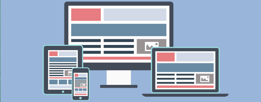 Having great web design has never been more important than now. If you want to make a good impression, solidify your brand, and better communicate your message, then using modern, responsive web design is the way to go. And though there are pros and cons to using a responsive site design, it’d be foolish to ignore the trend—and with the advent of mobile devices, you can’t afford to NOT adapt. Not adapting to the current design culture is as hopeless as swimming against a riptide.
This post isn’t about WHY you should have a responsive web design, but more on how to make your site more user-friendly so that can get you more sales and happier customers.
Never underestimate the importance of making a good impression. Know this: when someone first comes to your site, they will often judge a book by its cover. If they see a cluttered, messy, outdated design, with poorly placed images, sloppy typography, and complicated navigation, you can bet that they will bounce right off your site (unless they are especially interested in what you have to offer). A modern design that is attractive and eye-pleasing, while also being simple to use, will be a winner for your business.
Let’s look at the 5 principles we need to be thinking about when designing an Ecommerce site.
Clean Typography
The content needs to be readable across all devices. The web is mostly textual, meaning that the communication between you and your site visitor will be articulated through your text/content. But that’s just the practicality of it. Within the style of the typography is the actual message you’re trying to convey, the vibe you want to evoke, and the image you’re trying to sell. You need the typography to be clean and modern, while also being large and noticeable enough for the average visitor to read across all devices.
For example, look at the design for Cotton Bureau, an E-commerce retailer that sells clothing. Their typography is large, clean and simple, and it also manages to illustrate their brand image.
Fluid Grid Layout
Having a fluid, responsive grid system is worthy of a separate blog post, but we can still talk about it briefly here. A great grid structure will allow you to do two things:
- Have as many columns as you want. And better yet, you can place them wherever you want.
- Adjust the width and height to scale. Obviously, the dimensions required for a desktop will be entirely different than an iPhone. With a fluid grid structure, you can make custom adjustments so that your site will condense or expand naturally whether you’re on a mobile device or a desktop computer.
Easy Navigation
Simply, make it easy for a new site visitor to get around your site. If you’re a retailer that sells all types of clothes, and a potential customer wants to buy socks, you need to make it very easy for him to find the “socks” section of your site. Even if your site has a huge stock of products, the average visitor to your site will still need to go where they need to go, and if they spend too much time searching, they will get frustrated and leave your site.
As an example, look at Currys. Its design isn’t the prettiest, but Currys tremendously compensate for it by having stellar navigation. If you browse the site, you’ll see that they have a huge catalog of products across different markets and industries, but the navigation is so focused and organized that you can find what you need very, very quickly.
Attractive Product Placement
The way you present your product is very important. How you properly display your product is also dependent on what we already discussed: the typography, grid layout, and navigation. But something we haven’t touched on is the image, or how the product actually looks to the prospective buyer. It needs to look appealing.
The aesthetic attributes of the product will mostly depend on what you’re selling, but stick by this principle: The product needs to be photographed or illustrated beautifully.
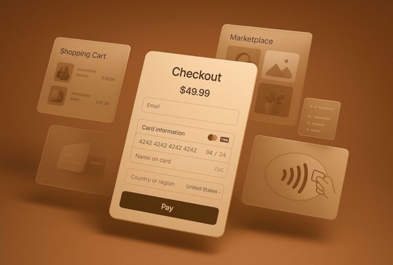
Fast Checkout
If a prospect clicked on the checkout button, then you’re almost home, and you definitely don’t want to be stopped by any bumps in the road. Across all devices, the checkout process must be quick and streamlined. If someone is pulling out their credit card to buy your product, then you want to eliminate as many obstacles as possible. Here are a few common mistakes to avoid:
- Making the prospect “create an account” right before the final stages of checkout. Though you should definitely encourage your customers to sign up, don’t do it during the checkout process. It’s generally a pain for the customer.
- Not visually identifying the sensitive fields when a customer fills out his information. If you require the customer to enter his email address, for example, add visual cues to instruct him to do so (like a red star to indicate that he cannot proceed to the next page without entering his email).
- Using ambiguous language. In the checkout process, make your communication as clear and easy-to-understand as possible.
Having a good design isn’t just about the attractiveness of the site, it’s about the functionality, ease-of-use, versatility—the all-around package. The goal is to capture more customers as easily as possible. And if you can accomplish that, then your site design did its job.


