
Why Your Site Needs Responsive WordPress Web Design to Survive
Why Your Site Needs Responsive WordPress Web Design to Survive
Why Mobile Traffic Is Forcing Every WordPress Site to Adapt
Responsive WordPress web design is the practice of building WordPress sites that automatically adjust their layout, images, and content to look great on any screen — from a wide desktop monitor to a small smartphone.
Here’s a quick overview of what it means in practice:
| What It Does | Why It Matters |
|---|---|
| Adjusts layout to screen size | Users get a clean experience on any device |
| Uses fluid grids and flexible images | No broken layouts or horizontal scrolling |
| Applies CSS media queries | Different styles load for different screens |
| Follows mobile-first principles | Fast, focused designs that scale up to desktop |
| Supported natively in WordPress | Most modern themes are responsive out of the box |
More than half of all web traffic now comes from mobile devices. That number keeps climbing. Yet many WordPress sites are still built with desktop users in mind first — and it shows. Menus that are impossible to tap, text too small to read, images that break the layout. These aren’t just annoyances. They cost you visitors, leads, and revenue.
Google noticed this shift too. Its mobile-first indexing means your mobile site is what Google primarily evaluates when deciding where to rank you. A site that looks great on a 27-inch monitor but falls apart on a phone is actively hurting your search visibility.
The good news? WordPress is one of the best platforms for building responsive sites. With the right theme, the right blocks, and a few key techniques, you can build a site that works beautifully everywhere — without rebuilding it from scratch for every device.
I’m Joseph Riviello, CEO and Founder of Zen Agency, and with over 22 years of experience leading digital strategies, I’ve built and optimized hundreds of responsive WordPress web design projects for businesses that needed real, measurable growth. In this guide, I’ll walk you through exactly how to make your WordPress site work hard on every screen your visitors use.

Responsive WordPress web design terms you need:
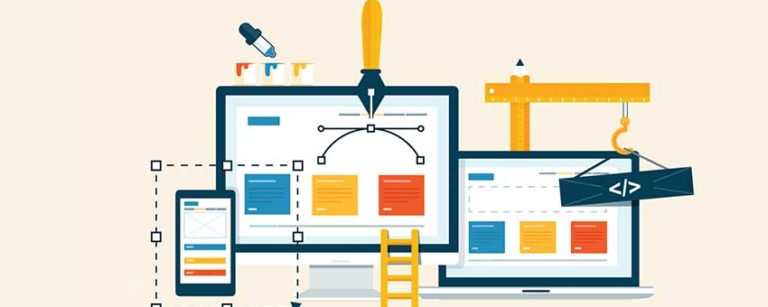
Core Principles of Responsive WordPress Web Design
To build a site that truly “survives” the modern web, we have to move away from the idea of fixed widths. In the early days of the web, designers built pages like they were printing a magazine — every element stayed exactly where it was put. Today, a website is more like water; it should flow to fill whatever container it’s poured into.
According to HubSpot’s definition of responsive design, responsive web design refers to pages that “automatically appear in their optimized form on all devices.” This isn’t just about shrinking things down; it’s about re-ordering and re-sizing content so it remains usable.
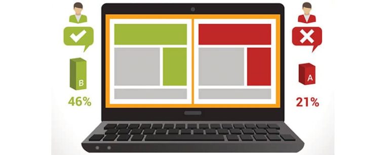
Comparing Layout Strategies
Understanding the difference between layout types is the first step in mastering Responsive WordPress web design.
| Layout Type | Description | Pros/Cons |
|---|---|---|
| Fixed | Uses set pixel widths (e.g., 960px). | Easy to design, but breaks on mobile. |
| Adaptive | Uses static layouts for specific screen sizes. | Better than fixed, but feels “jumpy” between sizes. |
| Responsive | Uses fluid grids and percentages to scale. | The Gold Standard. Works on any screen size. |
The Three Pillars of Responsiveness
- Fluid Grids: Instead of saying a sidebar is 300 pixels wide, we say it is 30% of the screen. This allows the layout to expand or contract proportionally.
- Flexible Images: We use CSS rules like
max-width: 100%; height: auto;to ensure images never spill over the edge of their container. - Media Queries: These are the “brains” of your CSS. They tell the browser: “If the screen is narrower than 600 pixels, hide the sidebar and make the font larger.”
To make this work, every WordPress site needs a Viewport Meta Tag in the header. This tiny line of code tells mobile browsers not to “fake” a desktop view but to render the site at the device’s actual width. Without it, your responsive efforts won’t even trigger.
How to Build a Mobile-First WordPress Site
When we talk about “mobile-first,” we aren’t just saying mobile is important. We are saying you should design for the smallest screen first, then add complexity as the screen gets larger. It’s much easier to scale a simple, clean mobile layout up to a desktop version than it is to try and cram a complex desktop site into a phone screen.
Step 1: Choosing Your Foundation
Your choice of theme is the most critical decision. While the WordPress.org theme repository contains thousands of options, not all are created equal. When vetting a theme, don’t just look at the desktop demo. Open the demo on your phone. Is the menu easy to tap? Does the text stay readable?

Step 2: Embracing Intrinsic Design
Modern WordPress development has shifted toward “Intrinsic Design.” This means we use the Gutenberg editor to create layouts that adapt based on the content itself, rather than just hard-coded breakpoints. With the block editor, you can preview your work in mobile and tablet modes instantly, allowing you to catch layout shifts before you hit “Publish.”
Step 3: Designing for Fingers, Not Mice
On a desktop, a user has a precise cursor. On a phone, they have a thumb.
- Touch Targets: Buttons and links should be at least 44×44 pixels (or 48x48px for better accessibility) to prevent “fat-finger” errors.
- Hover States: There is no “hover” on a touchscreen. If your site hides important information behind a hover effect, mobile users will never see it.
Leveraging Blocks for Responsive WordPress Web Design
The block editor (Gutenberg) has revolutionized how we handle responsiveness. Instead of needing custom code for every column, we can use Column and Group blocks that have built-in stacking rules. On desktop, three columns sit side-by-side; on mobile, they automatically stack vertically.
For developers looking for more control, the theme.json file is where the magic happens. This file allows us to implement Fluid Spacing and Fluid Typography using the CSS clamp() function.
What is the Clamp Function?
clamp() allows you to set a minimum size, a preferred “fluid” size, and a maximum size. For example, a heading could be set to stay between 20px and 48px, scaling perfectly as the window resizes. This eliminates the need for dozens of media queries and keeps your code lightweight.
If the native blocks aren’t enough, WordPress development services often utilize block libraries like Kadence or Stackable. These plugins offer granular responsive controls, allowing you to change padding, font size, and even element visibility specifically for mobile users.
Optimizing Navigation and Media for Responsive WordPress Web Design
Navigation is usually where responsive sites fail. A massive “mega menu” works on a 24-inch screen but is a disaster on a phone.
- The Hamburger Menu: This is the standard icon (three horizontal lines) that hides your navigation until needed. It saves space and keeps the focus on your content.
- Site Search: A Google study found that functional site search is one of the most important elements of a mobile-friendly site. If users can’t find what they need in the menu, they should be able to search for it instantly.
- Optimizing Media: Images are the biggest cause of slow mobile sites. WordPress supports
srcsetby default, which means it automatically creates different sizes of your images and serves the smallest one possible to mobile users. To take it further, use the WebP format and enable Lazy Loading so images only load as the user scrolls down to them.
Advanced Customization and Fluid Typography
For those using page builders like Elementor, the process is even more visual. Elementor allows you to set Custom Breakpoints. While most sites use standard breakpoints (Mobile, Tablet, Desktop), you might find that your design “breaks” at a specific width, like 900px. You can create a specific rule just for that size.
Scalable Typography and Relative Units
To ensure your site remains accessible, we avoid using pixels (px) for font sizes. Instead, we use rem or em units.
- REM units are relative to the root font size. If a user increases their browser font size for better readability, your whole site will scale beautifully to accommodate them.
- Viewport units (vh/vw) allow elements to be sized based on a percentage of the screen’s height or width. This is perfect for hero sections that need to fill the screen regardless of the device.
Handling Interactive Elements
Forms and tables are notoriously difficult on mobile. A wide table will often “break” the page, causing a horizontal scroll bar (one of the biggest “sins” of Responsive WordPress web design).
- Responsive Tables: We use techniques that allow tables to scroll horizontally inside their container or transform into “cards” on mobile.
- Mobile-Friendly Forms: Ensure your input fields are large enough to tap and that the keyboard that pops up matches the field (e.g., a number pad for phone number fields).
If you are struggling to get these advanced elements right, our WordPress development services can help you build custom, high-performance layouts that don’t sacrifice functionality for beauty.
Frequently Asked Questions about Responsive Design
What is the difference between responsive and adaptive design?
Responsive design uses a single fluid layout that “flows” to fit any screen size. Adaptive design uses several fixed layouts (e.g., one for iPhone, one for iPad, one for Desktop) and switches between them. Responsive design is generally preferred because it is future-proof; it will work on devices that haven’t even been invented yet.
Does responsive design affect my Google SEO rankings?
Absolutely. Google uses mobile-first indexing, meaning it looks at your mobile site to determine your rank. If your site isn’t responsive, you will likely see a significant drop in search visibility. Furthermore, responsive sites typically have lower bounce rates and better user engagement, which are key ranking signals.
How do I make my existing WordPress theme responsive?
If your theme isn’t responsive, the best path is usually to switch to a modern, responsive theme. However, you can add “patches” using plugins like WPtouch or by adding custom CSS media queries. For a professional result, it’s often more cost-effective to undergo a responsive redesign than to try and “hack” an old, non-responsive theme.
Conclusion: Future-Proofing Your Digital Presence
In today’s market, a website that isn’t mobile-friendly is essentially invisible to more than half of your potential customers. Responsive WordPress web design isn’t just a trend; it’s the foundation of a successful digital strategy. It ensures that whether your customer is browsing from a laptop in a Scranton office or a smartphone in Billings, they get the same high-quality experience.
At Zen Agency, we specialize in providing enterprise-grade solutions that help businesses scale. We don’t just build websites; we build high-performance marketing tools designed to increase your ROI and visibility. From custom theme development to complex e-commerce integrations, we ensure your site is ready for whatever the future of the web looks like.
Don’t let an outdated design hold your business back. Start your project with Zen Agency’s WordPress development experts today and let’s build something that works everywhere.


