
Thumb-Friendly Shopping: The Ultimate Guide to Mobile Ecommerce Design
Thumb-Friendly Shopping: The Ultimate Guide to Mobile Ecommerce Design
Why Ecommerce Mobile Website Design Makes or Breaks Your Revenue in 2026
Ecommerce mobile website design is the practice of building online stores that are fast, thumb-friendly, and built to convert on smartphones — prioritizing mobile layouts, touch-optimized navigation, and streamlined checkout over desktop-first thinking.
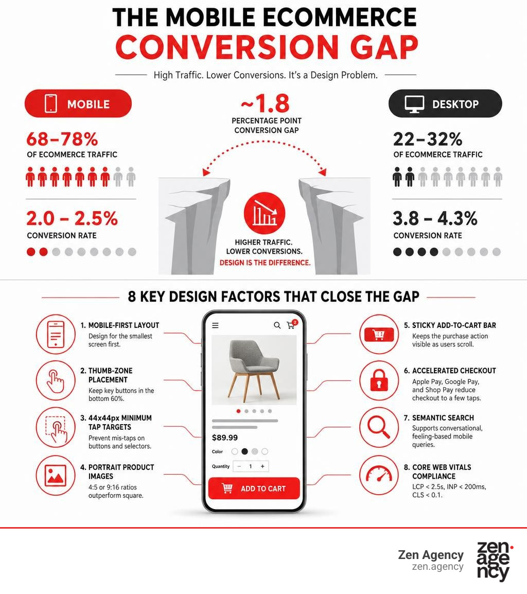
The 8 most important principles of mobile ecommerce design:
- Mobile-first layout — design for the smallest screen first, then scale up
- Thumb-zone placement — keep key buttons in the bottom 60% of the screen
- 44x44px minimum tap targets — prevent mis-taps on buttons and variant selectors
- Portrait product images — 4:5 or 9:16 ratios outperform square on mobile
- Sticky Add-to-Cart bar — keeps the purchase action visible as users scroll
- Accelerated checkout — Apple Pay, Google Pay, and Shop Pay reduce checkout to a few taps
- Semantic search — supports conversational, feeling-based mobile queries
- Core Web Vitals compliance — LCP under 2.5s, INP under 200ms, CLS below 0.1
Mobile commerce is no longer a secondary channel. By mid-2026, 68–78% of ecommerce traffic comes from smartphones — yet mobile conversion rates still lag desktop by roughly 1.8 percentage points. That gap isn’t a customer intent problem. It’s a design problem.
Most stores were built on a desktop canvas and squeezed down to fit a phone. The result: cramped tap targets, slow-loading images, buried CTAs, and checkout flows that frustrate shoppers into leaving. With 70% of ecommerce visitors abandoning their carts and 18% citing checkout complexity alone, the cost of poor mobile UX is measurable and significant.
This guide breaks down exactly what separates high-converting mobile ecommerce experiences from the ones quietly bleeding revenue.
I’m Joseph Riviello, CEO and Founder of Zen Agency, and over my 22+ years in digital marketing I’ve helped businesses of all sizes close the conversion gap through smarter ecommerce mobile website design — from thumb-zone audits to full mobile-first rebuilds. Let’s get into what actually works.
Ecommerce mobile website design terms to remember:
Core Principles of High-Converting Ecommerce Mobile Website Design
When we look at the foundations of high-converting ecommerce mobile website design, we must move beyond the simple checklist of making a site “look okay” on a phone. True mobile optimization is rooted in human ergonomics, cognitive load reduction, and technical speed.
Many brands confuse responsive design with mobile-first design. While responsive design ensures your site doesn’t technically “break” on smaller screens, it often results in a shrunken desktop experience. To unlock your store’s true potential, we must build from the ground up, keeping the physical mechanics of how users hold and interact with their devices at the forefront of our strategy. If you are looking to scale, understanding the ins and outs of ecommerce website design is your first step toward building a highly functional digital storefront.
Why Mobile-First Beats Responsive Ecommerce Mobile Website Design
To design a truly high-converting store in 2026, we must understand the difference between mobile-first, mobile-friendly, and basic responsive design.
A responsive theme takes a desktop layout and uses CSS breakpoints to stack elements vertically. While this keeps the site readable, it often leaves users with massive scroll depths, oversized hero images that push critical content below the fold, and heavy desktop assets that destroy mobile load times.
Mobile-first design, on the other hand, is a process of progressive enhancement. We start by designing the absolute leanest, most intuitive interface for a 390px-wide screen. Once that experience is perfected, we progressively add features, columns, and visual enhancements for larger viewports like tablets and desktops.
This approach is non-negotiable for two primary reasons:
- Google’s Mobile-First Indexing: Google uses the mobile version of your website as the primary basis for how it indexes and ranks your pages. If your mobile site is cluttered, slow, or hides key content behind complex desktop-style navigation, your organic visibility will suffer. To counter this, integrating expert development with expert SEO services is crucial for maintaining search dominance.
- The Mobile Conversion Gap: While mobile accounts for over 70% of traffic, it converts at roughly half the rate of desktop. This gap represents billions of dollars in unrealized revenue. Designing mobile-first directly addresses this bottleneck by removing the friction points that cause mobile users to abandon their journeys.
Designing for the Thumb Zone
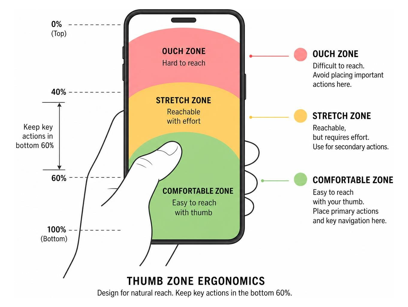
The physical reality of mobile shopping is that your customers are using their thumbs. Research indicates that approximately 49% of mobile users hold their phones with one hand, and 67% of all on-screen interactions are driven entirely by the thumb.
This ergonomic reality gives rise to the “Thumb Zone” framework, which categorizes mobile screens into three distinct areas:
- The Natural Zone: The bottom third and middle-center of the screen, where the thumb can easily tap without stretching.
- The Stretch Zone: The upper-middle portion of the screen, requiring minor hand adjustments.
- The Ouch/Hard-to-Reach Zone: The top 20% of the screen, which requires users to either use a second hand or awkwardly shift their grip.
To maximize conversions, all primary interactive elements—such as the “Add to Cart” button, variant selectors, and checkout CTAs—must live comfortably within the Natural Zone.
Furthermore, we must adhere strictly to established tap target standards. Apple’s Human Interface Guidelines recommend a minimum touch target size of 44×44 points, while Google and the Web Content Accessibility Guidelines (WCAG) suggest at least 48×48 pixels, with a minimum of 8px of space between adjacent interactive elements.
When buttons are too small or placed too close together—such as tiny quantity selectors or cramped color swatches—users experience “mis-taps.” This immediate UX frustration is a major bounce trigger.
Essential Features of a Mobile Product Detail Page (PDP)
The mobile Product Detail Page (PDP) is the primary battleground for conversions. On a desktop, you have ample horizontal space to display high-resolution galleries, extensive product descriptions, trust badges, and reviews side-by-side. On a 390px mobile screen, you must stack this information vertically without overwhelming the shopper.

According to recent industry insights, mobile-first product pages are now the primary conversion battleground. To win this battle, store owners must prioritize layout hierarchy and interactive simplicity.
Portrait Photography and Video Galleries
Visual presentation on mobile requires a complete departure from standard desktop square photography.
- Portrait Aspect Ratios (4:5 or 9:16): Portrait images occupy more vertical screen space, allowing product details to remain highly visible without requiring the user to zoom. One DTC outdoor brand reported an 18% lift in Add-to-Cart rates simply by migrating their product assets from square to 4:5 portrait formats.
- Short-Form Video Integration: Incorporating a 15–30 second auto-playing, muted video as the second frame in your product gallery can increase conversions by up to 22% for apparel, beauty, and home goods. It helps shoppers visualize the drape of a fabric, the texture of a cream, or the scale of an object in real-world contexts.
- Visual Thumbnails over Dots: A staggering 76% of mobile websites fail to use visual thumbnails for additional product images, relying instead on tiny, nondescript swipe dots. Always use small, tappable image thumbnails beneath the main image so users know exactly what perspective they are swiping to next.
- Pinch-to-Zoom and Double-Tap: Approximately 40% of mobile sites neglect basic zoom features. Ensure your mobile gallery supports native touch gestures like pinch-to-zoom and double-tap to allow close-up inspection of product details.
- Asset Compression: To keep load times fast, compress all product images to WebP or AVIF formats, aiming for a file size under 120KB per image, and lazy-load all gallery assets below the primary hero image. Learn more about executing this strategy in this guide on how to build a high-converting mobile PDP in 2026.
Sticky Add-to-Cart and Variant Selectors
On mobile, once a user scrolls down to read reviews or product specifications, the primary call to action (CTA) disappears. If they decide to buy, they have to scroll all the way back to the top. This extra step introduces friction.
To solve this, implement a sticky Add-to-Cart bar that anchors to the bottom of the viewport (within the thumb-comfortable zone) the moment the primary CTA scrolls out of view. This button should remain clean and unobtrusive, containing only the product name, price, and a high-contrast CTA button.
Additionally, replace traditional dropdown menus for variants with highly visual button swatches. Dropdowns require multiple taps to open, scroll, select, and close. Button swatches for colors and sizes allow shoppers to see all available options at a single glance and select their preferences with a single tap.
By streamlining these interactions, you can significantly boost your mobile conversion rate. For more ideas on maximizing your store’s performance, consult The Ultimate Playbook to Skyrocket Ecommerce Conversion Rates.
Optimizing Navigation and Product Discovery
If shoppers cannot find what they are looking for within seconds, they will leave. Mobile product discovery must be predictive, fast, and designed around short sessions. Whether you are running a boutique B2C shop or managing a complex WooCommerce B2B enterprise platform, intuitive discovery is the backbone of user retention.
Navigational Layouts for Modern Ecommerce Mobile Website Design
Traditional desktop mega-menus do not translate to mobile. Cluttering a small screen with dozens of text links leads to cognitive overload. Instead, modern ecommerce mobile website design relies on clean, streamlined navigation patterns:
- Sticky Bottom Navigation Bars: Rather than hiding everything inside a top-left hamburger menu, surface your 4–5 most critical destinations (Home, Search, Cart, Account, Shop) in a persistent bottom navigation bar. This keeps primary navigation targets within immediate thumb reach.
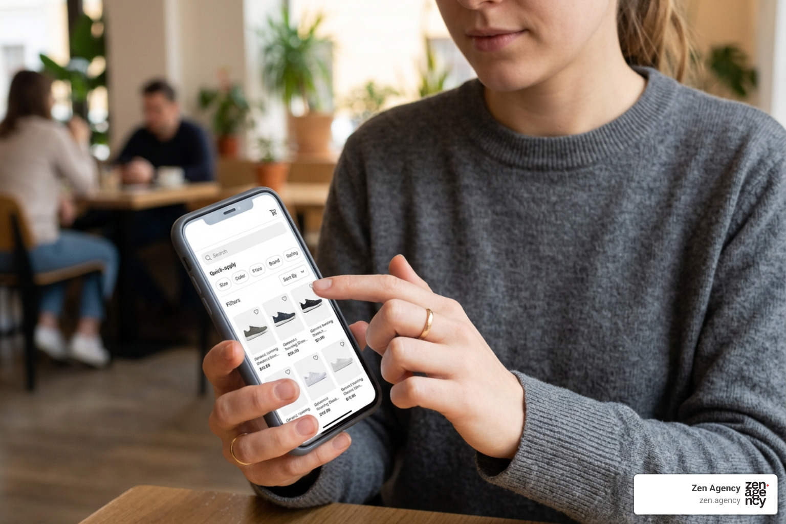
- Sticky Category Pill Bars: Use horizontal, swipeable pill menus at the top of collection pages to allow users to jump between popular categories instantly. Using emojis or small icons alongside text labels in these category bars has been shown to increase tap-through rates.
- Simplified Breadcrumbs: Don’t let users feel lost. While 36% of mobile sites fail to provide full category paths, implementing clean, single-line horizontal breadcrumbs allows users to easily jump back to broader categories.
- Horizontal Swiping for Product Rails: On homepages and collection pages, use swipeable horizontal product carousels (containing 8–12 curated items) rather than forcing endless vertical scrolling. This allows shoppers to explore various categories rapidly.
For a deeper dive into structuring these pathways, check out this guide on how to build a mobile-first store design that converts in 2026.
Semantic Search and Visual Discovery
Mobile searchers are high-intent shoppers, but typing on virtual keyboards is error-prone. To capture this high-converting traffic, optimize your search experience:
- Semantic and Conversational Search: Implement vector-based semantic search engines that can interpret natural, conversational queries (e.g., “warm winter jacket for skiing” instead of just “ski jacket”). This is especially powerful when paired with conversational AI tools to guide users to the right products.
- Autocomplete and Visual Search: Provide real-time search suggestions with thumbnail images as the user types. This allows them to bypass the search results page entirely and click straight through to the PDP.
- Optimizing Zero-Results Pages: Never present a dead end. If a search query yields no exact matches, use that space to display personalized recommendations, top-selling categories, or a helpful customer support widget.
- Category-Specific Search Filters: Enable users to “search within” their active category, a feature neglected by 94% of mobile sites. This keeps search results highly relevant to the shopper’s current intent.
To build a truly frictionless discovery journey, explore the strategies highlighted in this resource on how to build a mobile-first product discovery experience in 2026.
Frictionless Mobile Checkout and Payment Integration
The checkout page is the ultimate hurdle in the mobile shopping journey. Typing credit card numbers, billing addresses, and shipping details on a small, virtual keyboard is slow and frustrating. By removing friction at this final stage, you can instantly recover lost sales and increase online sales without needing to drive new traffic to your site.
| Feature / Metric | Standard Mobile Checkout | Accelerated Checkout (Shop Pay/Apple Pay) |
|---|---|---|
| Average Steps | 3 to 5 pages | 1-click drawer or single-page overlay |
| Average Completion Time | 90 to 120 seconds | Under 15 seconds |
| Required User Inputs | ~18 form fields (Manual entry) | 0 to 2 taps (Biometric/Saved profile) |
| Conversion Rate Lift | Baseline | Average 1.72x to 2x increase |
| Cart Abandonment Rate | High (~75-80%) | Significantly lower (~35-45%) |
One-Click Ordering and Digital Wallets
The single most effective way to optimize mobile checkout is to eliminate manual typing altogether. Digital wallets like Apple Pay, Google Pay, and Shop Pay store the user’s shipping, billing, and payment details securely.
When these accelerated payment methods are integrated directly on the product detail page or within a slide-out cart drawer, the checkout process is reduced from a tedious multi-step form to a simple biometric scan (FaceID or fingerprint). Shop Pay, for example, has been shown to convert at 1.72 times the rate of standard checkouts.
If you are planning to upgrade your checkout experience, make sure to read our step-by-step payment integration guide to ensure a secure, seamless setup.
Reducing Form Fields and Autodetecting Data
If users must check out manually, keep the form fields to an absolute minimum. Every additional field you present increases the likelihood of abandonment.
- Address Autocomplete and Postal Code Autodetection: Instead of forcing users to manually enter their city, state, and zip code, use Google Places API or postal code autodetection. Over 28% of mobile sites still require manual entry of city and state, which is a major source of unnecessary typing.
- Guest Checkout by Default: Never force a user to create an account to make a purchase. Offer a prominent guest checkout option, and allow them to create an account with a single tap after the purchase is complete.
- Touch Keyboard Optimization: Ensure your site’s code triggers the correct keyboard type for each input field. For example, triggering a numeric keypad for phone numbers and zip codes, and disabling auto-correct on name and address fields.
- Inline Validation: Provide real-time feedback as the user fills out the form. Displaying a green checkmark or a clear, localized error message immediately prevents the frustration of submitting a page only to be greeted by a laundry list of red error boxes.
For inspiration on building the cleanest checkout flows, explore our detailed guide on the best checkout page designs for frictionless shopping.
Frequently Asked Questions About Mobile Ecommerce Design
What is the difference between responsive and mobile-first design?
Responsive design is a desktop-first approach where a single layout is designed for large screens and then styled with CSS breakpoints to shrink, stack, and fit smaller viewports.
Mobile-first design flips this process. We design the absolute leanest, most user-friendly interface for the smallest screen first, ensuring perfect thumb ergonomics, fast asset delivery, and clear visual hierarchy. We then progressively enhance the design with more columns and features as the screen size increases. This keeps the mobile experience fast and highly focused.
How does mobile page speed affect ecommerce SEO?
Mobile page speed is a direct ranking factor in Google’s search algorithms. Google measures speed through Core Web Vitals, focusing on three primary metrics:
- Largest Contentful Paint (LCP): How fast the main content loads (target: under 2.5 seconds).
- Interaction to Next Paint (INP): How responsive the page is to user taps (target: under 200 milliseconds).
- Cumulative Layout Shift (CLS): How visually stable the page is during loading (target: below 0.1).
Slow mobile sites are penalized in search rankings, resulting in a loss of organic traffic. Furthermore, pages that load slower than 3 seconds lose over 53% of their mobile visitors before they even interact with the site.
Why do mobile shopping carts get abandoned so often?
Mobile cart abandonment, which averages around 70–80%, is primarily driven by input friction and checkout complexity. Typing out credit card numbers and shipping addresses on a virtual keyboard is tedious.
Other major triggers include forced account creation, unexpected shipping costs displayed late in the funnel, slow page load times, and a lack of trusted mobile payment options like Apple Pay or PayPal.
Conclusion
Mastering ecommerce mobile website design is no longer about checking a box for mobile-friendliness; it is about engineering a frictionless, thumb-optimized shopping experience. From the moment a user lands on your homepage to the final biometric scan at checkout, every tap, swipe, and scroll must feel effortless.
If your mobile conversion rates are lagging, or if you are ready to build a high-performing digital storefront from scratch, we can help. Zen Agency is an award-winning digital marketing and web development agency with locations in Wilkes Barre, Scranton, and Wyoming, PA, as well as Billings, MT, serving businesses across the USA. Since 2008, we have specialized in custom website development, branding, and conversion-focused digital marketing. Our USP is delivering enterprise-grade solutions and innovative, data-driven strategies that help struggling-to-scale brands increase visibility, profitability, and ROI.
Whether you are looking to build a new WooCommerce store, optimize your checkout flow, or execute a comprehensive SEO strategy, our expert team is ready to help you grow.
Ready to unlock your store’s mobile potential? Discover how our tailored Zen Agency’s Ecommerce Website Design Services can transform your mobile user experience and skyrocket your conversion rates today. Let’s build something incredible together!