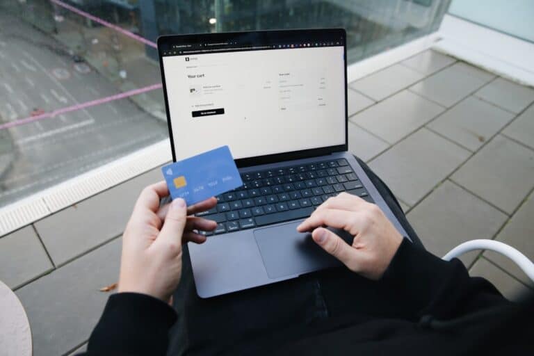
The Best Checkout Page Designs: A Guide to Frictionless Shopping
The Best Checkout Page Designs: A Guide to Frictionless Shopping
Why Ecommerce Payment Page Design Directly Impacts Your Revenue
Good ecommerce payment page design is one of the highest-leverage things you can do to grow online revenue. Here’s a quick summary of what makes a payment page convert:
- Remove friction — fewer fields, no forced account creation, clear CTAs
- Show costs early — surprise fees are the #1 reason carts get abandoned
- Display trust signals — SSL badges, lock icons, familiar payment logos
- Support multiple payment methods — cards, digital wallets, BNPL, and local options
- Optimize for mobile — 70% of purchases happen on smartphones
- Handle errors gracefully — real-time validation keeps customers from giving up
The numbers tell a stark story. Around 70% of online shopping carts are abandoned before purchase. And the average payment page only converts 58% of the time — meaning nearly half of customers who reach checkout still don’t complete their purchase.
That’s not a traffic problem. That’s a design problem.
Small friction points — a confusing form, a missing payment option, an unexpected shipping fee, a vague error message — quietly kill conversions at the very last step. The good news: most of these issues are fixable with the right design decisions.
I’m Joseph Riviello, CEO of Zen Agency, and over my 22+ years in digital marketing I’ve helped businesses of all sizes fix exactly these kinds of conversion leaks through smarter ecommerce payment page design. In this guide, I’ll walk you through the specific design principles, layout choices, and optimization tactics that turn more visitors into paying customers.

Terms related to ecommerce payment page design:
Core UX Principles of Ecommerce Payment Page Design
Designing a payment page is a delicate balancing act. On one hand, you must gather sensitive, highly secure financial details. On the other hand, you must make that process feel as effortless as a single tap. To achieve this, we rely on a few foundational user experience (UX) principles.
First and foremost is visual simplicity. The payment step is not the place to show off flashy graphics, promotional banners, or complex navigation menus. Every element on the page should serve one purpose: helping the user complete the transaction. By removing headers, footers, and unnecessary links, we reduce the user’s cognitive load and keep them laser-focused on the checkout form.
Another critical principle is offering a guest checkout option. Forcing a customer to register an account before they can pay is one of the quickest ways to drive them to a competitor. Instead, make guest checkout the default experience. You can always invite them to save their details and create an account after the purchase is finalized, when their motivation is high and the hard part is already over.

Furthermore, accessibility compliance is a must-have, not a nice-to-have. Your checkout page should be fully navigable via keyboard, support screen readers, and maintain high color contrast. Not only does this expand your market to all potential buyers, but it also ensures compliance with web standards like WCAG.
Finally, brand consistency must be preserved throughout the entire checkout journey. If a customer is redirected from your beautifully branded store to a generic, unstyled, third-party payment gateway, they may suspect fraud and abandon their cart. Whether you use custom styling or a hosted checkout solution, ensure the fonts, brand colors, and logos match your main site seamlessly.
For a deeper dive into crafting accessible and highly functional digital storefronts, check out our guide on The Ins and Outs of Ecommerce Website Design and review Checkout screen best practices for high conversion | Stripe. If you want hands-on help from our design experts, explore our E-commerce Design Services.
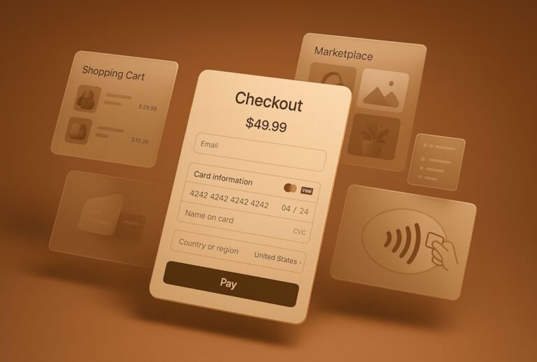
Anatomy of a High-Converting Payment Page
What does a high-converting checkout page actually look like? To design one, you need to understand the structural anatomy of the page and how visual hierarchy guides a user’s eyes from top to bottom.
An effective layout generally divides the screen into two primary sections: the payment form on one side (usually the left) and a clear, transparent order summary on the other (usually the right). This layout keeps the most critical information in view at all times, reassuring the customer of what they are buying as they enter their payment details.

The primary call-to-action (CTA) button should be the most visually prominent element on the page. Use a contrasting color that stands out from the rest of the design, and make the button text explicit. Instead of generic phrases like “Submit” or “Continue,” use action-oriented language that includes the actual order total, such as “Pay $45.99.” This removes any ambiguity about what happens when the button is clicked.
Essential Fields and Layout in Ecommerce Payment Page Design
When it comes to form fields, less is always more. Every additional field you require represents another opportunity for a customer to abandon their cart. Limit your input fields to only the absolute essentials: name, billing address, and card details.
To streamline the data entry process, incorporate these best practices:
- Dynamic Totals: Ensure the order summary instantly updates to reflect shipping costs, taxes, and applied discounts without requiring a page reload.
- Collapsible Promo Code Fields: Keep the promo code input hidden behind a text link (e.g., “Have a coupon?”). Leaving a massive, empty discount box in plain sight encourages shoppers to leave your site to hunt for promo codes, often resulting in them never returning.
- Simplified Billing vs. Shipping Logic: Default the billing address to match the shipping address with a pre-checked box. This single design choice eliminates the need for users to fill out an entire second address form in most transactions.
- Address Auto-Fill: Integrate address lookup APIs (like Google Places) to allow users to find and complete their address in just a few keystrokes.
By refining these small form interactions, you can dramatically boost your store’s performance. Learn more actionable optimization techniques in The Ultimate Playbook to Skyrocket Ecommerce Conversion Rates and Unlock Your E-commerce Potential: Simple Steps to Increase Online Sales.
Trust Signals and Security Indicators
Because the payment page is where customers hand over their sensitive financial information, building trust is paramount. Approximately 19% of abandoned carts occur because shoppers do not trust the website with their credit card details.
To combat this hesitation, you must strategically display security indicators without cluttering the visual design. These include SSL/TLS certificates (signaled by the lock icon in the browser address bar and HTTPS protocol), PCI-DSS compliance badges, and secure payment processor logos (such as Visa, Mastercard, and PayPal).
Here is a list of essential trust signals every ecommerce payment page should include:
- SSL/TLS Secure Padlock Icon: Reassures users that their connection is encrypted.
- Familiar Payment Badges: Displaying logos of trusted payment networks builds immediate credibility.
- PCI-DSS Compliance Verbiage: A brief, clean line of text stating “Your payment is secure and encrypted” near the CTA button.
- Accessible Customer Support: Links to a live chat widget, a helpline phone number, or an FAQ section near the footer to resolve last-minute purchase anxieties.
To learn more about implementing secure, trustworthy layouts, consult the Payment page template best practice | Stripe.
One-Page vs. Multi-Step Checkout Flows
One of the most debated topics in ecommerce design is whether to use a single-page checkout or a multi-step checkout flow. Both approaches have unique advantages, and the right choice depends heavily on your target audience, product catalog, and transaction complexity.
To help you decide which layout fits your business model, we have broken down the primary differences below:
| Feature / Metric | One-Page Checkout | Multi-Step Checkout |
|---|---|---|
| Checkout Speed | Extremely fast; ideal for quick, impulse purchases. | Slightly slower, but allows users to double-check their details. |
| Cognitive Load | Can feel overwhelming if too many fields are displayed at once. | Lower; breaks information into digestible chunks. |
| Mobile Friendliness | Great for digital wallets, but long forms can require excessive scrolling. | Excellent; easily fits smaller screens step-by-step. |
| Analytics Tracking | Harder to track exactly where users drop off without custom event tracking. | Easy to identify the exact step where users abandon their carts. |
| Best Use Cases | Digital products, single-item stores, and repeat customer bases. | High-ticket items, customizable products, and B2B orders. |
The Single-Page Checkout Layout
The single-page checkout places all steps—shipping, billing, payment method, and order review—on a single screen. When designed well, this approach minimizes the time-to-purchase and creates a highly streamlined experience.
To prevent a single-page layout from feeling cluttered, use an accordion-style design. This keeps secondary sections collapsed until the prior step is completed, guiding the user logically through the page. Additionally, implementing real-time inline validation ensures that mistakes are caught immediately, maintaining checkout momentum.
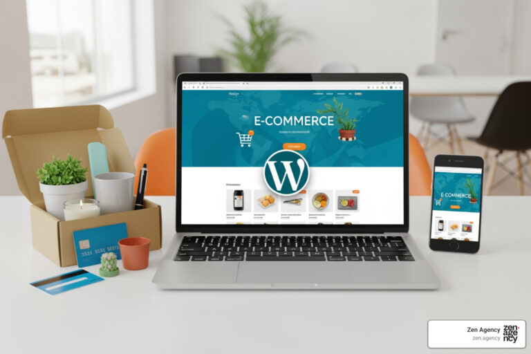
If you are developing a custom frontend, utilizing pre-built components like the Checkout Payment Methods block can help you deploy a beautiful, tabbed payment selector with minimal development overhead. To explore how to configure these systems on WordPress, read Choosing Your Digital Storefront: A WordPress E-commerce Deep Dive.
Multi-Step Stepper Flows in Ecommerce Payment Page Design
For complex transactions, such as business-to-business (B2B) orders or highly customized products, a multi-step checkout is often the superior choice. By breaking the checkout process into distinct phases (e.g., Shipping -> Billing -> Payment), you prevent cognitive overload.
The key to a successful multi-step flow is a clear progress indicator or “stepper” at the top of the page. This tells the customer exactly how many steps are left and where they currently stand, reducing anxiety. Each step must validate the user’s input before allowing them to click “Next,” ensuring they do not reach the final step only to find out they made an error on step one.
For developers building modern React or Next.js applications, the React Payment Processing Stepper Block provides a secure, fully styled multi-step payment flow that integrates seamlessly with major payment processors.
Optimizing for Mobile and Alternative Payment Methods
With over 70% of online purchases completed on smartphones, mobile optimization is no longer optional—it is the primary battlefield for ecommerce conversions. If your payment page is difficult to navigate on a mobile screen, you are actively losing the majority of your potential sales.
Mobile-Responsive Design and Biometrics
Mobile-first payment design requires large, tap-friendly buttons, highly legible typography, and forms that automatically trigger the correct smartphone keyboard (such as displaying a numeric keypad for credit card numbers and ZIP codes).
The gold standard for mobile checkout is the integration of express checkout buttons and digital wallets like Apple Pay and Google Pay. These methods allow customers to bypass traditional forms altogether. By utilizing biometric authentication—like Face ID or Touch ID—shoppers can complete a purchase in seconds, using saved shipping and billing details securely stored on their devices.
Integrating tools like the Express Checkout Block into your site’s checkout interface can dramatically speed up transactions for mobile users. If you are looking to build long-term customer loyalty on mobile, consider reading The Complete Guide to Embedding Rewards into Your Online Store.
Localizing Payments for Global Markets
If your business sells internationally, your checkout page must adapt to local preferences. While credit cards are dominant in the United States, other regions rely heavily on Alternative Payment Methods (APMs), which account for roughly 50% of global online transactions.
For instance, a customer in Brazil will look for Pix, a shopper in India will expect UPI, and a buyer in the Netherlands will likely prefer iDEAL. Offering local payment methods, alongside Buy Now Pay Later (BNPL) options like Klarna, can increase your cross-border sales by up to 46%.
To design a truly global checkout experience that handles multi-currency rendering and dynamic payment routing, read Juspay | Global Checkout Design: The Multi-Market Playbook for Higher Conversions.
Error Handling, Validation, and A/B Testing
Even with a gorgeous design, users will make mistakes. How your checkout page handles those mistakes can mean the difference between a completed sale and an abandoned cart.
Real-time inline validation is the most effective way to handle input errors. Instead of letting the user fill out the entire form, click submit, and then reload the page with a list of red error messages, validate their input as they type. If they enter an invalid email address or card number, highlight the specific field immediately with a gentle, clear error message.
Here is a list of common validation errors to account for in your design:
- Card Number Formatting: Automatically format card numbers with spaces so they are easy to read and spot typos.
- Expiration Date Validation: Flag expired dates or incorrect formats (e.g., MM/YY) instantly.
- Missing CVV/CVC: Provide a small tooltip explaining where to find the 3- or 4-digit security code.
- Invalid Postal Codes: Auto-detect the country and validate the ZIP/postal code format accordingly.
When payment processing failures occur, be direct and transparent. Explain why the transaction failed (e.g., “Insufficient funds” or “Incorrect billing address”) and offer clear recovery steps, such as trying another card or using a digital wallet. Crucially, always preserve the customer’s cart data so they do not have to rebuild their order from scratch after a failure.
Finally, never stop testing. A/B testing different checkout layouts, button colors, and payment method placements is essential for continuous conversion rate optimization (CRO). To start optimizing your store’s performance systematically, check out these guides:
- The Ultimate Guide to Improving Your Conversion Rate
- Step-by-Step Guide to Website Conversion Optimization
- Stop Losing Leads with These CRO Secrets
For real-world design inspiration and benchmark data, you can browse over 1482 ‘Payment’ Design Examples – Baymard Institute.
Frequently Asked Questions about Checkout Design
Why do customers abandon their shopping carts at the payment stage?
Cart abandonment at the payment stage is typically caused by friction and unexpected friction points. The leading reasons include surprise costs (such as shipping fees, taxes, or service charges revealed only at the end), forced account creation, overly complex checkout forms, and a lack of trusted payment methods or security badges.
Should I use a one-page checkout or a multi-step checkout?
It depends on your business model. One-page checkouts are excellent for fast, simple purchases and repeat buyers. Multi-step checkouts are highly effective for expensive, complex, or B2B products where customers prefer a structured, step-by-step review process. At Zen Agency, we recommend running user testing and analyzing your checkout analytics to see which layout performs best for your specific audience.
How do alternative payment methods impact checkout page layout?
Alternative payment methods require a layout that can dynamically display the most relevant payment options without cluttering the screen. This is best achieved using a tabbed interface or an express checkout section at the top of the page, which keeps the card entry form clean while giving quick access to digital wallets and BNPL providers.
Conclusion
Designing a frictionless, high-converting checkout experience requires a perfect blend of intuitive frontend design and robust backend infrastructure. By implementing the core UX principles, trust signals, mobile optimizations, and smart error-handling patterns outlined in this guide, you can eliminate conversion bottlenecks and scale your business’s revenue.
At Zen Agency, we have been delivering custom, enterprise-grade e-commerce solutions and conversion rate optimization strategies since 2008. From our locations in Pennsylvania (including Wilkes-Barre, Scranton, Wyoming, Kingston, and Hazleton) to Billings, Montana, and across the USA, we help businesses scale their visibility, usability, and ROI.
Ready to unlock your store’s full potential and eliminate checkout friction? Partner with Zen Agency for professional website design services.