Design Your First Iconic Logo from Scratch Without Getting Stuck
How to Design a Logo from Scratch That Works Everywhere
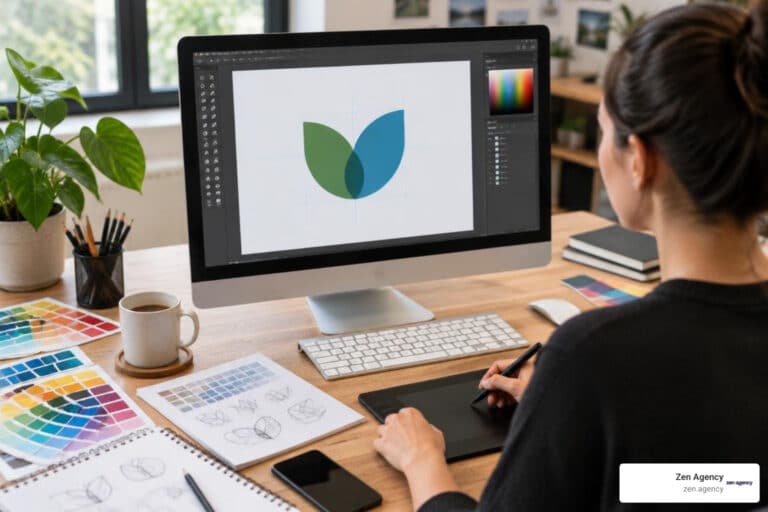
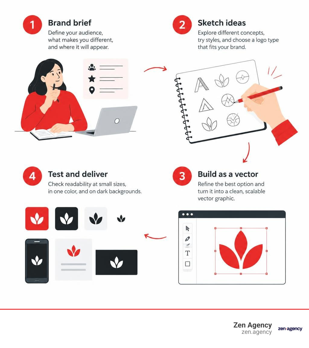
Start with a brief, not a drawing. Write down who your business serves, what makes it different, and where the logo will appear. Then sketch several ideas, choose a logo type that fits the brand, and build the strongest option as a vector. Before using it, check that it stays clear at small sizes, works in one color, and remains readable on dark backgrounds.
Those checks matter more than making a logo look impressive on a large screen. A mark that fails on a website icon, invoice, or sign will be hard to use consistently as your business grows. According to the U.S. Patent and Trademark Office, a distinctive logo can also serve as a trademark that identifies your goods or services and distinguishes them from competitors, which is why the design process should account for legal protectability from the start.
I’m Joseph Riviello, founder and CEO of Zen Agency. My 22 years in digital marketing shape how I approach logo design from scratch: as a way to build a clear identity that supports the wider business.
Explore more about logo design from scratch:
The Strategic Foundations: What Makes an Enduring Logo
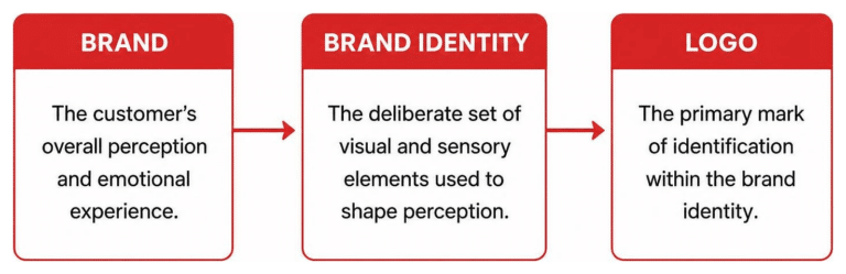
A great logo is not a tiny piece of art; it is a piece of visual infrastructure. Its primary objective is instant cognitive identification. When someone interacts with your product packaging, mobile app, or storefront signage, your mark must communicate your presence within milliseconds. Research shows that 25% of consumers are more likely to purchase from a business whose logo they recognize, proving that visual familiarity directly influences revenue.
Enduring brand identities manage cognitive load by removing visual clutter. If a mark contains three concepts, four gradients, and complex textures, the human brain struggles to encode it into memory. Stripping away ornamentation leaves a bold, memorable silhouette that builds immediate recognition. When developing an identity, understanding the art of bespoke logo design for modern businesses helps align pure aesthetic beauty with core commercial goals.
Evaluating Logo Types for Your Business Model
Choosing the correct structure for your mark prevents costly redesigns down the road. Every category serves distinct communication needs:
- Wordmarks (Logotypes): Focus entirely on stylized typography of the company name (e.g., Google, Visa). Ideal for businesses with distinctive, memorable, and short names.
- Lettermarks (Monograms): Condense long or multi-word business names into initials (e.g., IBM, HBO). Perfect for data-heavy or global brands requiring extreme layout economy.
- Pictorial Marks: Literal visual representations of a physical object (e.g., Apple, Target). They convey brand metaphors instantly when public awareness is established.
- Abstract Marks: Geometric symbols that evoke an emotional or conceptual idea without depicting literal objects (e.g., Nike, Airbnb).
- Combination Marks: Pair a standalone symbol with a distinct wordmark. This represents the gold standard for startups and scaling businesses because it provides full layout flexibility.
- Emblems / Badges: Encapsulate text and symbols inside a contained border or crest (e.g., Starbucks, Harley-Davidson). Great for heritage and craft trades, though challenging at micro-scales.
- Dynamic Marks: Adaptable visual frameworks that alter colors or details based on environmental context while keeping core geometry intact.
| Logo Type | Primary Use Case | Scalability Challenges | Recognition Speed |
|---|---|---|---|
| Wordmark | Short, unique brand names | Struggles in square app avatars | High |
| Lettermark | Long, multi-word corporate names | Requires heavy marketing to build meaning | Medium |
| Pictorial Mark | Established brands with clear metaphors | Complex silhouettes blur below 32px | Instant |
| Abstract Mark | Tech, finance, and multifaceted firms | Lacks immediate semantic meaning | Low to Medium |
| Combination Mark | Startups and scaling small businesses | Requires multiple layout lockups | High |
| Emblem / Badge | Heritage brands, craft goods, schools | Illegible at small screen sizes | High (as a unit) |
The Psychology of Color and Functional Typography
Color increases brand recognition by up to 80%. When choosing a palette, we must weigh emotional resonance against practical contrast. A survey of almost 5,000 people across 30 nations discovered clear cross-cultural associations: 68% link red with passion and urgency, 52% connect yellow with joy, and 51% associate black with elegance or somber gravity. Sector expectations matter as well: restaurants leverage red for appetite stimulation and blue for refreshment, whereas aviation and tech lean on blue for dependability.
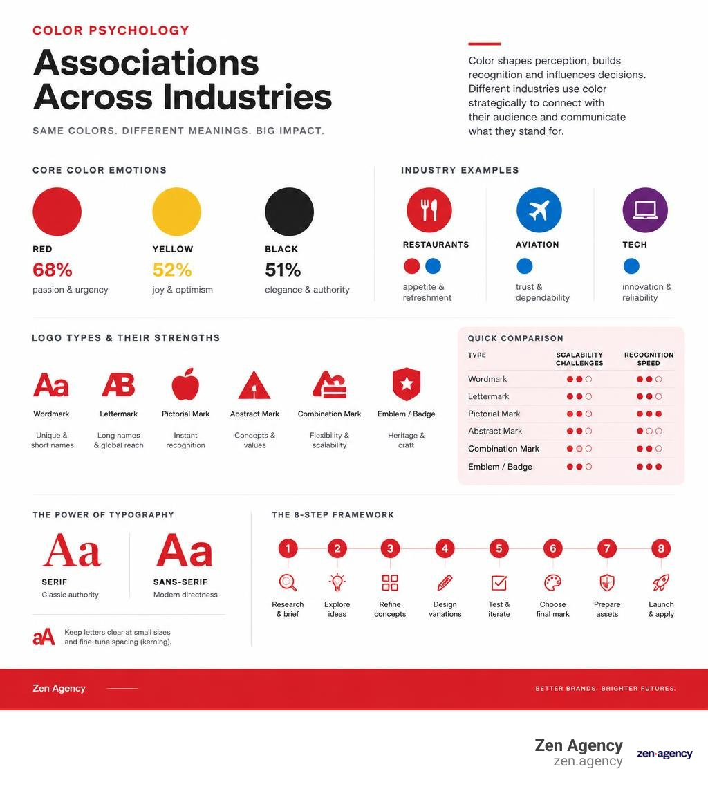
Typography carries equal weight. A serif communicates classic authority, while a geometric sans-serif projects modern directness. Ensure the thinnest stroke weight remains visible when scaled down, and manually balance letter spacing (kerning) so uneven gaps do not distract the eye.
The 8-Step Framework for Logo Design from Scratch
Creating a mark from a clean canvas requires a structured, constraint-driven framework rather than waiting for creative lightning to strike.
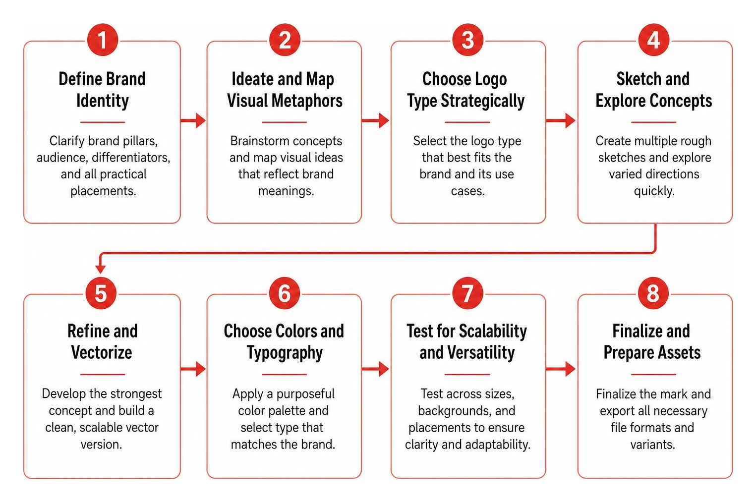
Step 1: Define Brand Identity Before Starting Logo Design from Scratch
Never open vector software without a crystal-clear brief. Document your brand pillars, primary target audience, core differentiators, and list every practical placement where the mark will appear. Limiting yourself to a one-page brief creates essential design boundaries that keep visual exploration focused.
Step 2: Ideate and Map Visual Metaphors
Build a keyword map around your trade and mission. Connect unrelated concepts to generate unique angles instead of relying on tired clichés. If you run a local bakery, pair wheat or flame metaphors with geometric archways rather than settling for generic rolling pins.
Step 3: Low-Fidelity Sketching and Silhouette Stress-Testing
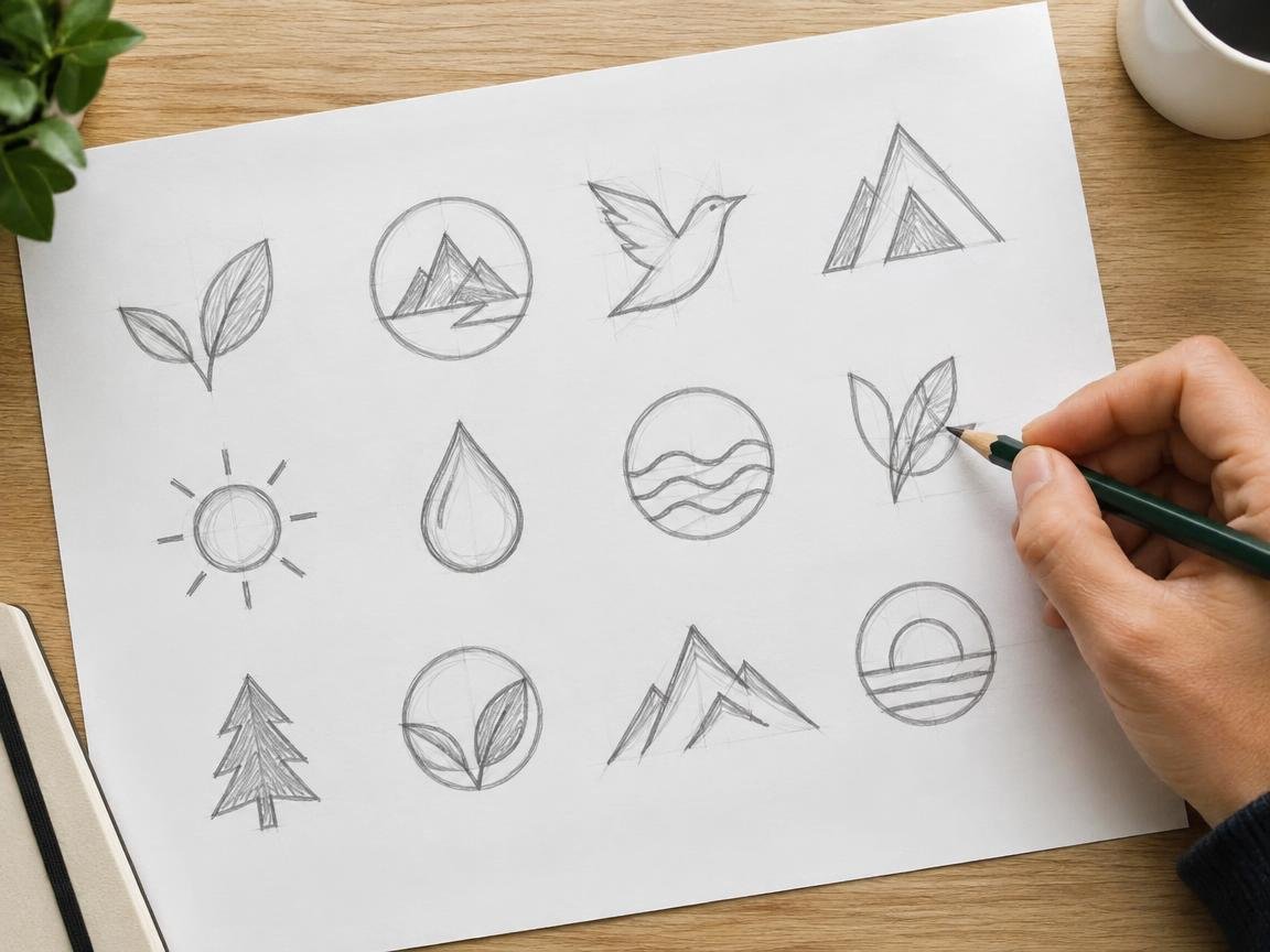
Draw dozens of rough thumbnail concepts on paper within 20 minutes. Paper allows speed and removes perfectionism. Focus strictly on outer silhouettes: if a sketch relies on fine inner linework to make sense, scrap it and move to the next idea.
Step 4: Leveraging AI for Rapid Exploration Without Losing Creative Control
AI image models make exceptional sketch assistants but terrible final production engines. Use prompt constraints like flat vector silhouette, minimal geometric iconography, single color, white background, no gradients to break creative blocks. AI outputs raster pixels and often suffers from subtle shape inconsistencies. You must act as the discerning art director who curates and manually vectorizes the best conceptual seeds.
Step 5: Applying Grids and Geometry in Logo Design from Scratch
Anchor your sketches inside a vector construction grid. An 8-pixel modular base or interlocking circular grids establish mathematical harmony across curves. Keep Bézier anchor points to an absolute minimum: fewer anchors yield smoother curves and crisp rendering across all screen resolutions. When structuring clean proportions, following the ultimate guide to what makes a great logo design principles prevents visual dissonance.
Step 6: Typography Pairing and Kerning Refinement
Select a typeface that matches your symbol’s visual weight and secure proper commercial licensing. Manually adjust the kerning between every letter pair and add breathing room across uppercase lettering with wide tracking.
Step 7: The Five Rigorous Logo Stress Tests
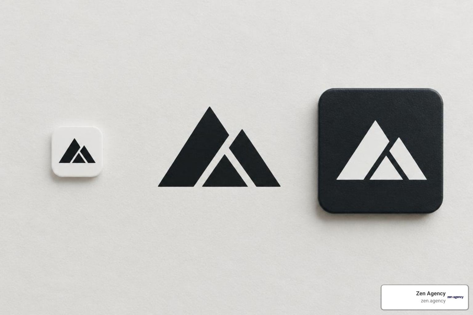
Before approving any mark, subject it to these decisive quality tests:
- The 16-Pixel Favicon Test: Google’s rules for favicons demand a clean square image of at least 8×8 pixels and recommend assets above 48×48 pixels. Scale your mark down to 16×16 pixels; it must remain completely identifiable without turning into muddy blur.
- The One-Color Monochrome Test: Convert the mark entirely to solid flat black. If the design loses its core meaning without color differentiation, the underlying geometry is broken.
- The Inversion Test: Place the asset in pure white over a dark surface to verify negative space relationships do not invert visual meaning.
- The Photocopier/Fax Test: Print and copy the logo at low resolution to ensure thin lines survive extreme degradation.
- The Distance Squint Test: Step six feet back from your screen and squint; the primary silhouette must stay crisp.
Step 8: Assembling the Full Brand System and Exporting File Formats
A single isolated graphic file does not make a functional brand. Build horizontal lockups for website headers, stacked lockups for packaging, and isolated marks for profile avatars. Package these with clear spacing rules and color values.
Critical Logo Design Mistakes to Avoid
Most branding failures stem from predictable execution traps. Review these tips for logo design that won’t make your eyes bleed to keep your assets robust:
- Excessive Special Effects: Drop shadows, complex bevels, and heavy gradients look dated quickly and fail on embroidery machines.
- Neglecting Scalability Thresholds: While WCAG’s contrast ratio requires 4.5:1 for standard body text, logos are legally exempt. However, ignoring high-contrast values makes assets unreadable outdoors or on mobile screens.
- Raster-Only Workflows: Building a logo in raster software guarantees pixelated edges on banners and vehicle wraps. Every master logo must originate as scalable mathematical vector math.
- Inconsistent Clear Space: Crowding your logo against headlines or container edges degrades visual authority.
DIY vs. Professional Logo Design: Making the Strategic Choice
Roughly 8 in 10 small businesses can launch successfully with a well-tested DIY logo. However, growing enterprises and firms undergoing rapid scaling eventually hit the limits of self-made marks.
| Approach | Typical Investment | Turnaround | Trademark Feasibility | Scalability Potential |
|---|---|---|---|---|
| DIY Tool / Template | $0 – $30 | 1 – 3 Hours | Very Low (Shared Assets) | Low |
| Generative AI | $10 – $50 | 1 – 2 Days | Unclear (Human Input Required) | Medium (Needs Vectorizing) |
| Freelance Specialist | $250 – $2,500 | 1 – 3 Weeks | High (Custom Geometry) | High |
| Full-Service Agency | $3,000 – $15,000+ | 3 – 8 Weeks | Comprehensive Clearance | Enterprise Grade |
Cost, Time, and Quality Trade-Offs
A free online maker costs $0 upfront, whereas senior design specialists bill between $85 and $150+ per hour. The trade-off centers on risk and positioning. If you operate in crowded markets or plan substantial investments in physical signage and packaging, reading about why good branding is worth every single penny highlights how custom design avoids expensive rebrands.
Trademark Registration and Legal Ownership Pitfalls
Registering a trademark through the USPTO requires a $350 filing fee per class and typically takes 12 to 18 months. Template-based makers sell shared, non-exclusive licenses, meaning dozens of other businesses may legally use identical iconography. Furthermore, purely AI-generated artwork lacks copyright protection under current legal precedents without substantial, provable human authorship. Investing in custom vector geometry remains the only reliable route to undisputed brand ownership.
Frequently Asked Questions About Designing a Logo
What files do I need for a complete logo package?
A complete brand delivery system requires master vector formats (.SVG, .EPS, and .PDF) for infinite scalability, high-resolution raster files (.PNG with transparent backgrounds at 2000px+ width), optimized files for digital profiles (Google recommends 720×720 pixels for Business Profiles), and a dedicated square .ICO favicon.
Can I legally trademark a logo made with free templates or AI?
Generally, no. Free template libraries grant non-exclusive licenses, preventing you from claiming exclusive intellectual property over those visual assets. Purely AI-generated outputs also lack standard copyright protection unless you have materially transformed them through manual vectorization, typography integration, and custom geometric alterations.
How do I know if my logo works at small sizes?
Scale your symbol down to a 16×16 pixel square canvas. If the fine details collapse into an illegible shape, remove internal linework, thicken your primary paths, and increase negative spacing until the outer silhouette remains immediately recognizable.
Conclusion
A successful logo balances creative simplicity with functional geometry. By establishing a focused brief, refining silhouettes through low-fidelity sketching, and stress-testing vector shapes against real-world constraints, you build durable visual equity that scales across every touchpoint. For businesses looking to establish an authoritative presence, the power of logo design lies in creating a mark that looks clear, functional, and enduring everywhere it appears.