Standout Art Group Logo Ideas for Modern Creative Collectives
Art Group Logo Ideas That Bring Artists Together
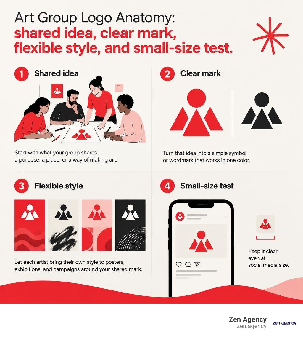
Start with what your group shares: a purpose, a place, or a way of making art. Turn that idea into a simple symbol or wordmark that works in one color and stays clear at social media size. Then let each artist bring their own style to posters, exhibitions, and campaigns around that shared mark.
A strong art group logo gives people a way to recognize the collective without making every member’s work look the same. The ideas below will help you find that balance.
I’m Joseph Riviello, founder and CEO of Zen Agency. For more than 22 years, I’ve helped organizations strengthen their online presence, and I’ll use that branding lens to show what makes an art group logo useful across channels.
What Distinguishes an Art Group Logo from Corporate Branding?
When designing for commercial enterprises, the primary goal is often market positioning, customer conversion, and straightforward commercial appeal. An art collective, however, operates on a fundamentally different axis. An art group is defined by creative synergy, philosophical alignment, and mutual cultural production rather than pure revenue generation.
While businesses prioritize uniform brand guidelines, art collectives must preserve the distinct voices of their individual members. A collective brand mark does not demand conformity; instead, it establishes an anchor for shared values and creative disruption. Understanding the psychology of branding and emotional connection helps clarify this difference: corporate logos build customer trust through predictability, whereas an art collective logo sparks intrigue through narrative depth and creative autonomy.
| Branding Dimension | Corporate Brand Identity | Art Collective Brand Identity |
|---|---|---|
| Primary Objective | Market recognition, lead conversion, brand equity | Philosophical expression, cultural dialogue, creative solidarity |
| Visual Framework | Rigid guidelines, strict color codes, uniform layouts | Modular frameworks, expressive textures, dynamic iterations |
| Voice & Tone | Standardized corporate voice and persona | Polyphonic expression celebrating diverse member styles |
| Longevity Model | Designed for sustained commercial stability | Evolves alongside artistic manifestos and cultural movements |
| Application Scope | Corporate stationery, packaging, product interfaces | Gallery banners, zines, screen-printed posters, digital avatars |
Historical Inspiration: How Iconic Collectives Mastered Visual Identity
Art history shows that memorable collectives build cohesive visual marks without stifling their members. Long before modern design software, historical avant-garde movements created emblems, woodblock stamps, and bespoke insignias that communicated their shared manifestos.
Exploring the art of bespoke logo design reveals that custom, concept-driven emblems hold enduring cultural value. When a group’s identity emerges from shared philosophy rather than transient trends, its visual mark resonates across generations.
Decoding Historical Marks: From Calcutta Group to Spiral Group and General Idea
Historic movements demonstrate how simple geometric and typographic choices can carry substantial political and cultural weight.
In 1940s India, the Calcutta Group formed amidst social upheaval, establishing a modern visual language that broke away from conservative academic traditions and reflected progressive values.
In 1960s America, the Spiral Group built a powerful legacy addressing the relationship between race, society, and creative expression. Formed by 15 Black artists ranging in age from 28 to 65—who initially contributed $50 each alongside a $10 monthly fee to secure their Greenwich Village space—the group selected an Archimedean spiral moving outward from a central point as their emblem. The symbol’s 15 distinct segments reflected each member’s voice, culminating in their historic 1965 exhibition First Group Showing: Works in Black and White.
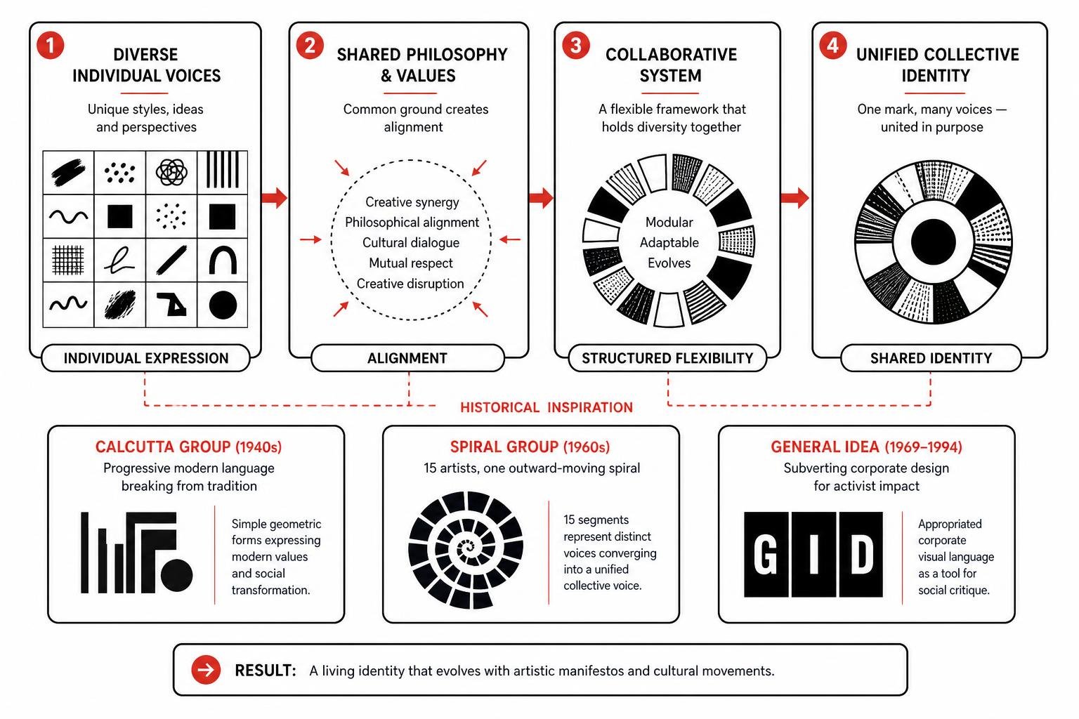
Decades later, the Canadian collective General Idea, founded in Toronto in 1969 and active until 1994, took a subversive approach by mimicking corporate branding. As highlighted in their major retrospective exhibition, the trio appropriated commercial layouts and public emblems for activist projects like IMAGEVIRUS, turning corporate design aesthetics into potent social critique.
Designing an Art Group Logo for Contemporary Performance and Activism
Modern collectives continue to redefine visual branding across dynamic physical and digital environments.
New York’s Big Art Group integrates real-time performance and multimedia, utilizing a visual identity that translates across theatrical staging, digital streaming, and experimental festivals. In activist circles, the Extinction Rebellion Art Group shares DIY design guidelines, providing open-source stencils and modular marks designed to be screen-printed on scrap fabric and recycled wallpaper.
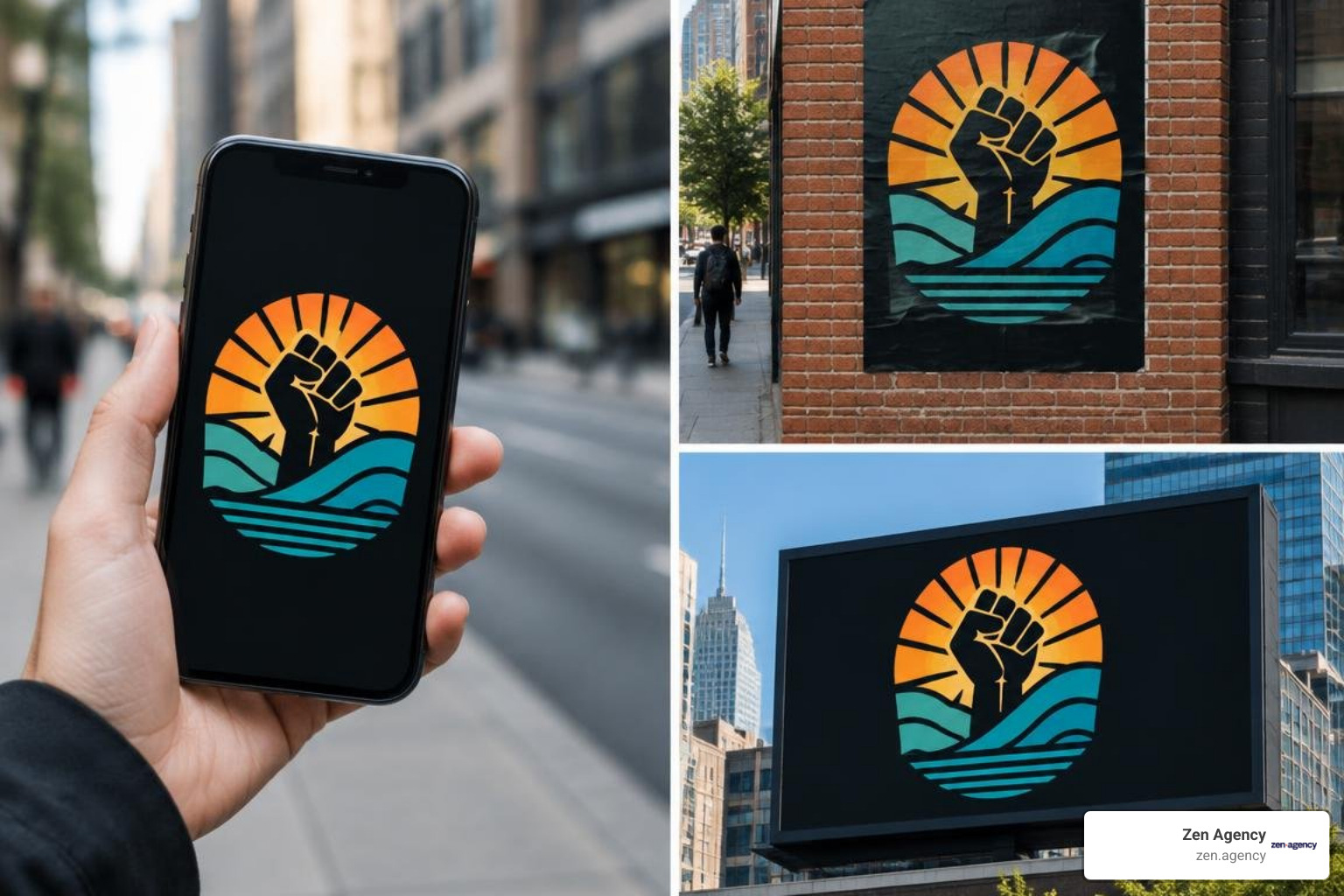
Similarly, Hamilton-based street-art team Clear Eyes Collective created a collaborative mural logo by passing canvases across provinces, demonstrating how collaborative philosophies can yield flexible, seasonal brand marks that retain their core structural integrity.
How to Build an Art Group Logo: A Step-by-Step Blueprint
Creating a unified emblem for several independent artists requires an organized, collaborative process. Following a strategic framework ensures all group members contribute while keeping the final design clear and functional.
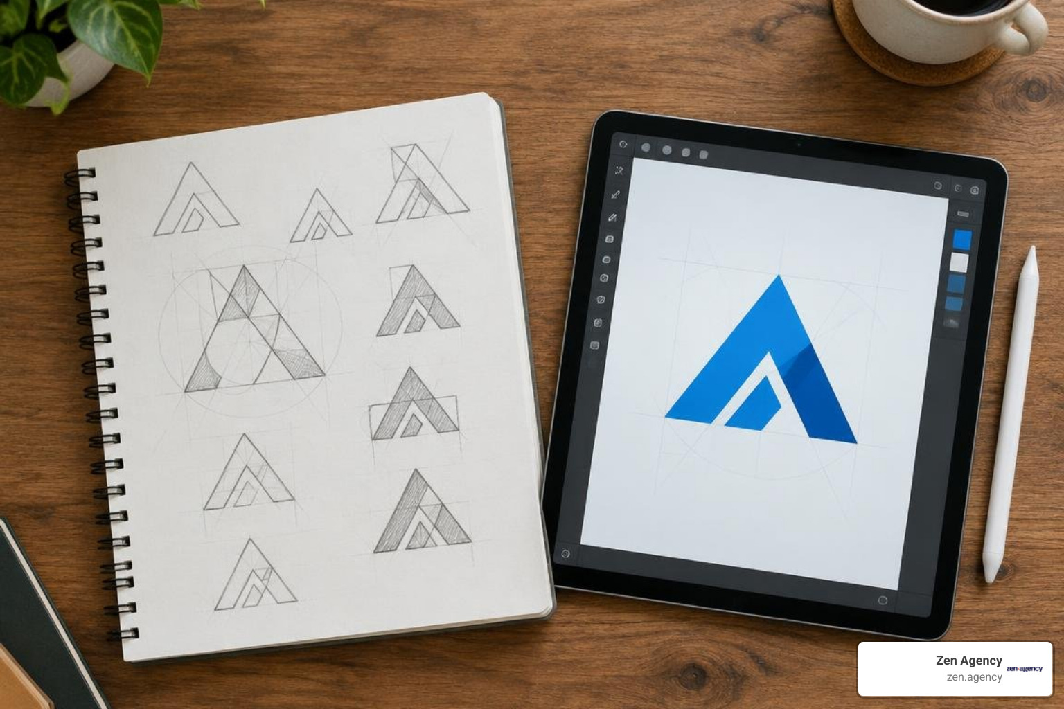
- Uncover Shared Principles: Host an initial discovery session to outline the collective’s core mission, medium, and aesthetic principles.
- Draft Loose Conceptual Sketches: Encourage each member to sketch raw geometric ideas, monograms, or symbolic motifs.
- Select Unified Directions: Group sketches into thematic clusters and vote on the strongest concepts.
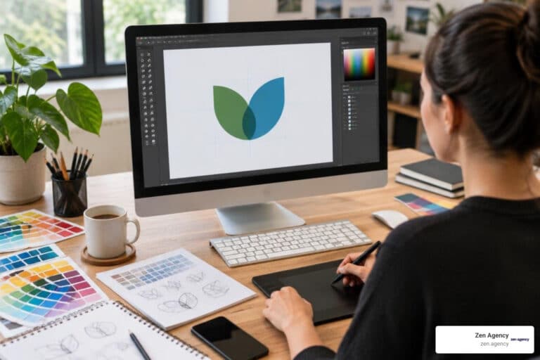
- Digitize into Scalable Vectors: Convert the chosen hand-drawn mark into a clean digital vector that scales smoothly.
- Test Across Mediums: Preview the mark on exhibition catalogs, social profile icons, screen-printed merchandise, and small gallery labels.
Investing in strategic brand identity design ensures your collaborative mark functions seamlessly as an operational asset for events, grants, and public exhibitions.
Essential Principles for Your Art Group Logo Design
A successful art collective logo balances visual clarity with conceptual resonance. Applying core logo design principles keeps your mark versatile:
- Geometric Simplicity: Minimalist forms reproduce reliably across screen-printing, embroidery, digital screens, and metal signage.
- Typographic Harmony: Pair clean, legible typography with expressive symbols to ensure group names remain readable at small scales.
- Monochrome Versatility: Design the primary mark in solid black and white before introducing color palettes.
- Conceptual Depth: Integrate subtle geometric or negative-space cues that reflect your geographic roots, medium, or artistic philosophy.
Balancing Handcrafted Expression with Digital Scalability
Art collectives often want to retain a raw, textured aesthetic without sacrificing digital clarity. You can maintain this handmade character while ensuring high-resolution digital fidelity:
- Vectorize Linework Carefully: Trace pencil, charcoal, or ink sketches into clean vector paths that retain expressive edges without creating overly complex anchor points.
- Build a Responsive System: Use a full lockup for exhibition banners, a compact wordmark for catalog headers, and a simplified glyph for social media avatars.
- Prioritize Versatile Reproduction: Ensure the mark remains legible across dark gallery walls, glossy programs, and digital feeds.
Applying high-impact graphic design strategies provides your collective with the visual polish needed to secure gallery representations and institutional partnerships.
Common Pitfalls in Collective Branding and How to Avoid Them
When multiple visual creators collaborate on a single brand mark, differing aesthetic opinions can lead to common design missteps:
- Overcomplicating the Symbolism: Trying to represent every individual member’s medium in a single mark results in a cluttered, unreadable design.
- Ignoring Functional Scalability: Highly detailed fine-art illustrations blur when scaled down to a mobile avatar or catalog footer.
- Relying on Fragile Color Dependencies: Designs that depend on subtle watercolor gradients or multi-tone shading lose their impact when printed in single-color formats.
- Neglecting Typography Legibility: Overly experimental display fonts can make the collective’s name unreadable to curators, collectors, and event attendees.
When internal aesthetic disagreements stall progress, working with professional logo design services provides objective creative direction to help unite your team around a cohesive design.
Frequently Asked Questions About Art Collective Logos
How do we choose colors that represent multiple artistic styles?
Establish a monochromatic base in black and white for your core mark. This gives you a neutral foundation that works across any exhibition poster, website, or catalog without clashing with the artwork on display. You can then introduce seasonal or exhibition-specific accent colors as needed.
How can a logo reflect diverse mediums like performance, painting, and digital art?
Focus on abstract geometric symbols or dynamic framing devices rather than literal tools like brushes or pixels. An open frame, dynamic geometric spiral, or bold typographic monogram represents collective momentum and accommodates different artistic mediums naturally.
How often should an art collective update its visual identity?
A collective’s core brand mark should remain stable for several years to build recognition with galleries, curators, and audiences. Instead of redesigning the primary logo frequently, create custom exhibition sub-marks, poster palettes, and event layouts for individual shows while keeping your central brand mark consistent.
Conclusion
A well-crafted brand mark unites independent creators under a shared vision while providing the flexibility needed for personal expression. By focusing on simple geometry, scalable typography, and thoughtful symbolism, your collective creates an identity that commands attention in galleries, community spaces, and digital platforms.
At Zen Agency, we help creative organizations and growing collectives build distinctive visual identities that stand out across channels. Explore our complete guide to mastering the elements of iconic logo design to start building your collective’s visual mark today.