Tips for Logo Design That Won’t Make Your Eyes Bleed
Why Your Logo Is the Most Important Visual Decision You’ll Make
The best tips for logo design can be the difference between a brand people remember and one they scroll past without a second thought. Here’s a quick breakdown of what makes a logo work:
Top Logo Design Tips (Quick Reference)
- Keep it simple — the best logos are easy to recall after a single glance
- Limit your colors — 95% of top brands use just one or two colors
- Choose readable fonts — legibility ranked as a top priority by professional designers
- Design in black and white first — color should come later, not drive the concept
- Make it scalable — your logo needs to work on a billboard and a favicon
- Avoid trends — timeless beats trendy every single time
- Test it on real people — even a small group of five users can surface major problems
- Match your audience — every design choice should reflect who you’re talking to
Your logo is usually the first thing a potential customer sees. It’s not just a pretty graphic — it’s your brand’s visual shorthand. According to surveys of professional graphic designers, memorability (44%), creativity (33%), and legibility (32%) are the top three attributes that separate great logos from forgettable ones. And over 70% of designers say establishing an emotional connection through logo design is important.
That’s a lot riding on one small image.
Yet many business owners rush the process, skip the strategy, or make choices that look fine today but age badly within two years. The result? A logo that works against the brand instead of for it.
I’m Joseph Riviello, CEO and Founder of Zen Agency, and with over 22 years of experience leading digital marketing strategy for businesses across industries, I’ve seen how the right tips for logo design can transform a company’s brand visibility and bottom line. In this guide, I’ll walk you through the core principles, practical steps, and common pitfalls — so you can build a logo that actually earns trust.
The Golden Rules of Effective Logo Design
When we sit down at Zen Agency to discuss brand identity, we always start with the “Golden Rules.” These aren’t just suggestions; they are the bedrock of design that lasts. In 2026, the noise in the digital marketplace is louder than ever. To cut through it, your logo must be simple, memorable, timeless, and appropriate.
Simplicity is perhaps the hardest rule to follow. Many founders feel the urge to “get their money’s worth” by packing every detail of their business into one icon. If you’re a plumber, you don’t need a logo with a pipe, a wrench, a drop of water, and a house. A simple, clean mark is much easier for the human brain to process and recall. In fact, a really simple logo can often be recalled after as little as a brief glance.
Appropriateness is equally vital. A law firm shouldn’t use a bright pink, bubbly font, just as a children’s toy store shouldn’t use a cold, sharp geometric emblem. Your logo needs to “feel” like your industry. This is where Beyond Moodboards: Mastering the Brand Identity Design Process comes into play—it’s about moving past surface-level aesthetics to find the soul of the brand.
According to 10 Logo Design Tips from Professional Designers in 2026, one of the most effective ways to ensure your design sticks is to focus on a single “hook”—one unique element that makes the mark stand out without overcomplicating it.
Fundamental Tips Logo Design for Memorability
What makes a logo “iconic”? When graphic designers are surveyed, they consistently point to Coca-Cola (59%), Apple (58%), and McDonald’s (50%) as the gold standards. Within the tech world, Apple is the undisputed heavyweight, winning 80% of the vote for the most memorable tech logo.
Why does Apple win? It isn’t because they have the most complex illustration. It’s because of the emotional connection and the sheer simplicity of the silhouette. Interestingly, 87% of designers prefer Apple’s logo to that of Android, and 89% still prefer the old Twitter bird to the “X” branding.
To achieve this level of memorability, you must focus on the 44% stat: Designers rank memorability as the single most important attribute of a logo. This is often achieved through:
- Distinctive Shapes: Faces and unique silhouettes are recognized faster than words.
- Emotional Resonances: Using colors and shapes that trigger specific feelings (like trust or excitement).
- Clever Use of Negative Space: Think of the hidden arrow in the FedEx logo. It creates a “eureka” moment that cements the brand in the viewer’s mind.
Choosing the Right Type: From Wordmarks to Emblems
Not all logos are created equal. Depending on your business name, age, and industry, one specific type of logo will likely serve you better than others. Understanding these categories is essential for Your Brand, Your Rules: A Guide to Custom Identity Design.
| Logo Type | Description | Best For… | Example |
|---|---|---|---|
| Wordmark | Text-only, focusing on a unique typeface. | Short, distinctive names. | Google, Coca-Cola, Visa |
| Lettermark | Monogram based on initials. | Companies with long or clunky names. | IBM, NASA, HBO |
| Pictorial Mark | An icon or graphic-based logo. | Brands that are already well-established. | Apple, Twitter (Bird), Target |
| Abstract Mark | A geometric shape that represents the brand. | Global brands wanting a unique symbol. | Pepsi, Adidas, BP |
| Mascot | An illustrated character. | Family-friendly or service-oriented brands. | KFC, Pringles, Kool-Aid |
| Combination Mark | A mix of a wordmark and a symbol. | Startups needing name recognition. | Lacoste, Burger King, Doritos |
| Emblem | Font inside a symbol or icon (seal-like). | Schools, government, or “heritage” brands. | Starbucks, Harley-Davidson |
When to Use Abstract vs. Literal Marks
A common question we hear is: “Should my logo show exactly what I do?” Usually, the answer is no. Symbols don’t show what you do; they make it clear who you are.
The Nike swoosh doesn’t look like a shoe. It represents movement and speed. Literal symbols (like a literal hammer for a carpenter) can actually limit a business if they decide to expand their services later. Abstract marks are often more enduring and allow for global scalability because they don’t rely on language-specific puns or cultural icons that might not translate well.
For startups, we often recommend a Combination Mark. This gives you the “best of both worlds”—a symbol to build visual recognition and a wordmark to ensure people actually know the name of your new company.
Psychology of Color and Typography in Logo Design
Colors aren’t just about what looks “cool.” They are powerful psychological triggers. Research shows that people form a judgment about a product within 90 seconds, and between 62% and 90% of that judgment is based on color alone.
Here is how designers in 2026 view color psychology:
- Blue: Trust, tranquility, and stability. Used by 33% of top brands (e.g., PayPal).
- Red: Strength, power, and hunger. Used by 29% of brands (e.g., Netflix, Coca-Cola).
- Green: Eco-friendly, sustainable, and growth. (86% of designers associate it with sustainability).
- Black: Sophistication, luxury, and authority.
- Yellow/Gold: Optimism and warmth.
A professional tips logo design secret is the 60-30-10 rule: 60% of your brand palette should be a primary color, 30% a secondary/complementary color, and 10% an accent color. Also, 95% of the world’s most successful brands use only one or two colors. Don’t turn your logo into a rainbow unless you’re selling crayons.
According to How to Design the Perfect Logo for Your Startup in 2026 | Designhill, startups should always identify what their color communicates before they start picking shades.
Typography Trends and Brand Perception
Your choice of font is the “voice” of your logo. In 2026, the trend is leaning heavily toward clean, geometric sans-serif fonts.
- Helvetica (41%), Futura (39%), and Montserrat (34%) are the top three favorites among professional designers.
- Cursive is on the way out. Roughly 20% of designers now suggest brands move away from cursive or script logos, as they can be difficult to read on small mobile screens.
- Uppercase vs. Lowercase: Uppercase conveys authority and stability; lowercase feels more approachable and modern.
Always ensure you have the proper font licensing. Using a “free” font you found on a random website for a commercial logo can lead to expensive legal headaches down the road.
Essential Tips Logo Design for Versatility and Scalability
A logo might look stunning on your 27-inch 5K monitor, but does it still work when it’s a tiny favicon in a browser tab? Or when it’s embroidered on the left chest of a polo shirt?
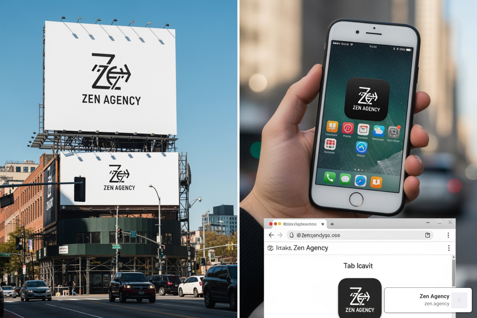
This is where scalability and versatility become the “make or break” factors. Professional designers always work in vector formats (AI, EPS, or SVG). Unlike raster images (JPG, PNG), vectors can be scaled to the size of a skyscraper without losing a single pixel of clarity.
Another major trend in 2026 is debranding. Over 30% of designers have “debranded” a logo in the past year—this means stripping away 3D effects, gradients, and shadows to create a flatter, simpler version that performs better on digital platforms. If your logo relies on a complex drop shadow to be readable, it’s not a good logo.
To ensure your brand stays consistent as you grow, you should document these rules. Check out The Ultimate Guide to Brand Guideline Creation to see how to protect your logo’s integrity across different media.
Designing for Digital and Print Platforms
One of the most common (and expensive) mistakes is designing only for the screen. Screens use RGB (Red, Green, Blue) light, while printers use CMYK (Cyan, Magenta, Yellow, Key/Black) ink. A vibrant neon blue on your screen might turn into a dull, muddy navy when printed on a business card.
Pro tips logo design for versatility:
- The Black and White Test: If your logo doesn’t work in pure black and white, it fails. You will eventually need to print it on a monochrome receipt or a faxes (yes, some people still use those).
- Negative Space: Use the space around your logo to your advantage. The FedEx arrow is the gold standard here, but you can also use negative space to create balance and “breathing room.”
- Social Media Readiness: Your logo needs a version that fits perfectly into a circle or square for profile pictures.
The Professional Workflow: Tools, Testing, and Finalization
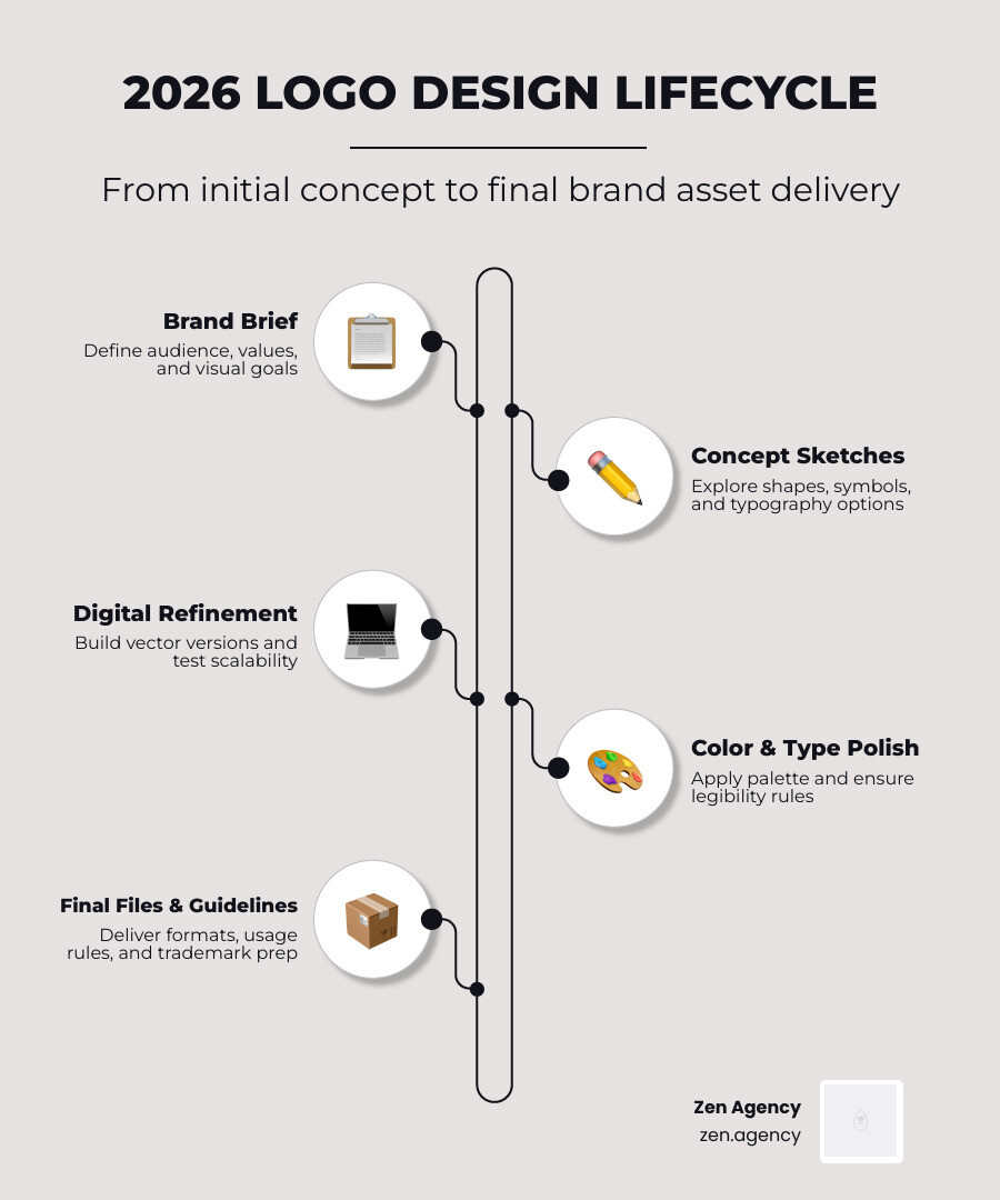
How do the pros do it? They don’t just open a laptop and start clicking. The most successful logos start with a pencil and paper. Sketching allows for “perfectionism-free” brainstorming where ideas can flow without the constraints of software.
Once a concept is chosen, it moves to digital development. While tools like Canva or AI-powered logo makers are popular for beginners or small businesses, they often produce “formulaic” results that lack the unique personality of a custom design. For a professional result, Adobe Illustrator remains the industry standard.

According to How to make a business logo in 2026: Logo design tips | GoDaddy Blog, you should spend at least 20-30 minutes on pre-design brainstorming before ever touching a digital tool.
Iterative Tips Logo Design for Final Refinement
Once you have a design you love, don’t finalize it yet.
- User Testing: Show it to a small group of people who aren’t your family. Ask them what industry they think the company is in and how the logo makes them feel.
- Avoid Committee Design: While feedback is good, trying to please everyone (your spouse, your neighbor, all 20 employees) will result in a generic, “watered-down” design.
- Trademarking: Before you print 10,000 boxes, check the USPTO database to ensure you aren’t infringing on someone else’s mark.
When the project is done, ensure you receive a full “logo pack” including:
- Vector files (AI, EPS, SVG)
- High-resolution raster files (PNG with transparent background, JPEG)
- Color, Grayscale, and Reversed (white) versions
Frequently Asked Questions about Logo Design
What is the most important attribute of a logo in 2026?
According to professional designers, memorability (44%) is the top attribute, followed by creativity and legibility. In a world of infinite scrolling, being “sticky” in the consumer’s mind is the ultimate goal.
How many colors should a professional logo use?
Stick to one or two colors. 95% of top brands follow this rule. Using more than three colors often makes a logo look cluttered, unprofessional, and significantly increases printing costs.
Should a logo literally show what a business does?
Not necessarily. In fact, it’s often better if it doesn’t. Abstract marks (like the Nike Swoosh or the Apple apple) are more enduring. Symbols should represent the identity and values of the brand, not just a literal inventory of your products.
Conclusion
A great logo is more than just a mark; it’s the anchor of your entire brand world. It should be the starting point for a cohesive strategy that spans your website, your social media, and your physical marketing materials.
At Zen Agency, we specialize in helping businesses move beyond just a logo to create a lasting impact. Whether you’re in Scranton, Billings, or anywhere across the USA, we understand that “enterprise-grade” branding is about more than just looking pretty—it’s about driving ROI and building a legacy.
If you’re ready to stop making “eyes bleed” and start making an impression, check out our guide on How to Build a Brand That Lasts: A Step-by-Step Strategy Guide or Ready to elevate your brand? Explore our professional branding and graphic design services. Let’s build something iconic together.