A Visual Guide to Water Company Logo Styles That Stand Out
Water Company Logo Ideas That Build Trust at First Glance
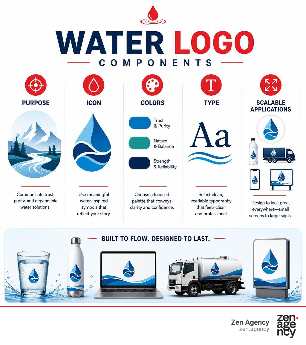
An effective logo for water company branding should be simple, clear, and built around the promise your customers care about most: clean water, dependable service, or responsible stewardship. Start with a focused palette of two or three colors, readable type, and one distinctive visual idea – such as a droplet, wave, mountain source, leaf, or engineered flow line.
The strongest water logos do more than look aquatic. They match the business:
- Drinking water brands can signal purity, source, and premium quality.
- Water treatment companies need to feel precise, reliable, and technically capable.
- Utilities should prioritize trust, visibility, and local connection.
- Recreation brands can use more movement, energy, and coastal character.
Blue remains a natural choice for cleanliness and calm, while navy can add authority and green can support an environmental message. But avoid the generic blue droplet alone. A recognizable logo needs a point of view that competitors cannot easily copy, then must stay legible on a bottle label, phone screen, truck, invoice, and large sign.
I am Joseph Riviello, CEO and Founder of Zen Agency, with more than 22 years of experience helping companies grow through connected digital marketing and brand strategy. In the sections ahead, I will break down the visual directions that can make a logo for water company feel clearer, more credible, and easier to remember.
Logo for water company vocab to learn:
7 Distinct Visual Styles for a Logo for Water Company
When developing a brand identity in the water sector, selecting the right visual style sets the stage for everything from customer trust to shelf appeal. Different sub-sectors require distinct visual languages.
| Logo Style | Core Visual Elements | Best Suited For | Key Customer Perception |
|---|---|---|---|
| Minimalist Droplet | Clean monoline, geometric tear shapes, negative space | Purified water, boutique delivery, tech filtration | Modern, pure, uncomplicated |
| Dynamic Wave | Hydrodynamic curves, crests, fluid currents | Mineral water, hydration beverages, sports recreation | Active, refreshing, revitalizing |
| Natural Source Badge | Mountain silhouettes, aquifers, enclosed emblems | Natural spring water, regional bulk delivery | Authentic, pristine, untamed |
| Technical Geometric | Hexagons, angular grids, filtration cross-sections | Commercial water treatment, engineering systems | Precise, reliable, scientific |
| Eco Botanical Hybrid | Droplets fused with leaves, dual-tone blue/green | Watershed management, sustainable utilities | Ecological, responsible, forward-thinking |
| Typographic Glyph | Custom letterforms with wave stems or drop counters | Modern direct-to-consumer hydration brands | Contemporary, established, polished |
| Civic Heritage Emblem | Aqueduct arches, historic masonry, municipal shields | Public water authorities, regional utilities | Trustworthy, permanent, dedicated |
1. Minimalist Droplet and Monoline Icons
The spherical symmetry of a water droplet is a natural starting point, but generic executions often fail to leave an impression. Modern minimalism elevates the droplet using precision geometry, monoline line weights, and negative space.
By employing the art of bespoke logo design for modern businesses, an iconic droplet becomes an intellectual puzzle that resolves instantly in the viewer’s mind. Utilizing surface tension principles—where lines curve seamlessly into circular nodes—communicates molecular purity and balance. Minimalist monoline droplets excel in digital mediums, scaling down smoothly to 16×16 pixel favicons without visual breakdown.
2. Dynamic Wave and Fluid Flow Concepts
Where droplets imply stillness and purity, wave motifs introduce kinetic motion and vitality. Dynamic wave layouts utilize sweeping, hydrodynamic arcs that draw the viewer’s eye across the brand mark.
For hydration drinks, sparkling water lines, and aquatic service providers, fluid flow concepts convey natural energy. Layering two or three overlapping wave ribbons in complementary shades of azure and cerulean generates depth without resorting to dated, muddy 3D gradients.
3. Natural Source and Geographic Badges
If your company distributes natural spring or artesian well water, provenance is your strongest value proposition. Badge-style logos that incorporate geological formations—such as mountain peaks, forest watersheds, or deep rock strata—ground the brand in its physical origin.
When applying these designs, mastering packaging design 101 learn the basics ensures the badge sits cleanly on curved bottle labels and cardboard cartons. Enclosed circular or shield badges provide high versatility, keeping intricate nature elements neatly contained across both light and dark backgrounds.
4. Technical and Engineering Geometric Marks
Commercial filtration providers, desalinization outfits, and industrial treatment operators require a visual identity rooted in precision, mechanics, and physical chemistry.
These designs favor clean structural geometry: hexagonal molecular models, stylized pipe junctions, clean cross-sections, and directional line grids. As detailed in the BRAND STANDARDS MANUAL of established utilities, angular lines can convey forward-moving operational energy, while steady horizontal base bars signal structural stability and uninterrupted supply.
5. Eco-Conscious Botanical and Leaf Hybrids
Water management and environmental preservation go hand in hand. Eco-conscious water operations frequently utilize hybrid marks that fuse aquatic shapes with botanical elements—such as a single droplet transforming into a sprout or an oak leaf forming half of a water ripple.
This style leverages a balanced dual-tone palette (deep aquatic blue alongside vivid leaf green). It communicates a commitment to conservation, ESG standards, and circular resource protection, appealing to eco-minded residential households and commercial partners alike.
6. Typographic Wordmarks with Integrated Glyphs
A purely typographic solution delivers immediate clarity, especially when paired with clever glyph substitutions. This approach involves taking a robust sans-serif or geometric serif typeface and modifying a specific character—such as turning the crossbar of an ‘A’ into a fluid wave, or utilizing a water droplet within the counter of a ‘P’ or ‘O’.
Adopting your brand your rules a guide to custom identity design allows an organization to own a distinct typographic footprint. Custom wordmarks reduce visual clutter by combining the symbol and the company name into a unified, high-impact mark.
7. Heritage Architectural and Civic Emblems
Public water utilities and regional authorities often carry decades or centuries of public service. Rather than chasing modern design fads, these organizations benefit from heritage-driven emblems that showcase historic water architecture, such as aqueduct arches, reservoir towers, and municipal crests.
As shown in the historical approach of the BRAND BOOK, weaving architectural legacy into an emblem transforms a basic utility into an essential public institution. These marks project permanence, safety, and community guardianship.
Color Psychology and Typography in Aquatic Branding
Color selection in the water sector directly affects consumer perception of safety, hydration, and corporate reliability.
- Primary Blue (PMS 638 / Cyan / Azure): Represents crisp clarity, freshness, and immediate hydration. Ideal for residential delivery and premium bottled water.
- Deep Navy (PMS 7700 / Midnight): Communicates institutional authority, industrial stability, and operational security. Essential for utilities and engineering contractors.
- Botanical Green (PMS 360 / Grass / Forest): Evokes environmental stewardship, watershed health, and sustainable resource management.
- Cool Slate and Crisp White: Serves as high-contrast structural support, keeping layouts clean, uncluttered, and modern.
When organizing typography, readability is critical. Primary logotypes should utilize robust geometric sans-serif typefaces (such as Proxima Nova or Avenir) to maintain legibility on utility fleet trucks and small bottle caps.
Public compliance standards also matter: as highlighted in the BRAND GUIDELINES JULY 2021, digital and print water service designs should maintain a minimum 4.5:1 color contrast ratio to comply with WCAG AA accessibility standards across invoices and notices.
Tailoring Water Logos Across Key Industry Sub-Sectors

A single visual approach does not fit every water-related organization. Crafting an effective identity means aligning the visual tone with the core expectations of your target audience.
Drinking Water and Premium Bottled Brands
For consumer beverage brands, shelf presence is paramount. Bottled water branding must communicate mineral composition, natural source purity, or enhanced alkalinity within a fraction of a second.
Applying the ultimate guide to creating a box packaging layout that pops helps ensure the primary logo locks up seamlessly with mandatory nutritional labels, volume callouts, and outer carton packaging.
Commercial Water Treatment and Filtration Services
B2B clients, property managers, and manufacturing facilities evaluate water treatment providers on technical competence. These logos should avoid whimsical illustrations, favoring solid engineering marks, crystalline filtration geometry, and clean lettering.
As outlined in the Style Guide for enterprise water solution providers, integrating subtle droplet motifs into structured, architectural typefaces projects technological innovation and long-term durability.
Public Utilities and Municipal Water Infrastructure
Public water authorities need identities that project trust, transparency, and round-the-clock reliability. Organizations like American Water | We Keep Life Flowing focus on clean, high-visibility branding that can be recognized instantly on field uniforms, service trucks, billing statements, and treatment plants.
Critical Execution Rules for Water Brand Identities
Even a visually stunning concept will fail if it cannot scale across physical and digital operational touchpoints. Implementing comprehensive brand identity design requires establishing strict application rules.
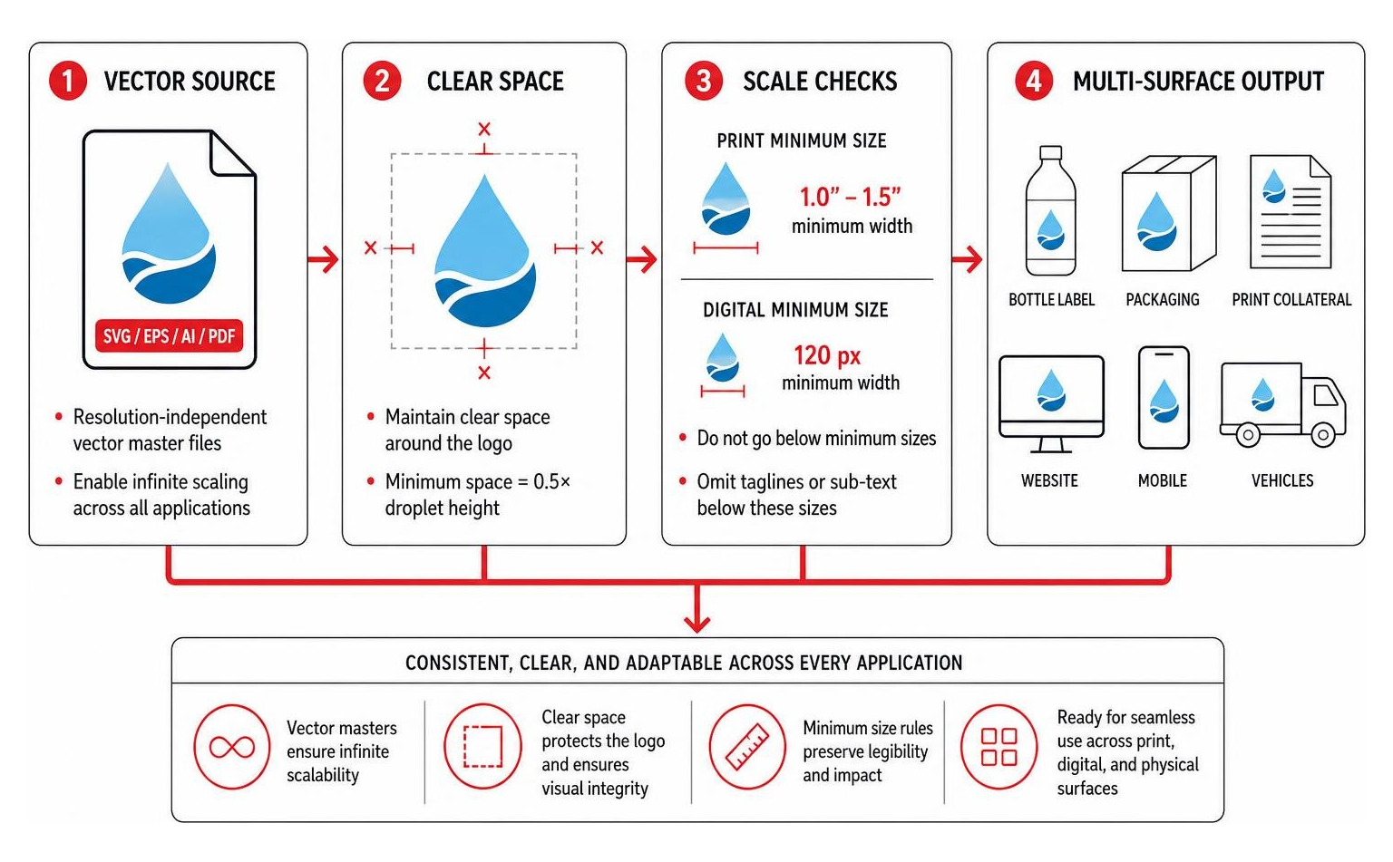
Designing an Adaptable Logo for Water Company Across Media Formats
To preserve clarity across diverse applications, every water brand identity should enforce the following standards:
- Vector File Formats: All brand master files must be built in resolution-independent vector formats (SVG, EPS, AI, PDF) to enable infinite scaling from pens to water towers.
- Defined Clear Space: Establish an unencumbered buffer zone around the logo—typically equal to half the height of the primary droplet or logotype mark—to prevent surrounding graphics from encroaching.
- Minimum Reproduction Sizes: Define exact minimum sizes for print (e.g., 1.0 to 1.5 inches wide) and digital screens (e.g., 120 pixels wide) below which taglines or secondary sub-text must be omitted to preserve legibility.
- Fleet and High-Vis Applications: Provide dedicated solid black, solid white, and two-color reverse variations to guarantee high visibility across utility truck doors, heavy machinery, and field safety apparel.
Common Mistakes When Creating a Logo for Water Company
- Relying on Generic Clip-Art: Utilizing stock droplet shapes makes a brand indistinguishable from thousands of competitors and creates trademark hurdles.
- Overusing Soft Color Gradients: Multi-tone gradients often turn muddy and unreadable when silkscreened onto uniform shirts or printed on low-grade paper invoices.
- Visual Overcrowding: Combining waves, mountains, sunbursts, and pipes into a single icon produces visual clutter that breaks down at small sizes.
- Ignoring Professional Help: Partnering with a dedicated agency helps avoid trademark infringements; learning how logo design services can help you to find reliable logo designers protects your investment from day one.
Frequently Asked Questions About Water Company Logo Design
What colors work best for a water company logo?
A palette consisting of primary cyan or azure paired with deep navy blue, crisp white, and an optional botanical green accent provides optimal balance. This combination balances freshness, authority, and sustainability while ensuring strong contrast.
How do you convey water purity and trust visually?
Purity is communicated through minimalist geometric balance, generous negative space, refined line weights, and uncluttered typography. Avoiding overly complex illustrations reinforces transparency and reliability.
What file formats are essential for water utility and fleet branding?
Organizations need scalable vector formats (EPS, AI, PDF) in CMYK color modes for commercial printing and vehicle wraps, alongside high-resolution RGB transparent PNG and SVG files for web and software applications.
Conclusion
A successful water company logo bridges the gap between natural purity and technical reliability. By balancing clean visual concepts, disciplined color palettes, and scalable vector assets, your organization can build an identity that commands respect from residential tap to commercial plant.
At Zen Agency, our branding specialists develop comprehensive visual identities and digital strategies that help businesses establish market authority. Discover the power of logo design what makes a great logo and let our team craft a distinctive, enduring brand for your business.