The Ultimate Guide to What Makes a Great Logo: Design Principles
Defining the Role: Logo vs. Brand vs. Brand Identity
To build a brand mark that drives recognition, you first need to understand where a logo sits within your broader business strategy. Business owners frequently mix up terms like “brand,” “brand identity,” and “logo,” treating them as interchangeable. Separating these concepts helps clarify why a logo works, how it functions, and why investing in a custom design is worth the effort.
A brand is ultimately the customer’s gut perception of your business. It is the emotional sum of their interactions with you, from customer service to product quality. While you cannot completely control a person’s feelings, you can influence them through a clear brand strategy and strategic positioning.
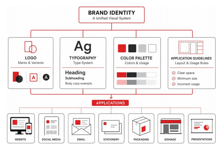
Your brand identity is the deliberate toolkit of visual and sensory elements you create to shape those perceptions. It includes your color palettes, typographic hierarchies, image styles, tone of voice, and layout systems.
A logo, by contrast, is the primary mark of identification within that identity system. Think of your logo as the signature emblem at the bottom of a contract or the period at the end of a sentence. It doesn’t tell the entire story on its own; instead, it provides a distinctive point of recognition that anchors everything else. When you partner with a digital branding agency, you align this anchor with a comprehensive market strategy.
Distinguishing Identity from Strategy
Understanding these distinctions prevents a common pitfall: expecting your logo to bear the entire burden of your messaging.
A logo does not need to explain your company history, list your services, or spell out your mission statement. Its core job is identification first, communication second.
When you anchor your brand identity design in a clean logo mark, you give your target market an immediate visual shorthand. Over time, every positive experience a customer has with your business accumulates behind that icon, building long-term equity.
Fundamental Qualities of What Makes a Great Logo
While design preferences vary across industries, every successful logo design shares four foundational qualities:
- Distinctiveness: It stands apart from market competitors and avoids tired clichés.
- Appropriateness: Its visual tone matches the expectations and values of the target audience.
- Durability: It stays relevant for decades rather than expiring as design trends change.
- Simplicity: It relies on clean, uncluttered aesthetics that process instantly in the human brain.
Why Simplicity is Key to What Makes a Great Logo
If there is a golden rule in graphic design, it is that simplicity wins. Great designers don’t look for what they can add to a brand mark; they look for what they can strip away.
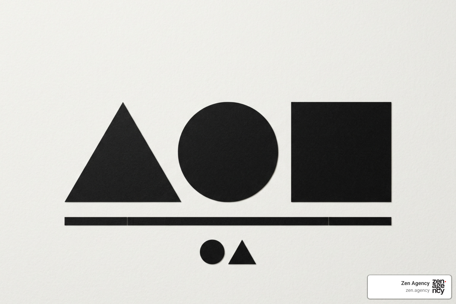
When someone scrolls through a social feed or drives past a sign, you may have only half a second to capture their attention. A cluttered design with multiple fonts, complex drop shadows, and overlapping gradients creates visual noise that the brain quickly ignores.
To test if a mark has achieved proper visual restraint, designers often use the sketch test:
- Show your proposed logo to a neutral viewer for 10 seconds.
- Hide the image.
- Ask them to draw it on a piece of paper from memory.
If they can easily sketch the basic geometric outline and key visual features, your design is simple and memorable. If they struggle to recall the main shapes, the mark is likely over-complicated and needs refinement.
The Role of Versatility in What Makes a Great Logo
Modern logos must perform across a vast range of physical and digital environments. A design that looks stunning on a large desktop display is useless if it turns into an illegible blur when scaled down to a 16×16 pixel browser favicon or a tiny circular app icon.
To achieve total versatility, your logo must be built with strict technical standards:
- Vector SVG Format: Always design logos in vector software (such as Adobe Illustrator) rather than raster formats (like JPGs or PNGs). Vector files rely on mathematical paths, allowing the artwork to scale infinitely from a business card to a highway billboard without losing sharpness.
- Monochrome Rendering: A great logo must work in pure black and white. If your design relies entirely on complex color gradients to differentiate its shapes, it will fail when applied to single-color media, such as embroidery, laser etching, or screen printing.
- Dark Mode and Light Mode: Test your mark across high-contrast environments. Ensure it remains visible whether displayed against a crisp white website background or a dark mode mobile interface.
Essential Visual Elements and Design Psychology
Creating a logo that captures audience trust requires a foundational understanding of graphic design principles. Every line, curve, color, and font choice carries psychological weight that subtly shapes consumer perception.
Good designers use visual balance to create harmony across an asset. Contrast ensures that essential elements stand out, while visual hierarchy guides the viewer’s eye along a logical path. When applied intentionally, these elements turn standard geometry into a compelling narrative, a process detailed in our overview of bespoke logo design.
Color Psychology and Visual Tone
Color is often the first visual trigger our brains process, with studies showing that up to 90% of initial product assessments are based on color alone. Furthermore, consumers form subconscious opinions about a visual layout within 90 seconds. Selecting the right color scheme is essential for communicating brand character.
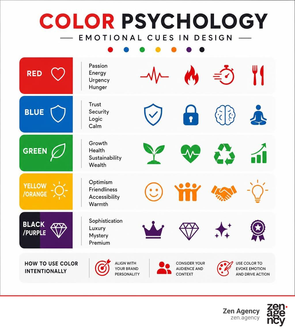
- Red: Passion, energy, urgency, and hunger. Frequently used in food service and high-energy retail.
- Blue: Trust, security, logic, and calm. The standard choice for financial institutions, law firms, and tech platforms (though often avoided in food branding due to its appetite-suppressing qualities).
- Green: Growth, health, sustainability, and wealth. Ideal for eco-friendly products, organic food, and financial services.
- Yellow/Orange: Optimism, friendliness, accessibility, and warmth. Captures quick attention without the high pressure of red.
- Black/Purple: Sophistication, luxury, mystery, and premium positioning.
When structuring color palettes, consider using either an analogous color scheme (colors adjacent to each other on the color wheel for a harmonious feel) or a complementary color scheme (colors opposite each other for high visual contrast).
From a technical standpoint, ensure your designer tests your chosen palette in both RGB (the screen color space) and CMYK (the four-color printing process). Colors that pop vibrantly on a backlit display can appear dull in print if not mapped correctly using standardized Pantone matching systems.
Shape Symbolism and Typography Selection
Shapes carry inherent emotional associations:
- Circles and Ovals: Signal community, unity, friendship, and approachability.
- Squares and Rectangles: Communicate stability, discipline, efficiency, and trust.
- Triangles and Sharp Angles: Represent movement, direction, power, and leadership.

Typography adds another layer of personality before a customer reads a word of your text:
| Font Category | Tone & Characteristics | Ideal Industry Applications |
|---|---|---|
| Serif | Traditional, authoritative, formal, dependable | Finance, legal, luxury, publishing |
| Sans-Serif | Modern, clean, accessible, efficient | Technology, startups, modern retail |
| Handwritten / Script | Personal, creative, bespoke, elegant | Boutique fashion, beauty, artisanal goods |
| Geometric Display | Bold, structured, innovative, impactful | Sports, entertainment, architectural firms |
Limit your logo to a maximum of one or two complementary fonts. Pairing too many competing type styles creates visual clutter that harms legibility at small sizes.
How to Evaluate and Test Your Logo Design
Once you have initial concepts, evaluate them objectively rather than relying on personal taste. Remember: your logo should appeal to your target market, not just your personal preferences.
Review guidelines from the U.S. Chamber of Commerce on business logo elements and build comprehensive brand assets using our guide to brand guideline creation.
Evaluation Checklist for Small Businesses
Run your logo drafts through this quick performance evaluation:
- [ ] Legibility Test: Is the business name easy to read in 0.5 seconds?
- [ ] Scale Test: Does the icon retain its clarity when sized down to a 16×16 pixel favicon?
- [ ] Monochrome Test: Does the mark maintain its visual impact in solid black and white?
- [ ] Trademark Safety: Have you performed reverse image searches and regional business registry checks to ensure the mark doesn’t infringe on existing brand assets?
- [ ] Orientation Test: Does the design maintain a professional look when rotated or applied to unconventional layouts?
| Effective Logo Traits | Red Flag Design Flaws |
|---|---|
| Scalable vector paths (SVG, EPS) | Complex raster artwork (JPG, PNG master files) |
| 1–2 legible typography styles | 3+ competing decorative fonts |
| Distinctive, ownable silhouette | Overused, clichéd stock iconography |
| High-contrast light & dark modes | Low-contrast or muddy color pairings |
| Functional in solid black and white | Reliance on heavy dropshadows or gradients |
Common Logo Design Mistakes to Avoid
Even well-funded businesses make critical design errors when building or updating their visual identity. Avoid these common traps:
- Chasing Short-Term Trends: Designing around passing fads (like skeuomorphic shadows, neon glassmorphism, or hyper-specific font trends) guarantees your logo will look dated in three to five years. Aim for timeless simplicity.
- Over-Complicating Meaning: Trying to weave five different subtle metaphors into a single icon results in visual noise. Focus on one clear idea.
- Font Frenzy & Spacing Errors: Mixing multiple decorative fonts or crowding elements without negative space makes artwork look amateurish. Give your design breathing room.
- Copycat Syndrome: Mimicking a dominant market competitor might feel safe, but it robs your company of distinction and can lead to legal complications.
- Neglecting Context: Designing a logo in isolation on a white screen without testing it on actual touchpoints—like vehicle wraps, packaging, or dark social headers—leads to costly redesigns later.
Investing in professional design upfront saves money over time. Rebranding due to poor planning means replacing physical signage, digital assets, apparel, and print marketing—costs that far outweigh doing it right the first time. For a deeper breakdown of budgeting for quality branding, read our analysis on why good branding is worth every penny.
Frequently Asked Questions About Logo Design
What is the primary purpose of a logo in branding?
The primary purpose of a logo is identification. It acts as a visual shorthand that allows customers to quickly identify, recognize, and distinguish your business from competitors. While it can convey tone and personality, its main function is to anchor your brand identity so that long-term trust and customer experiences can accumulate behind a single mark.
Does a logo need to show what a company actually does?
No, a logo does not need to show what your business sells. A shoe company does not need a shoe in its logo, nor does a tech brand need a computer icon. In fact, literal interpretations often result in generic visual clichés. A great logo uses abstract shapes, symbols, or styled typography to evoke a feeling and signal identity, leaving the details of your service offerings to your broader marketing materials.
How can small businesses create an effective logo on a budget?
Small businesses can create professional, budget-friendly logos by embracing strategic minimalism. Focus on a clean wordmark or lettermark paired with a strong, legibly styled font rather than attempting complex illustrations. Prioritize high contrast, keep color choices simple (1-2 colors max), and ensure your designer provides vector master files (SVG or EPS). Investing in a simple, well-crafted mark protects your growing business from needing expensive rebrands down the road.
Conclusion
A great logo is an invaluable business asset that serves as the visual cornerstone of your growth strategy. By grounding your mark in simplicity, distinction, appropriateness, versatility, and durability, you create a timeless signature that earns customer trust and withstands shifting market trends.
At Zen Agency, we have spent over 18 years developing enterprise-grade solutions for businesses seeking to scale visibility and ROI. Whether you are launching a new enterprise or updating an existing visual identity, our team delivers complete branding systems built for long-term growth.
Explore our custom branding and graphic design services to discover how strategic design can transform your business identity today.