Designing and Coding for Full ADA Web Compliance
ADA Accessible Web Development Starts With Usability
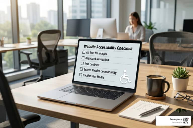
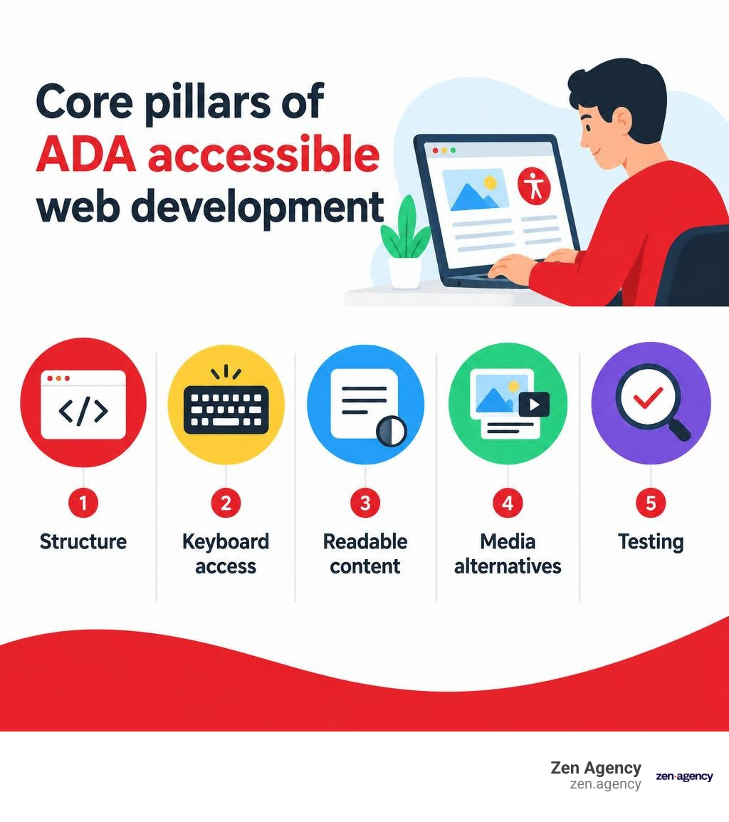
To build an accessible website, start with semantic HTML, keyboard-friendly controls, visible focus, readable contrast, and clear form labels. Add useful text for images, captions for videos, and error messages people can understand. Then test key tasks with a keyboard, a screen reader, and automated tools. No single tool can confirm that every visitor can use your site.
These steps help people with disabilities use your services and help your team catch barriers before they affect customers. The legal requirements and the right WCAG target depend on your organization, so treat accessibility as an ongoing part of design and development, not a one-time checklist.
I’m Joseph Riviello, founder and CEO of Zen Agency. My 22 years in digital marketing have taught me to look at the whole customer journey; this guide applies that approach to ADA accessible web development, from the first design choice through testing and upkeep.
ADA accessible web development vocabulary:
Legal Foundations and WCAG Standards for ADA Compliance
Passed in 1990, the Americans with Disabilities Act ensures that individuals with disabilities enjoy equal access to public life. While the initial legislation focused on physical spaces like ramps and automatic doors, digital spaces are now recognized as primary venues for commerce, education, and civic engagement. Inaccessible websites restrict visitors just as concrete steps block wheelchairs.
The U.S. Department of Justice (DOJ) affirms that web content falls under the ADA’s protections. Federal guidelines, including official Guidance on Web Accessibility and the ADA, highlight that public entities and private businesses must provide barrier-free digital experiences. Federal agencies also follow Section 508 standards to ensure electronic information technology remains accessible.
To evaluate compliance, courts and regulators rely on the Web Content Accessibility Guidelines (WCAG) developed by the World Wide Web Consortium (W3C). These guidelines are globally recognized, with WCAG 2.2 integrated into international benchmarks like ISO/IEC 40500:2025. Reviewing the complete guide to ADA legal requirements helps clarify how these evolving regulations apply to modern digital platforms.
| Standard Version | Release Year | Primary Focus Areas | Key Conformance Upgrades |
|---|---|---|---|
| WCAG 2.0 | 2008 | Foundational web accessibility | Core principles: Perceivable, Operable, Understandable, Robust (POUR) across Level A, AA, and AAA. |
| WCAG 2.1 | 2018 | Mobile responsiveness & low vision | Added 17 success criteria addressing touch targets, screen orientation, and cognitive accommodations. |
| WCAG 2.2 | 2023 | Modern UX, focus management, inputs | Introduced 9 new success criteria, refined keyboard focus visibility, and removed redundant parsing checks. |
Understanding Title II and Title III Obligations
The ADA organizes public obligations under distinct sections:
- Title II (State and Local Governments): Applies to public school districts, municipal service portals, public universities, and local administrative offices. These platforms must provide equal access to public services such as utility payments, voting information, and tax filing.
- Title III (Public Accommodations): Covers commercial enterprises and private businesses open to the public, including e-commerce retailers, banks, healthcare providers, restaurants, and digital service platforms.
Failing to provide accessible digital services creates unlawful barriers, exposing organizations to legal disputes and financial liabilities.
Choosing the Right WCAG Baseline
WCAG requirements are organized into three tiers of conformance: Level A (minimum foundational support), Level AA (the standard legal benchmark), and Level AAA (specialized enhancements).
Targeting WCAG 2.2 Level AA offers a robust defense against compliance risk while maintaining backward compatibility with WCAG 2.1 and 2.0. Understanding the nuances across these levels is simplified in our guide to understanding WCAG and ADA guidelines.
Core Engineering Principles for ADA Accessible Web Development

Digital accessibility benefits a wide audience: research indicates that accessibility technology makes website navigation possible or easier for 57% of all computer users. Incorporating clean DOM structures and standard accessibility APIs creates websites that perform better for search engines, mobile users, and assistive technologies alike. Technical references such as the federal Guide to Accessible Web Design & Development and our field guide to ADA compliant web design provide practical roadmaps for engineering accessible interfaces.
Semantic HTML as the Foundation of ADA Accessible Web Development
Assistive technologies, including screen readers and refreshable braille displays, rely on the browser’s Document Object Model (DOM) and Accessibility Tree. Native HTML elements communicate roles, states, and properties automatically.
- Landmark Roles: Use structural tags like
,,,, andto divide pages into logical regions. - Heading Structure: Maintain a strict hierarchical sequence from
through. Never skip heading ranks purely for visual sizing. - Native Controls: Use
for in-page actions andfor navigational URLs. Avoid using non-interactive elements likeorwith click handlers, as they lack built-in focus and keyboard support.
For an introduction to these core concepts, explore What is accessibility? on MDN to see how clean markup directly translates to better assistive usability.
Keyboard Navigation and Focus Management
Many visitors navigate digital interfaces entirely without a mouse, relying instead on standard keyboards, switch devices, or sip-and-puff hardware.
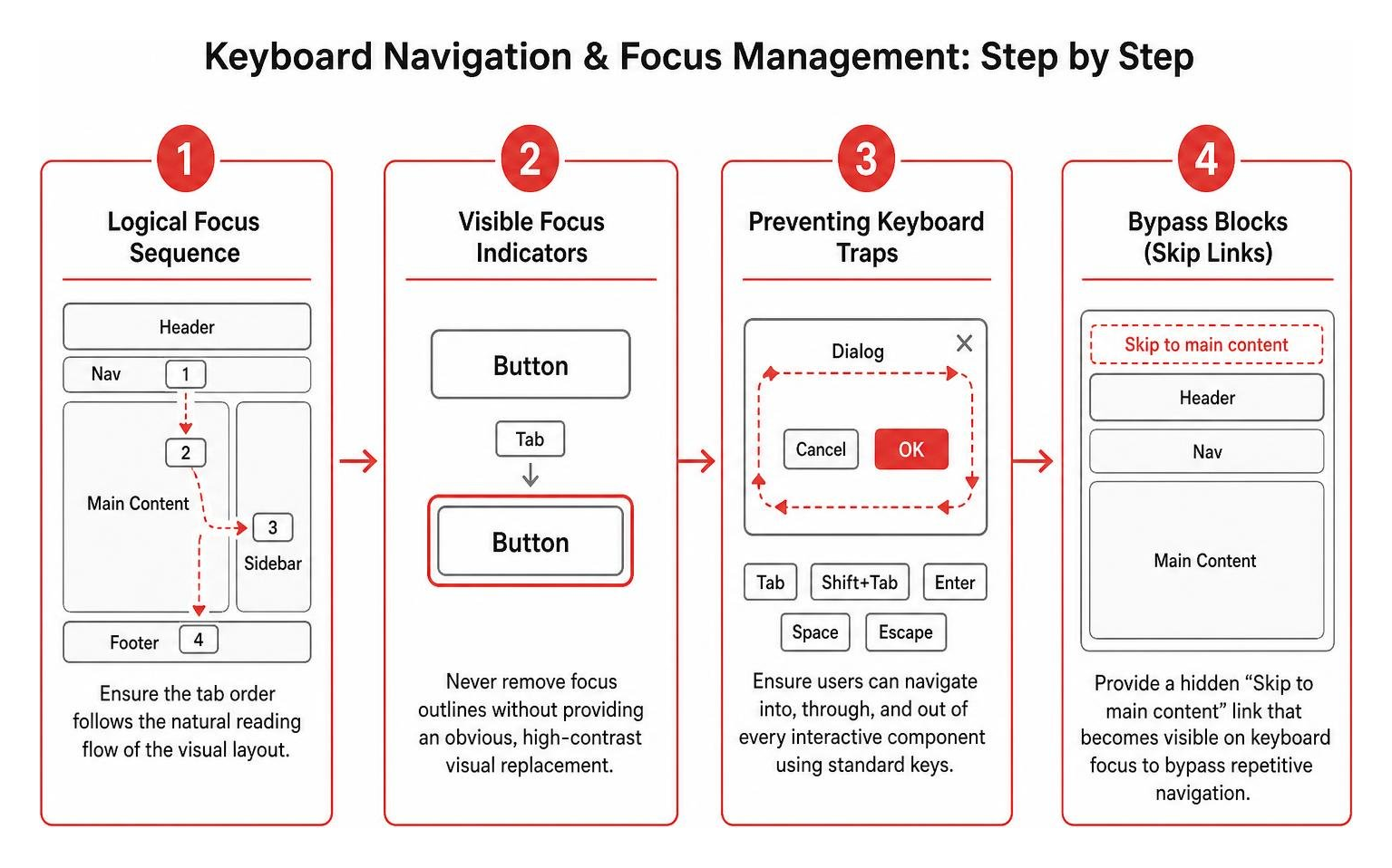
- Logical Focus Sequence: Ensure the tab order follows the natural reading flow of the visual layout.
- Visible Focus Indicators: Never remove CSS focus outlines (
outline: noneoroutline: 0) without supplying an obvious, high-contrast visual replacement. - Preventing Keyboard Traps: Ensure visitors can navigate into, through, and out of every interactive component using standard keys like Tab, Shift+Tab, Enter, Space, and Escape.
- Bypass Blocks (Skip Links): Provide a hidden “Skip to main content” link at the top of the DOM that becomes visible on keyboard focus, allowing users to bypass repetitive header navigation.
Visual Styling, Contrast, and Responsive Resizing
Visual accessibility ensures that users with low vision, color vision deficiencies, or situational impairments (such as viewing a screen in bright sunlight) can consume content comfortably:
- Color Contrast Ratios: Maintain a minimum contrast ratio of 4.5:1 for normal body text against its background. Large-scale text (at least 18pt regular or 14pt bold) requires a minimum ratio of 3.0:1.
- Independent Cues: Never rely on color alone to indicate required fields, system status, or interactive links. Pair color variations with icons, text labels, or underline patterns.
- Text Scaling: Ensure layouts scale gracefully up to 200% zoom without truncating text, breaking containers, or introducing horizontal scrolling.
- Motion Settings: Support the
prefers-reduced-motionCSS media query to suppress auto-playing animations, smooth scrolling, and parallax effects for users with vestibular sensitivities.
Implementing Accessible UI Components, Media, and Dynamic Features

Rich interactive components, dynamic single-page applications, and multimedia require deliberate implementation to avoid creating accessibility barriers. Developers can streamline this process by referencing resources like Learn Accessibility on web.dev alongside our breakdown on how to build ADA compliant websites without the stress.
Media Alternatives, Captions, and Audio Control
Non-text content must be accompanied by equivalent alternatives:
- Informative Images: Supply concise, descriptive alternative text via the
altattribute that communicates the purpose and context of the image. - Decorative Visuals: For purely decorative graphics, background textures, or spacer elements, use an empty
alt=""attribute so screen readers ignore them. - Synchronized Captions: Provide accurate, synchronized captions for all prerecorded and live video content containing speech.
- Audio Descriptions & Transcripts: Supply text transcripts for podcasts and audio-only media, along with descriptive audio tracks for videos with meaningful visual actions.
- Audio Control Mechanisms: If background audio or media plays automatically for longer than three seconds, provide accessible, easy-to-find controls to pause, stop, or mute the playback.
Accessible Forms, Error Handling, and CAPTCHA Alternatives
Forms are the primary engine for lead generation, account management, and transactions. Making them accessible ensures seamless user interactions:
- Explicit Label Association: Connect input controls to visible labels using native
markup. - Instructional Context: Associate helper text and formatting constraints with input fields using
aria-describedby. - Inline Validation and Error Summaries: When validation fails, identify the specific input containing the error in plain language. Group multiple issues into a focusable error summary container at the top of the form.
- Accessible Verification: Traditional image-based CAPTCHAs present significant barriers for users with visual and cognitive impairments. Implement multi-modal verification options, such as SMS verification, email magic links, or modern risk-analysis tools that do not require puzzle solving.
Managing Dynamic Content and Custom Widgets with WAI-ARIA
The Accessible Rich Internet Applications (WAI-ARIA) specification bridges gaps when native HTML elements cannot convey dynamic UI behaviors. However, the first rule of ARIA is: do not use ARIA if a native HTML element already provides the required functionality.
When engineering custom interactive components like accordions, tabs, or modal dialogs, consult the ARIA Authoring Practices Guide introduction. The APG provides standardized design patterns, keyboard interaction guidelines, and role definitions.
Use ARIA live regions (aria-live="polite" or aria-live="assertive") to announce real-time UI updates, such as shopping cart adjustments or search filtering results, without forcing a full page reload or shifting focus unexpectedly.
Comprehensive Testing, Auditing, and Verification Strategies
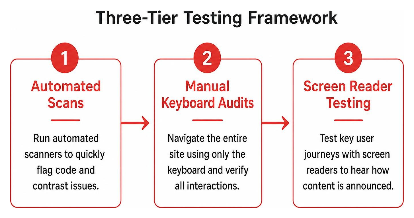
Achieving full compliance requires a multi-layered testing workflow. Relying solely on automated checkers catches only a fraction of potential barriers. You can learn more about structured testing procedures in our walkthrough on how to test your website for accessibility.
Integrating Automated and Manual Audits in ADA Accessible Web Development
- Automated Scanners: Run automated rule engines to quickly flag missing attributes, duplicate element IDs, and contrast failures across large volumes of templates. You can scan your site using accessibility audit tools to catch baseline code issues early in development cycles.
- Manual Keyboard Inspections: Disconnect your mouse and navigate the entire site using only the keyboard. Verify that all dropdown menus open, forms submit, dialogs close on Escape, and focus outlines remain visible.
- Assistive Technology Testing: Test core user journeys using native screen readers such as NVDA or JAWS on Windows, and VoiceOver on macOS and iOS. Listen to how labels, landmarks, and live notifications are announced during checkout or registration flows.
Establishing Ongoing Maintenance and Feedback Channels
Websites evolve constantly as new blog posts, products, and landing pages go live. Maintain compliance over time with the following practices:
- Accessibility Statements: Publish a dedicated accessibility statement detailing your conformance standards, supported environments, and known limitations.
- Public Feedback Mechanisms: Provide an accessible contact form and email address allowing visitors to report accessibility barriers directly to your development team.
- Continuous Integration Checks: Integrate automated accessibility linters into your build and deployment pipelines to catch regressions before code hits production.
Frequently Asked Questions About ADA Web Accessibility
What is the minimum WCAG level required for ADA compliance?
The legal benchmark across U.S. federal courts and Department of Justice settlements is WCAG Level AA conformance. While WCAG 2.1 Level AA remains widely accepted, targeting the current WCAG 2.2 Level AA standard ensures comprehensive protection against emerging compliance requirements and mobile UX issues.
Can automated accessibility overlays make a website fully ADA compliant?
No. Third-party accessibility overlay widgets and automated JavaScript toolbars cannot correct fundamental structural issues in underlying markup, such as missing form associations, broken keyboard focus traps, or flawed dynamic ARIA states. Sustainable ADA compliance requires remediating native source code directly.
Who is legally required to comply with ADA web standards?
Under Title II of the ADA, all state and local government agencies, public school systems, and municipal entities must maintain accessible websites. Under Title III, any private business categorized as a place of public accommodation—including e-commerce shops, healthcare networks, financial institutions, and service firms—is legally required to provide equal digital access.
Conclusion
Designing and coding for ADA compliance is more than a legal safeguard—it is a core engineering practice that improves the web experience for everyone. Building with semantic structure, clear contrast, intuitive keyboard navigation, and robust assistive support reduces legal exposure while expanding your audience reach.
At Zen Agency, we have helped businesses scale securely since 2008 with enterprise-grade web development and digital marketing solutions. Combining inclusive engineering with data-driven growth strategies allows brands to maximize both user satisfaction and market reach. For more insights on scaling your digital channels, explore our guide to optimizing PPC and web conversion strategies.