
Why the Best Website Design for Selling Products Is Sleeker Than You Think
The Best Website Design for Selling Products Removes Friction
The best website design for selling products is clean, fast, mobile-first, and built around one goal: helping shoppers find the right item and buy it with confidence. Lead with a clear product value, strong imagery, visible reviews, simple navigation, and an easy checkout.
A high-converting store does not need more banners, popups, or visual effects. It needs fewer distractions and clearer next steps:
- Show the product, price, benefit, and call to action early.
- Use lifestyle photos and customer proof to answer, “Will this work for me?”
- Make search, filters, cart access, and checkout effortless on a phone.
- Capture email only when the offer and timing match visitor intent.
This sleek approach matters because clutter creates doubt. Research cited in ecommerce design analysis finds that 51% of stores use aggressive homepage ads, while campaigns shown within the first five seconds can raise bounce rates by as much as five times. Good design earns attention before it asks for anything.
I’m Joseph Riviello, CEO and Founder of Zen Agency, with more than 22 years of experience helping companies connect website strategy to traffic, leads, conversions, and revenue. In this guide to the best website design for selling products, I’ll break down the design choices that make a store easier to trust, use, and scale.
Glossary for best website design for selling products:
Core Principles of the Best Website Design for Selling Products
When businesses struggle to scale online sales, they often assume they need more marketing budget or flashier graphics. In reality, conversion bottlenecks almost always stem from poor visual hierarchy and visual noise. The best digital storefronts rely on strict visual discipline, balancing generous whitespace with high-contrast calls to action that guide the eye naturally toward checkout.
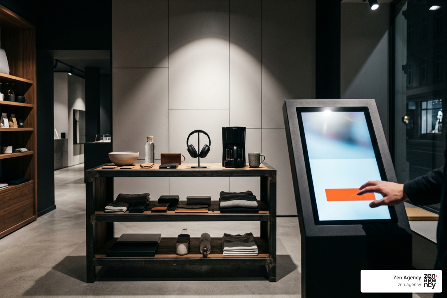
A functional layout respects cognitive load. When every element—from announcement bars to side widgets—screams for attention, nothing gets noticed. By mastering the ins and outs of ecommerce website design, brands create intuitive pathways that eliminate browsing hesitation. Many store owners seek creative inspiration by exploring curated boards on selling website design, but translating visual concepts into real-world conversion requires structural intent.
Essential Layout Elements in the Best Website Design for Selling Products
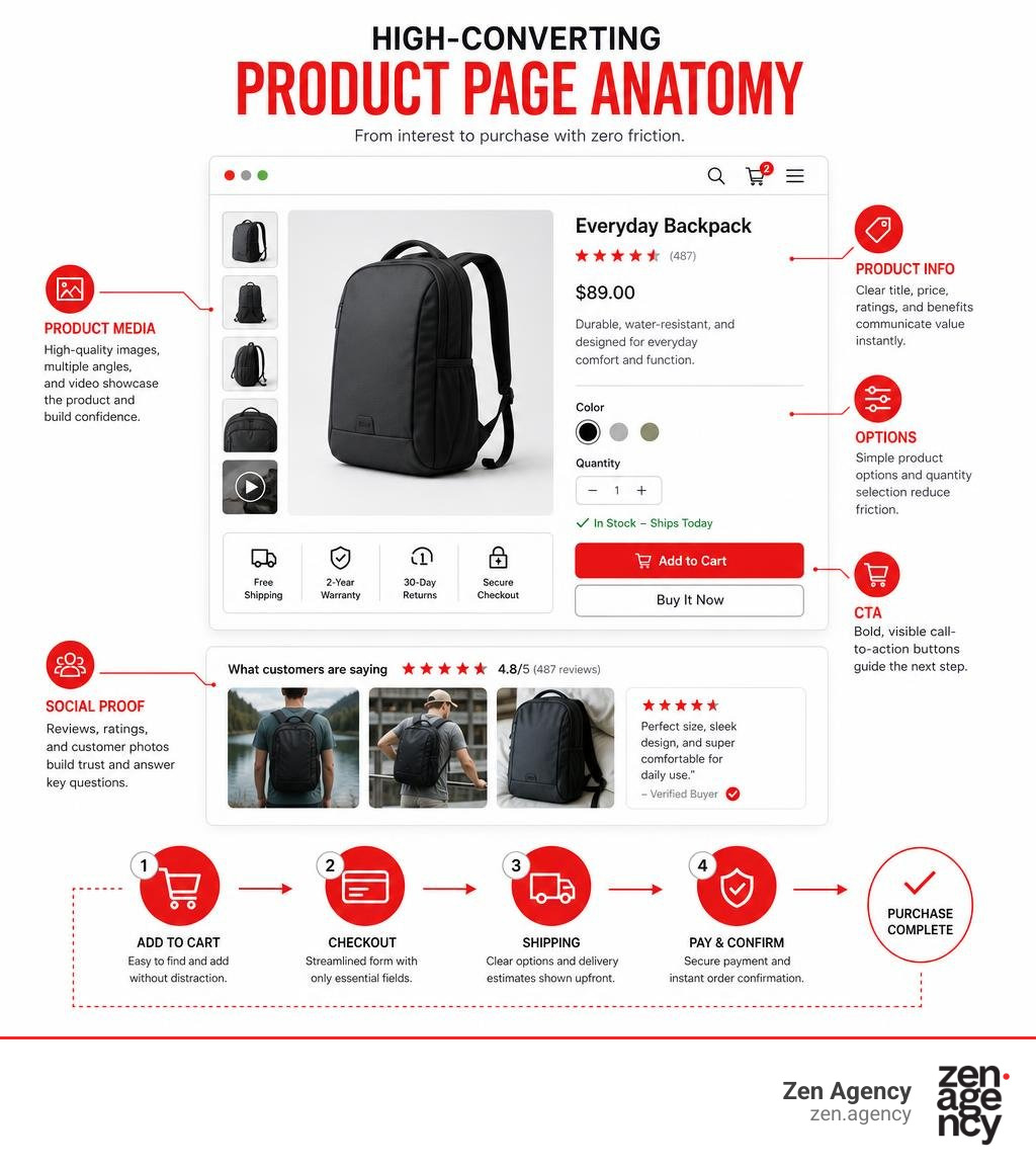
High-converting product pages follow a predictable visual rhythm. When a visitor lands on a product detail page (PDP), they should immediately see four foundational elements above the fold without scrolling:
- High-Resolution Media Gallery: Clear hero imagery, zoom capability, and contextual usage angles.
- Transparent Product Pricing & Titling: Prominent headers, obvious discount markers, and concise benefit summaries.
- Direct-to-Cart Action Elements: A prominent primary button supported by a sticky add-to-cart bar that remains visible as the user scrolls down the page.
- Risk Reversals: Reassuring microcopy directly beneath the button detailing shipping speeds, return policies, and secure checkout guarantees.
By deploying professional e-commerce design services, businesses can craft modular layouts that highlight product benefits immediately, capturing direct-to-cart conversions before hesitation sets in.
Lifestyle Photography and Early Social Proof
Plain white-background studio shots are necessary for showing technical specifications, but they make an online store feel purely transactional. Lifestyle photography, on the other hand, makes products aspirational by showing them in real-world contexts. It bridges the imagination gap, answering practical questions about fit, scale, and daily utility.
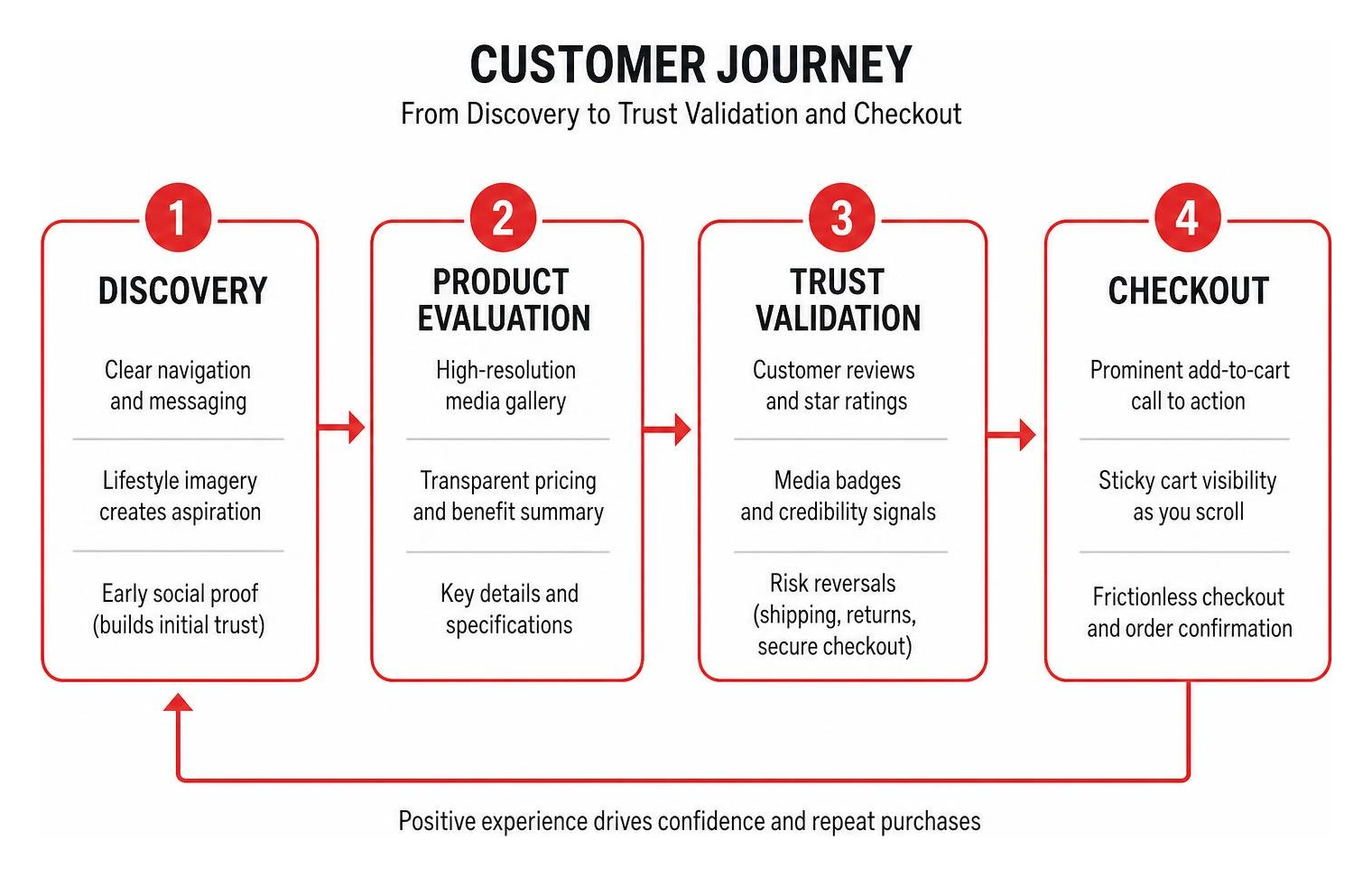
Equally critical is early social proof. Top-performing ecommerce homepages position customer reviews, star ratings, and reputable media badges within the first two screen heights—often before displaying a single product catalog grid. In our comprehensive breakdown in the ultimate playbook to skyrocket ecommerce conversion rates, we emphasize that trust must be established before asking shoppers to part with their hard-earned money.
Frictionless UX: Navigation, Mobile Architecture, and Checkout Flow
Navigation menus are meant to be roadmaps, not encyclopedias. One of the most common mistakes in store design is overwhelming shoppers with dozens of top-level categories. High-performing retailers restrict their main navigation to 4 to 6 core items, delegating secondary policies, company bios, and utility links to the footer.
Mobile shopping is no longer an afterthought; it accounts for the majority of consumer transactions. Responsive design is the bare minimum. True mobile UX requires reimagining touch targets and interaction models from the ground up. In our guide to thumb-friendly shopping: the ultimate guide to mobile ecommerce design, we advocate for sticky headers, bottom-sheet menus, and gesture-driven browsing patterns such as two-axis swiping.
Streamlined Product Discovery and Filtering
When shoppers know what they want, friction in product discovery kills sales. Well-structured online storefronts integrate intuitive merchandising tools:
- Faceted Search & Dynamic Swatches: Allowing users to filter instantly by color, size, material, or price without full-page reloads.
- Interactive Product Finders: Guided recommendation quizzes that match customers with the exact product variation suited to their needs.
- Visual Mega Menus: Rich dropdowns incorporating promotional banners, collection previews, and featured bestsellers directly within the navigation flow.
Templates like the Impact – Cocoon – Ecommerce website template demonstrate how rich merchandising tools, image hotspots, and swatch filters can streamline catalog discovery while maintaining rapid performance.
Frictionless Checkout and Cart Optimization
Cart abandonment frequently happens at the final hurdle due to hidden fees, forced account creation, or clunky multi-step forms. Modern checkout optimization focuses on speed and simplicity.
- Slide-Out Cart Drawers (Ajax Carts): Keep shoppers on the product page while displaying dynamic free-shipping progress indicators and one-click upsells.
- Express Digital Wallets: Offering Apple Pay, Google Pay, and Shop Pay eliminates form filling, slashing checkout times to seconds.
- Single-Page Checkouts: Displaying shipping, billing, and order summaries in a unified view reduces drop-off.
To eliminate friction across your final conversion step, review the best checkout page designs: a guide to frictionless shopping for structural patterns that protect cart value.
High-Performance Architecture: Headless Frameworks and Onsite CRO Strategy
A visually stunning store will fail if it takes seconds to load. Modern consumer expectations demand instant responsiveness, and Google’s Core Web Vitals directly penalize sluggish storefronts.

Monolithic ecommerce platforms often accumulate technical debt through bloated third-party plugins. Modern brands increasingly adopt headless and decoupled architectures to deliver sub-second interactions and superior search engine visibility.
| Architecture Feature | Monolithic Template Stores | Modern Headless Frameworks (React/Next.js) |
|---|---|---|
| Page Load Speed | 2.5s – 5.0s (plugin-dependent) | Sub-second edge-rendered delivery |
| Rendering Strategy | Server-rendered on request | Static Site Generation (SSG) & SSR |
| Catalog Scalability | Prone to database bottlenecks | GraphQL-driven decoupled API queries |
| Core Web Vitals | Frequent Cumulative Layout Shifts | Pixel-perfect component isolation |
| Omnichannel Flexibility | Restricted to theme engine | Deployable to web, mobile apps, and IoT |
How Modern Frameworks Power the Best Website Design for Selling Products
Frontend technologies like React and Next.js transform shopping experiences from static web browsing into smooth, app-like interactions. Through the React Virtual DOM, only changed page elements re-render during filtering or cart updates, eliminating jarring full-page refreshes.
Platforms and templates such as the ACME Storefront, powered by Saleor & Next.js demonstrate how modern headless architectures handle product filtering and inventory queries smoothly. Furthermore, engineering teams building high-performance React e-commerce for modern brands leverage Server-Side Rendering (SSR) and GraphQL APIs to maintain crawlable metadata for organic SEO while delivering lightning-fast client transitions.
Smart Onsite Triggers and Non-Intrusive Lead Capture
Email and SMS capture remain foundational for customer lifetime value, but traditional, aggressive popups ruin the user experience. Displaying full-screen popups within the first five seconds can increase bounce rates by up to five times.
Instead, smart storefronts use contextual behavioral triggers. Data shows that moving an onsite campaign trigger just one page later produces a median 39% to 52% increase in conversion. Furthermore, personalized campaigns targeted with custom properties (such as cart value or loyalty status) convert at 9.98%, compared to just 3.8% for untargeted blasts. For actionable strategies on balancing user engagement with conversion incentives, explore our insights on how to unlock your e-commerce potential: simple steps to increase online sales.
Adapting Storefront Design: Physical Goods, Drops, and Scalable Growth
Every ecommerce vertical requires a tailored design approach. Selling physical consumer goods demands clear sizing charts, material breakdowns, and shipping transparency. In contrast, B2B storefronts require wholesale portals, custom volume pricing tiers, and quote builders. When planning complex corporate sales architectures, reference your blueprint for B2B website success to align operational workflows with customer expectations.
Catalog-Heavy Stores vs. Limited-Edition Drops
Retailers with large SKU counts require dense, highly organized product catalog grids with faceted sorting to help users navigate hundreds of options.
In contrast, capsule collections and streetwear brands thrive on exclusivity and urgency. Themes like SPLY — Studio Shopify Theme cater to limited-edition drops by swapping traditional category grids for password-protected gates, live countdown timers, and interactive floating canvas layouts. The right design reflects your sales velocity, brand culture, and catalog size.
Custom Built vs. Template Solutions for Long-Term Scalability
Off-the-shelf templates are great for validating a business concept on a budget. However, as catalog complexity and transaction volumes expand, rigid templates often restrict growth and degrade site speed.
When off-the-shelf themes hold your business back, exploring our guidance on beyond templates: the smart way to get a custom website built helps identify when to invest in bespoke architecture. Partnering with a dedicated team for best custom web design ensures your storefront is tailored directly to your operational workflows, branding guidelines, and conversion targets.
Frequently Asked Questions about Product Selling Website Design
What makes an ecommerce layout high-converting?
A high-converting ecommerce layout pairs sub-second page load times with a clean visual hierarchy. It features high-quality lifestyle and contextual imagery, prominently positions social proof (reviews and media badges) above the fold, maintains a streamlined main menu with 4 to 6 items, and provides a frictionless, single-page checkout flow with express digital wallet integration.
How does popup timing impact bounce and conversion rates?
Timing is everything in onsite marketing. Triggering popups within the first five seconds of a session can increase visitor bounce rates up to fivefold. Conversely, delaying campaigns until a visitor views a second page or exhibits exit intent increases conversion rates by a median of 39% to 52%. Segmenting offers based on cart value or traffic source boosts conversions even further.
Why is headless React or Next.js preferred for modern online stores?
Headless React and Next.js architectures decouple the frontend user interface from backend commerce databases. This allows for sub-second page transitions via Virtual DOM updates, solves Single Page Application SEO challenges through Server-Side Rendering (SSR), and gives brands unlimited UI customization without platform-imposed theme limitations.
Conclusion
Building a high-performing digital storefront requires balancing clean visual aesthetics with technical performance and conversion strategy. Clutter, slow load times, and aggressive onsite popups introduce buyer friction that drives customers away. By focusing on streamlined navigation, lifestyle visual storytelling, mobile-first layouts, and modern frontend architecture, you create an effortless shopping experience that drives sustainable sales growth.
At Zen Agency, we have spent over two decades helping businesses scale through custom website development, enterprise ecommerce architecture, and data-backed conversion optimization. Ready to transform your digital storefront into a high-converting sales engine? Partner with our team and explore our enterprise-grade website design services to build an online store engineered for long-term ROI.