New Identity, Who Dis? The Modern Identity Design Process
Understanding Brand Identity Beyond the Logo
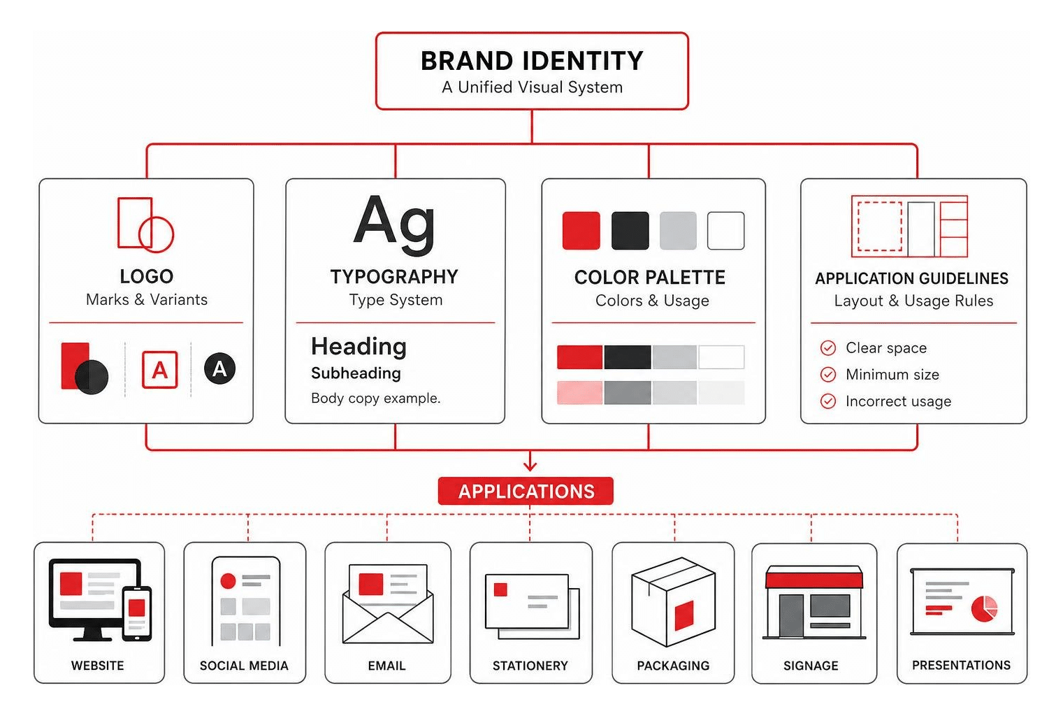
When most business owners hear the phrase “brand identity,” they instantly picture a logo. While a memorable mark is important, focusing solely on a logo is like trying to build a house by only designing the front door. A true corporate identity is a holistic visual and conceptual system that governs how your business shows up across every single customer touchpoint.
Human brains process visual elements approximately 60,000 times faster than written text. When a customer lands on your website, opens an email newsletter, or holds your product packaging, their subconscious mind synthesizes colors, layout spacing, typography, and visual tone in milliseconds. If those elements feel disjointed or amateurish, trust evaporates instantly.
At Zen Agency, we view identity design as building an interconnected visual ecosystem. Rather than offering a standalone graphic mark, we align corporate visual language with target market expectations. This comprehensive approach is why relying on Beyond Logos: Why Your Business Needs a Digital Branding Agency transforms how prospective buyers perceive your market value, elevating your business from a commodity into a category leader.
Core Anatomy of a Complete Identity System
A resilient, scalable identity system consists of far more than a couple of graphic files saved on a desktop. It is a carefully orchestrated group of design elements that work together seamlessly across print, web, software applications, and physical spaces:
- Logo Marks & Responsive Variants: A primary wordmark or combination mark supported by alternative layouts, monograms, secondary submarks, and simplified icon formats (such as 16x16px website favicons or social media profile avatars).
- Typography Hierarchy: Legibility-tested typeface pairings that set the emotional tone—whether modern, classic, playful, or serious—complete with clear rules for header sizing, body copy line-heights, and web layout kerning.
- Emotional Color Palettes: Primary, secondary, and accent swatches specified across all technical color spaces (RGB for digital screens, CMYK for offset printing, HEX for web development, and Pantone matching systems for physical collateral).
- Design Tokens: Standardized variables for padding, border radiuses, box shadows, and UI component behavior that bridge the gap between creative graphic design and front-end web development.
- Imagery & Graphic Patterns: Specific visual directions for photography filters, custom icon sets, custom illustrations, background textures, and geometric motifs that reinforce visual recognition even when the main logo is absent.
- Motion Identity: Defined animation principles, loading states, transition easing curves, and lower-third video bumpers created specifically for modern digital-first platforms and social video content.
Pre-Design Foundations: Discovery and Strategy
Opening design tools like Adobe Illustrator or Figma before completing rigorous research is the primary reason branding projects fail. Skipping strategic discovery inevitably leads to endless revision loops, internal subjective disagreements (“I just don’t like blue”), and visual identities that look pretty but fail to generate revenue.
Before we push a single pixel, we conduct exhaustive client discovery, audience analysis, and competitive auditing. We evaluate at least 10 to 15 key competitors in your niche to uncover common industry clichés to avoid, as well as distinct visual white space your business can comfortably own. Grounding every design decision in empirical market research ensures your final visual presence communicates value instantly. To explore how strategic foundations lead to long-term market authority, review our guide on How to Build a Brand That Lasts: A Step-by-Step Strategy Guide.
Why Strategy Governs the Identity Design Process
Strategy acts as the blueprint and compass for the entire identity design process. Without strategic positioning, visual design is merely subjective art. By defining your positioning statement, target buyer personas, brand pillars, and anti-positioning rules up front, we create an objective framework against which all future visual choices are evaluated.
Equally critical is establishing a brand’s verbal identity before finalizing visual aesthetics. Visual elements inherently carry verbal meaning; copy shape, headline length, and messaging tone directly inform visual hierarchy and spatial layout. A detailed tone spectrum determines whether your brand voice feels authoritative, witty, empathetic, or disruptive. Grounding creative executions in a clear framework ensures that every design choice directly serves concrete business goals, as detailed in this Framework for Brand Identity.
The 6 Key Phases of the Modern Identity Design Process

A professional identity design process transforms abstract business concepts into tangible visual systems through structured, repeatable milestones. Based on our experience working with growing enterprise businesses across Pennsylvania, Montana, and nationwide, structured workflows eliminate creative guesswork and guarantee predictable, high-impact outcomes. For an in-depth look at moving past surface-level visual brainstorms, read Beyond Moodboards: Mastering the Brand Identity Design Process.
Phase 1 and 2: Discovery and Strategic Positioning
The project begins with a deep-dive onboarding process. We conduct structured leadership discovery interviews, deploy target audience questionnaires, and facilitate alignment workshops to establish absolute clarity regarding your core value proposition.
During these initial weeks, we synthesize qualitative customer feedback, identify target audience demographics and psychological pain points, and craft a 1 to 2-page Strategic Direction document. This creative brief outlines core brand pillars, competitive differentiation angles, and messaging guidelines. Gaining formal client sign-off on this written document ensures all key stakeholders agree on the project’s strategic goals before visual exploration begins.
Phase 3: Visual Exploration and Concept Development

With an approved strategy in hand, visual exploration begins. Rather than relying on abstract moodboards that rely on vague visual “vibes,” we transition directly into concrete visual ingredient explorations. We explore color palette combinations, typography pairings, and tactile visual inspirations simultaneously.
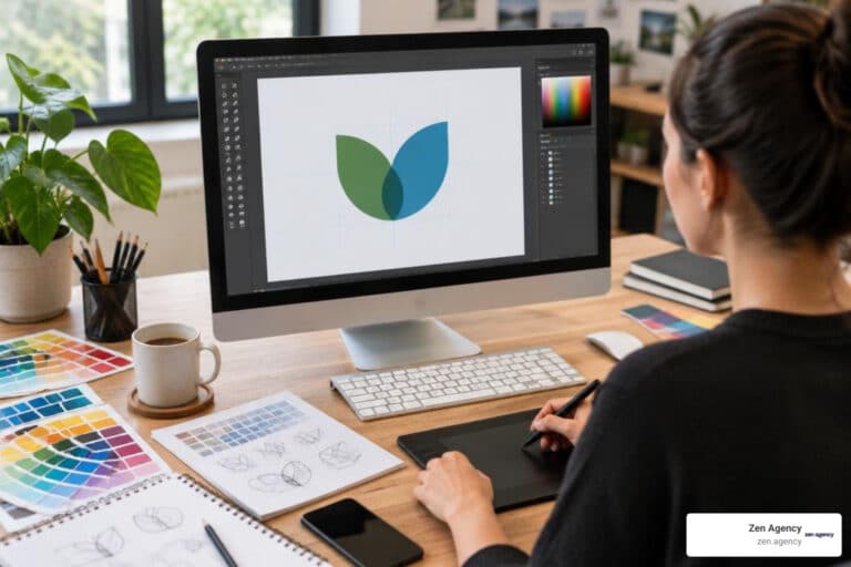
We sketch dozens of rough concepts on paper—allowing rapid visual iteration without software constraints—before digitizing the strongest directions in Adobe Illustrator. During this phase, we develop 2 to 3 distinctly different strategic visual directions. Each direction presents a complete visual system concept rather than minor variations of a single idea. Presenting fully contextualized concept directions prevents decision fatigue and helps clients evaluate meaningful strategic paths, as highlighted in David Airey’s Identity Design Process Insights.
Phase 4 and 5: Refinement, Testing, and System Build
Once a primary visual direction is chosen, we enter Phase 4 and 5: refinement, stress-testing, and building out the complete identity system. We fine-tune vector geometry, refine typographic kerning, test contrast ratios for digital accessibility, and evaluate the logo mark in monochrome (black and white) to ensure structural integrity without relying on color.
We then build real-world application mockups—testing the identity across responsive website layouts, mobile apps, physical product packaging, corporate stationery, pitch decks, and digital ads. To prevent endless feedback cycles and keep project momentum strong, standard client contracts enforce a cap of 3 revision rounds.
| Asset Format | Vector vs. Raster | Common File Extensions | Primary Use Case | Key Advantages |
|---|---|---|---|---|
| Vector Master | Math-based paths | .AI, .EPS |
Printing, signage, embroidery | Infinite scalability without loss of resolution |
| Vector Web | Math-based code | .SVG |
Web graphics, UI icons, web logos | Ultra-light file size, crisp display on HD screens |
| Raster High-Res | Pixel grid | .PDF, .TIFF |
High-quality print collateral, print ads | High color depth and precise print rendering |
| Raster Web | Pixel grid | .PNG, .JPG, .WEBP |
Digital content, social media, web body images | Native web browser compatibility, supports transparency |
Phase 6: Brand Guidelines and Governance
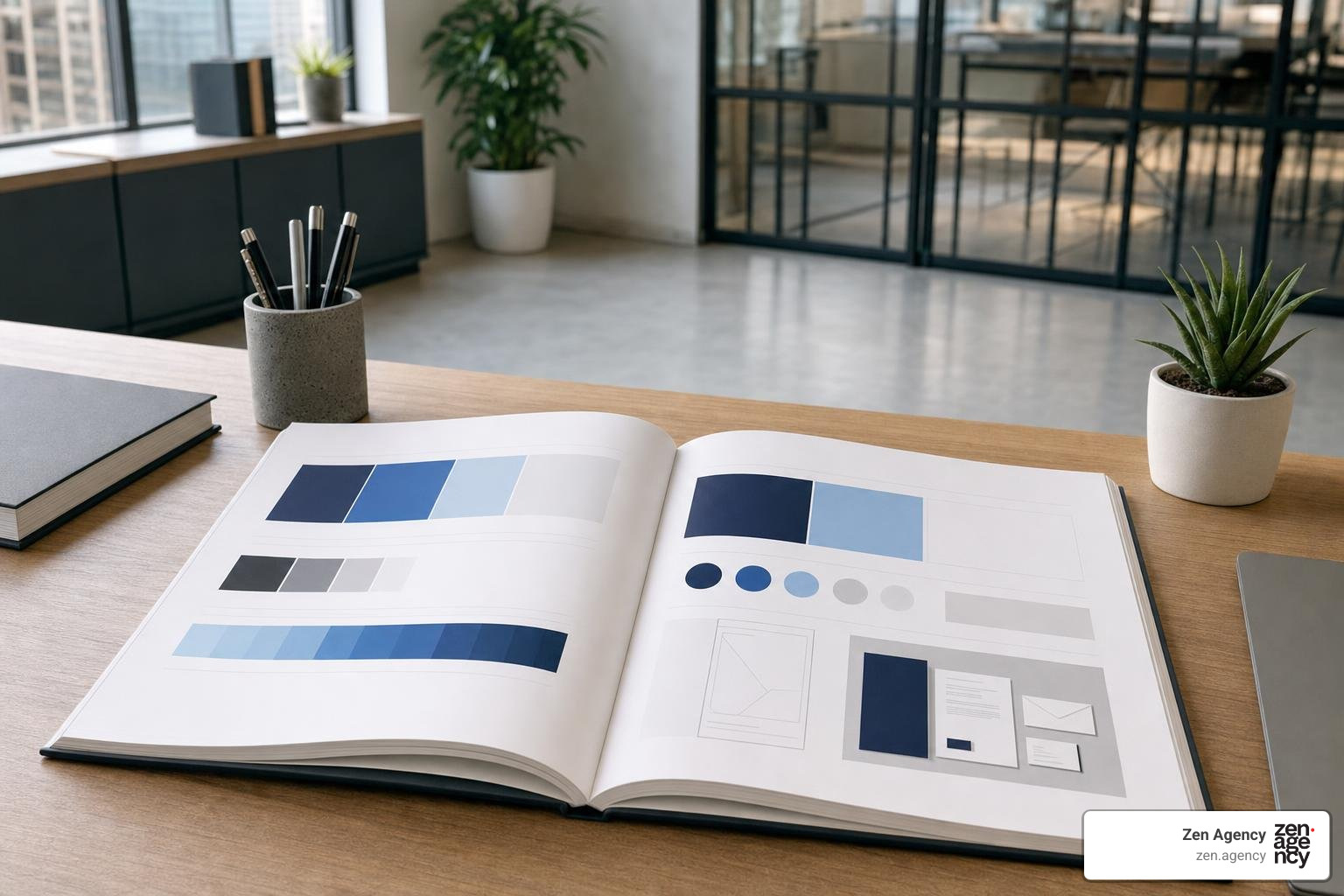
A visual identity is only as effective as its execution. Phase 6 focuses on creating a comprehensive Brand Style Guide (brand manual) that documents rules for internal teams, external freelancers, print vendors, and marketing agencies.
These guidelines range from 15 to over 100 pages depending on system complexity, detailing precise logo clear-space rules, prohibited usage examples, typography scale hierarchies, color swatch codes, and imagery standards. Furthermore, we integrate strict Web Content Accessibility Guidelines (WCAG 2.2 AA) to guarantee color contrast ratios (minimum 4.5:1 for standard text) satisfy modern digital compliance standards. Discover how to create comprehensive brand manuals in The Ultimate Guide to Brand Guideline Creation.
Asset Delivery and Final Implementation
The culmination of an identity design process is the systematic handoff of production-ready digital and print assets. Delivering a disorganised folder full of loosely named files leads to brand drift, incorrect logo usage, and frustration for your internal team.
We organize all deliverables into a clean, intuitive cloud storage directory structure separated into clear subdirectories for print and digital applications. We also record video walkthroughs demonstrating exact folder layouts, software usage guidelines, and asset file formats so your team feels completely supported from day one. To learn more about customized identity frameworks tailored specifically for high-growth businesses, explore Your Brand, Your Rules: A Guide to Custom Identity Design.
Navigating Handoff in the Identity Design Process
During final asset production, a single comprehensive brand identity redesign can produce anywhere from 40 to more than 300 individual exported files. Understanding file formats and color spaces ensures your team utilizes the right asset for every medium:
- Master Vector Files (.AI, .EPS): Source Illustrator and Encapsulated PostScript files built for professional commercial printers, signmakers, and vehicle wrap installers.
- Scalable Vector Web (.SVG): Crisp, code-friendly vector graphics engineered for modern responsive websites and digital product interfaces.
- Transparent Raster Assets (.PNG): High-resolution raster images with transparent backgrounds created for web pages, email templates, and presentation decks.
- Print-Ready PDFs (.PDF): Pre-flighted print documents configured with standard bleed and crop marks.
- Color Spaces (RGB, CMYK, Pantone): RGB and HEX codes for digital screens; CMYK and spot-color Pantone matching systems for exact physical color reproduction.
Frequently Asked Questions About Identity Design
What is the difference between a logo and a brand identity?
A logo is a single graphic mark or wordmark used as a shorthand visual identifier for a company. A brand identity is the complete visual, verbal, and experiential system surrounding that mark—including color palettes, typography hierarchies, imagery rules, graphic patterns, tone of voice, and layout standards across every customer touchpoint.
How long does a typical identity design project take?
A comprehensive agency identity design project typically requires 9 to 14 weeks from discovery kickoff through final asset handoff. This timeline accounts for approximately 50 to 80 active designer hours across strategic research, visual concept development, client feedback iterations, system builds, and guidelines documentation.
What should be included in a final brand identity package?
A complete brand identity package includes:
- Primary, secondary, and submark logo variants in all standard file formats (.AI, .EPS, .SVG, .PNG, .JPG).
- Defined color palettes specified in CMYK, RGB, HEX, and Pantone standard codes.
- Web and desktop font family licenses with clear typographic hierarchy rules.
- Custom graphic elements, icons, patterns, or photography style guides.
- Digital and print marketing collaterals templates (e.g., social media graphics, business cards, email headers, pitch decks).
- A comprehensive brand style guide detailing usage rules, WCAG accessibility standards, and application examples.
Conclusion
A successful identity design process is far more than a simple visual update—it is a strategic investment in your company’s long-term enterprise value. By replacing fragmented graphics with a cohesive, accessible visual system grounded in strategy, you eliminate sales friction, establish immediate market credibility, and create a brand identity that scales effortlessly as your business grows.
Since 2008, Zen Agency has helped businesses overcome scaling bottlenecks through custom website development, enterprise branding systems, and data-driven digital marketing. Operating across Scranton, Wilkes Barre, Wyoming PA, Billings MT, and nationwide, our team delivers the strategic clarity and design execution required to transform your brand into an industry leader.
Ready to revitalize your corporate image and build a high-converting brand identity system? Discover how our expert team can elevate your business by visiting our Branding Graphic Design Services today.